Ashraf Sabri
Hi, I’m a Product Designer who turns complex problems into simple, intuitive experiences, balancing human needs, business goals, and thoughtful craft, from early insight to shipped product.
Hi, I’m a Product Designer who turns complex problems into simple, intuitive experiences, balancing human needs, business goals, and thoughtful craft, from early insight to shipped product.
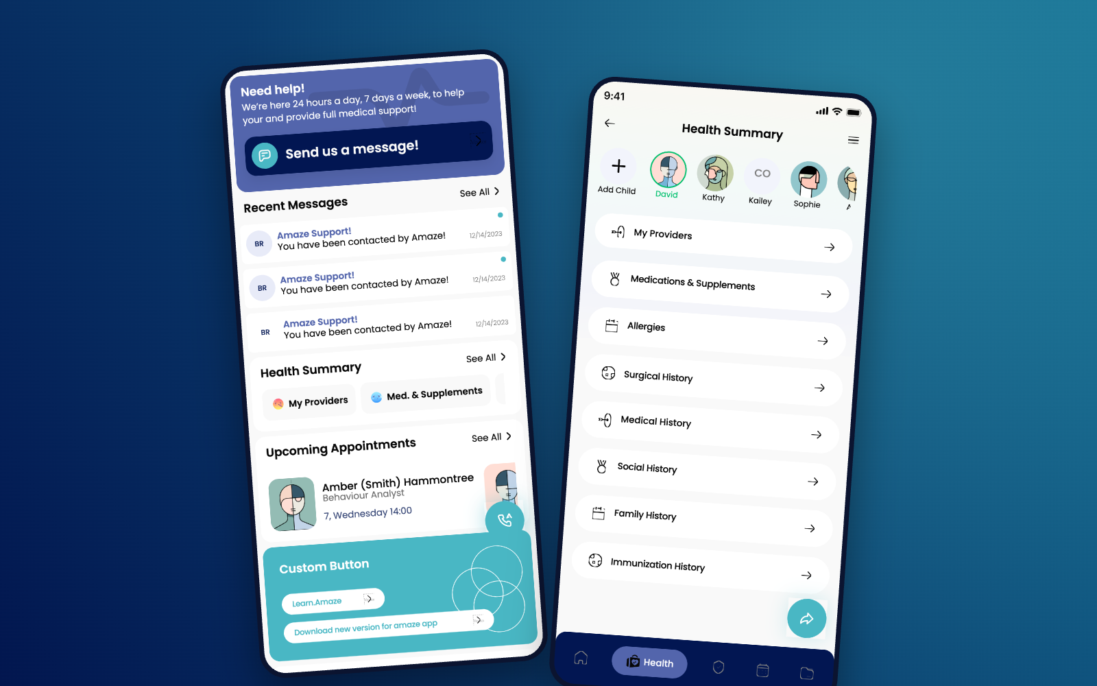
Designing a calmer, more human telehealth experience.
Helping patients connect with healthcare professionals through appointments, messaging, insurance, and everyday care.
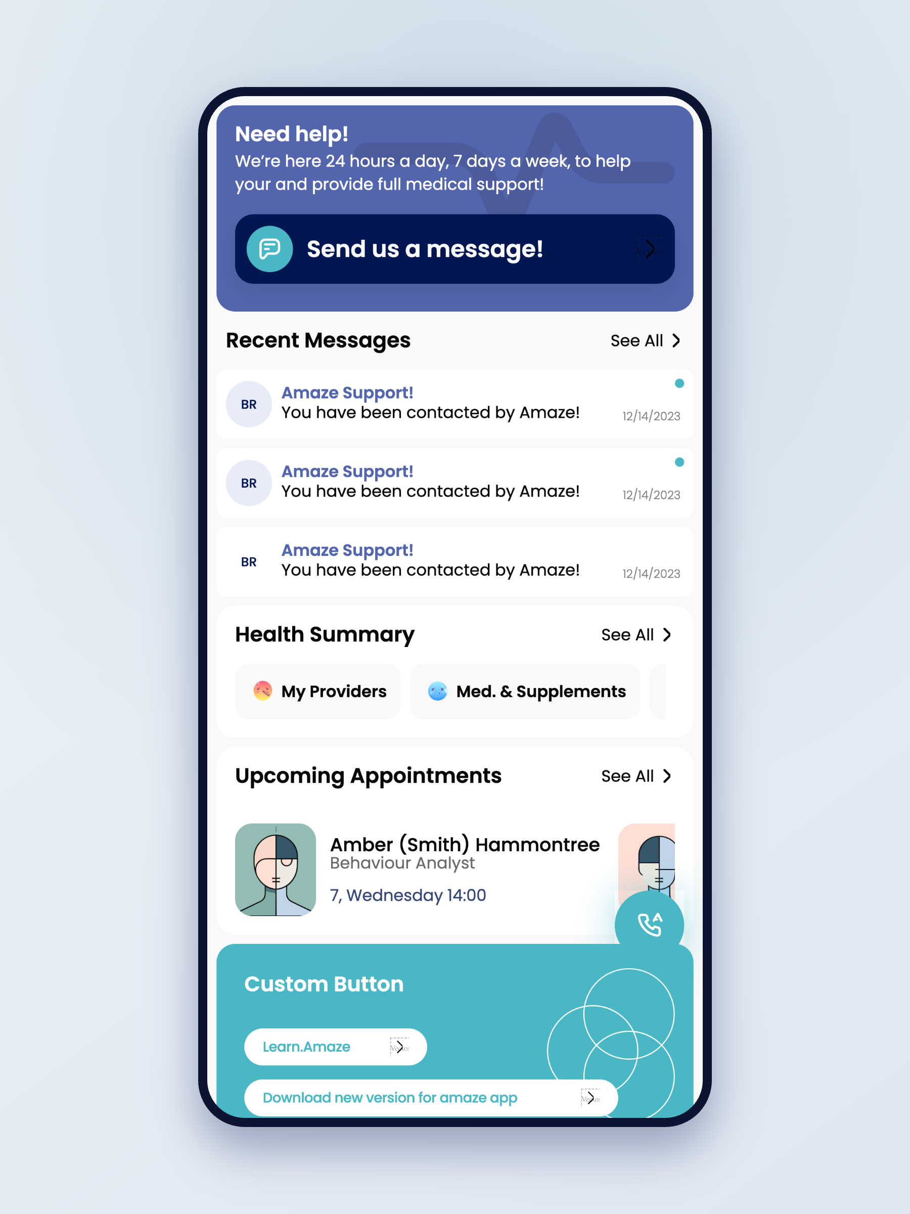
A connected healthcare ecosystem serving 100–150K patients — where a $34.99/month membership powers ongoing virtual care for roughly 80–100K premium members.
Most healthcare apps make scheduling feel like paperwork. Booking here is a few calm decisions — who you need, when it works, how you'd like to meet — and the rest is remembered for you. From "I need a doctor" to confirmed in under a minute.
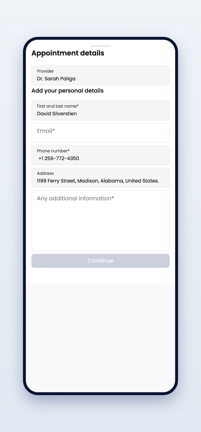
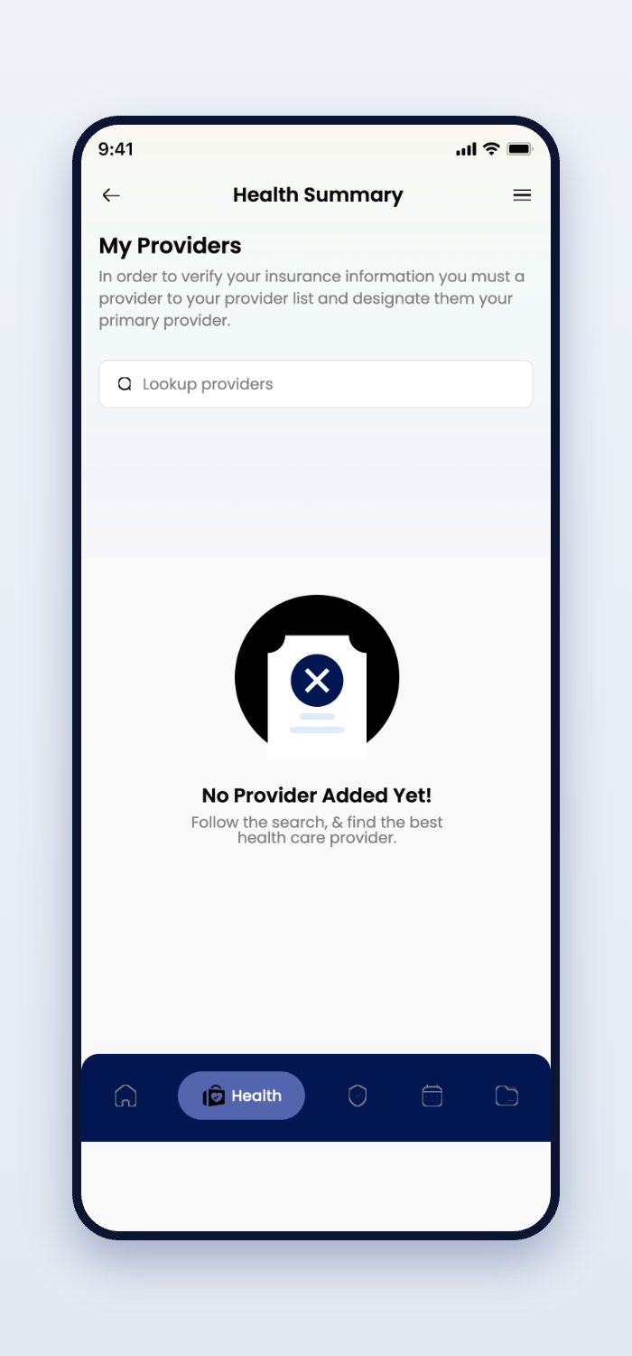
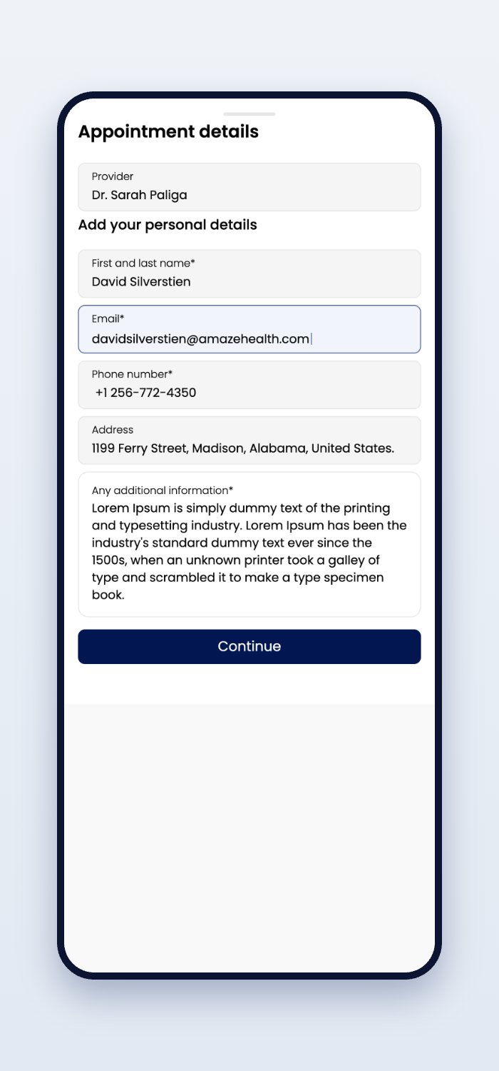
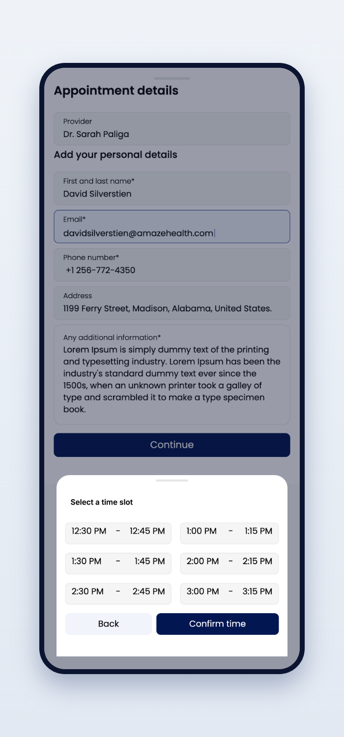
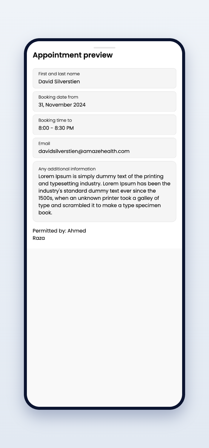
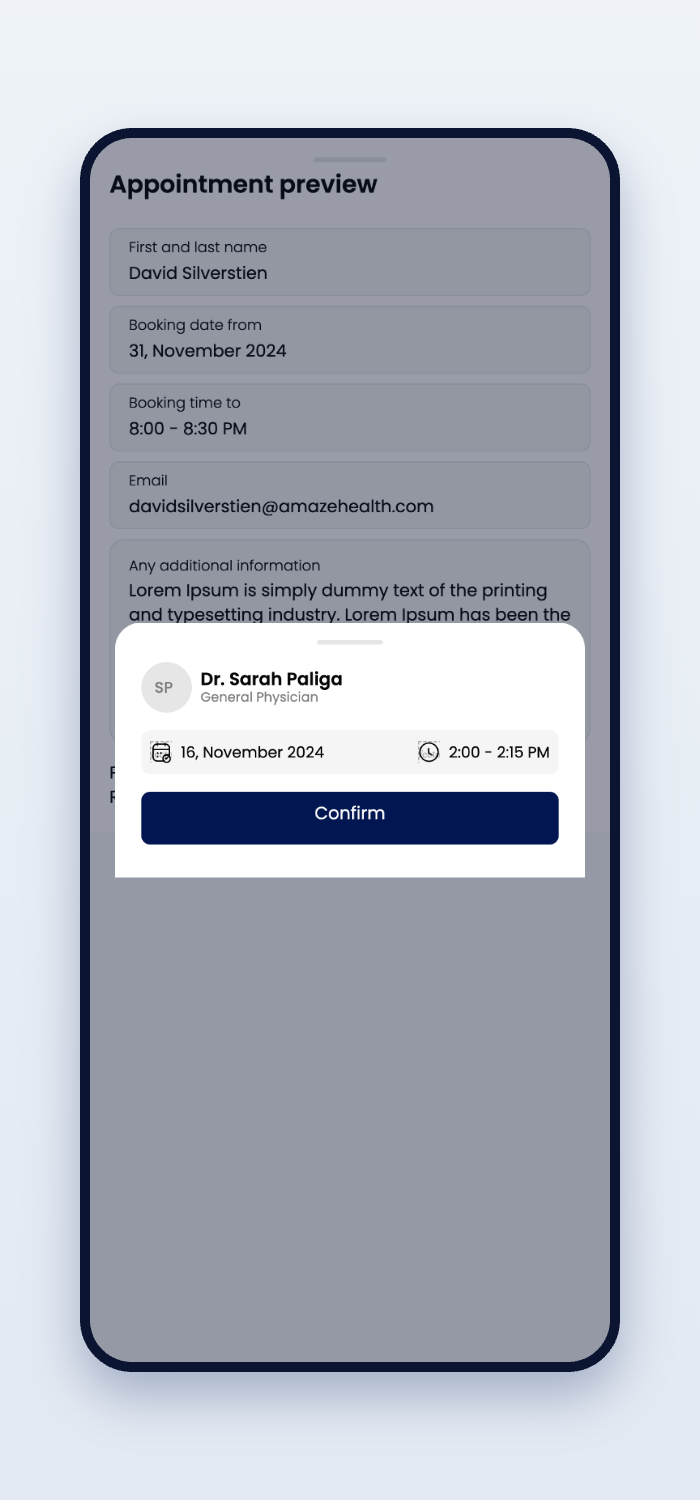
Patients rarely open a healthcare app to explore. They open it because they need something — quickly.
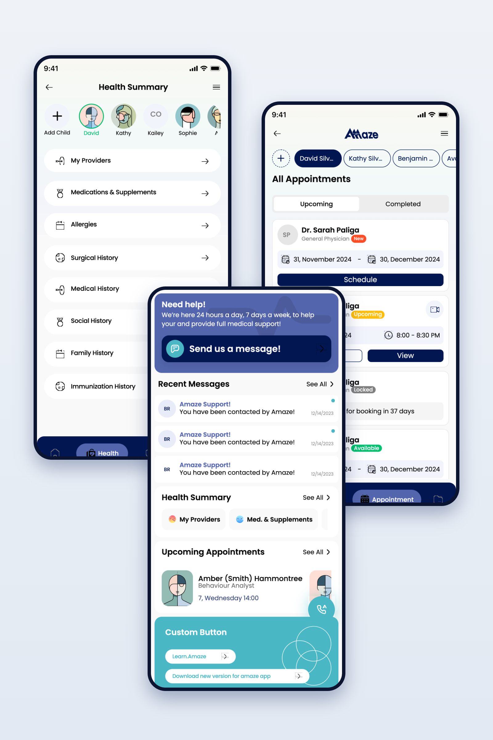
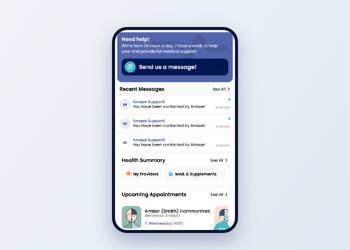
So home leads with what matters now — the next appointment, a message from your care team, a doctor one tap away. Everything important is visible within moments. Nothing to hunt for. Nothing to learn.
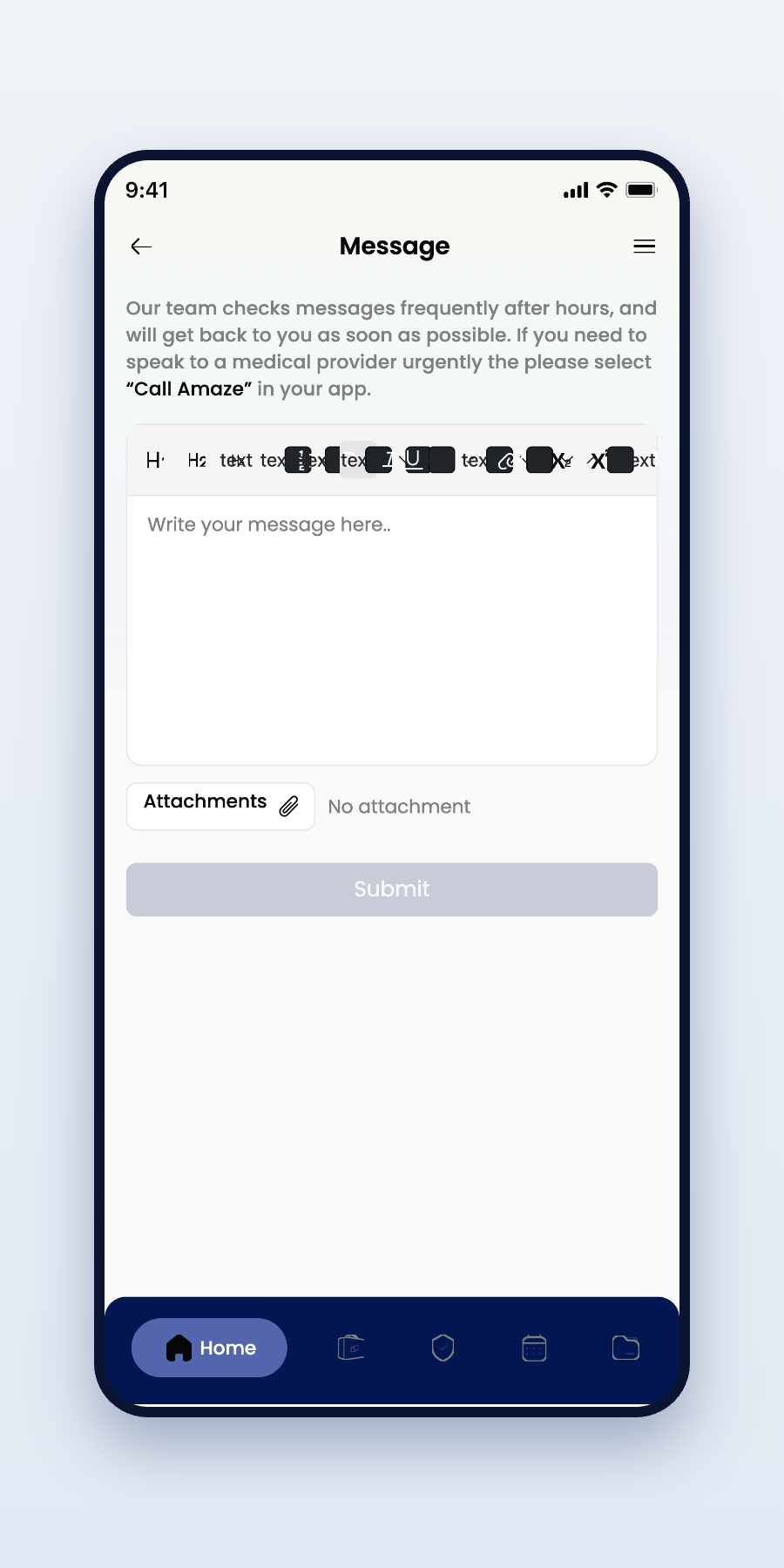
Messaging a care team should feel as natural as texting a friend — clear threads, human language, help that answers.
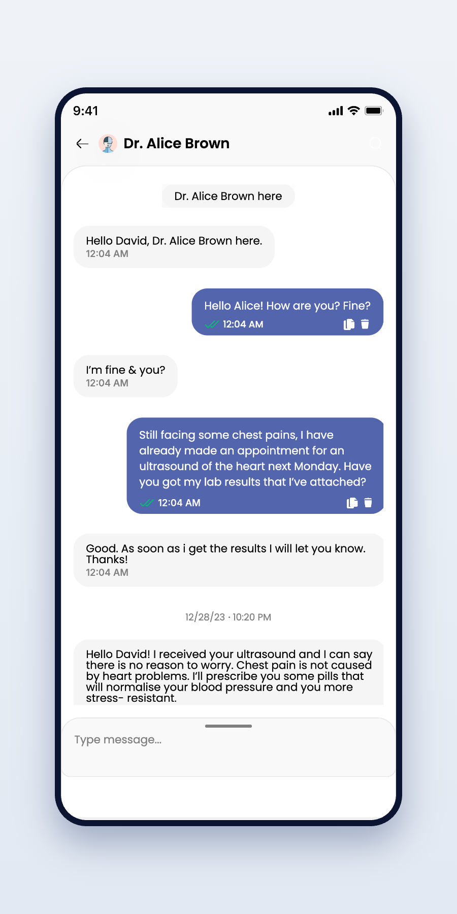
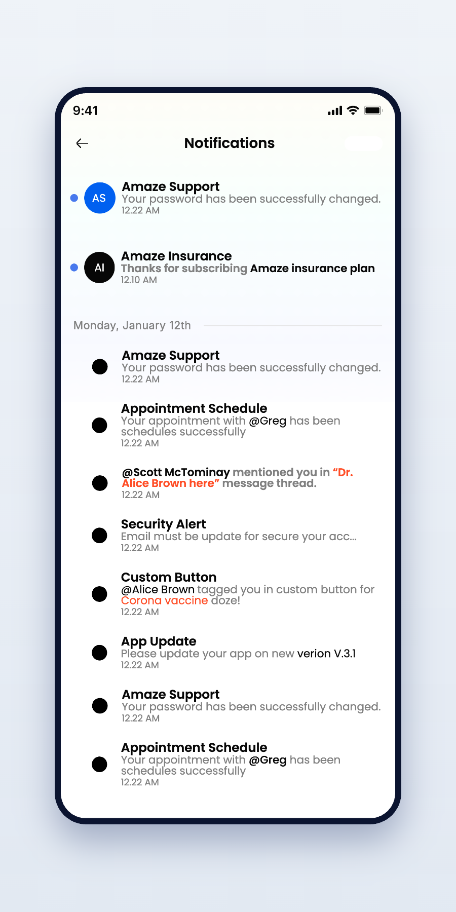
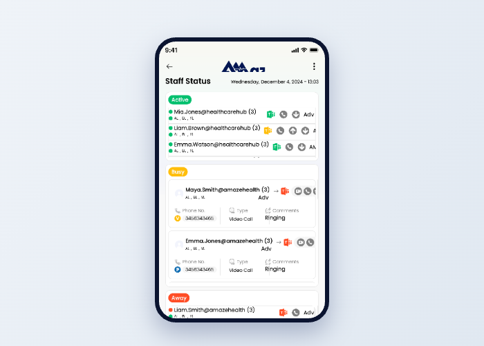
One design language, five surfaces — the experience follows patients and care teams wherever they work.
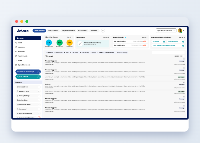
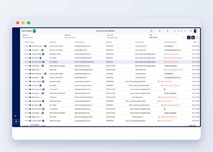
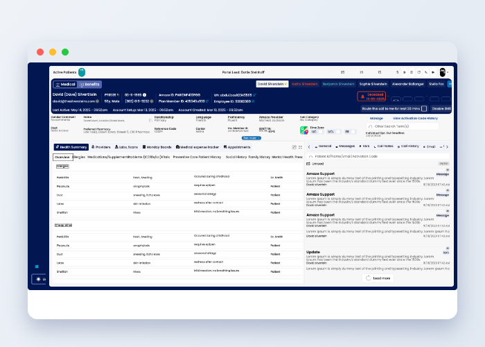
Not a palette. Not a type scale. A feeling.
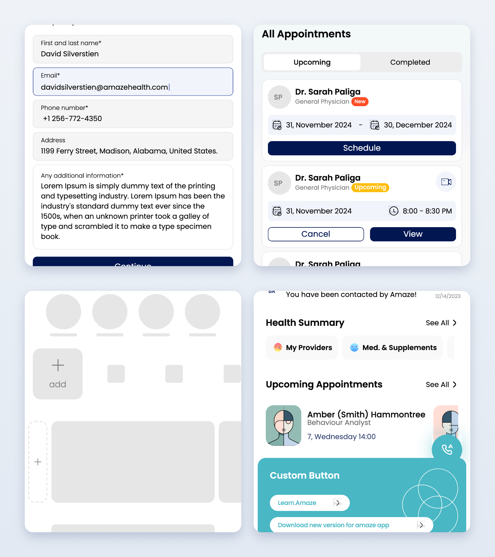
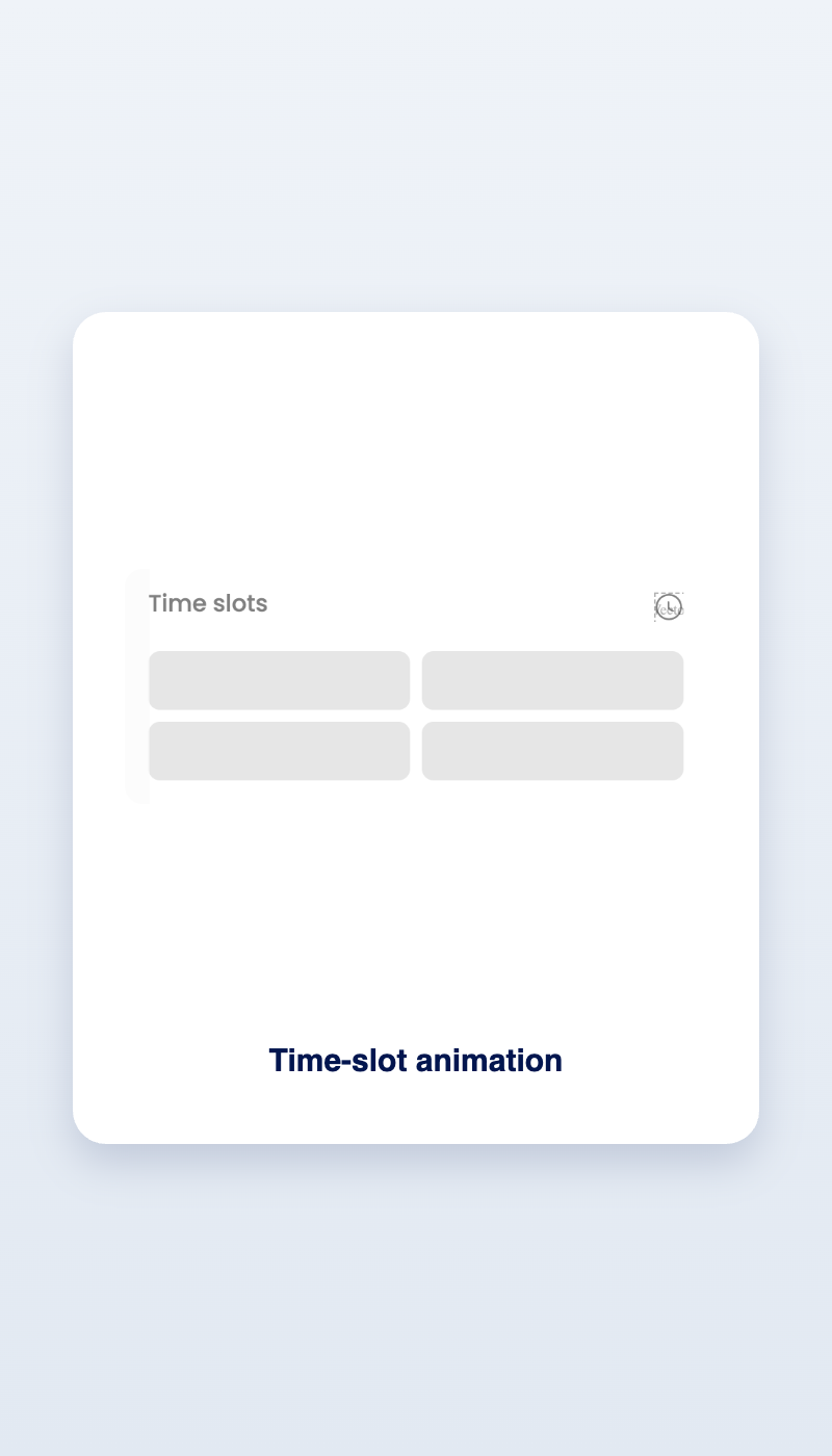
Lottie-built micro-interactions give every action a quiet confirmation — feedback you feel more than notice.
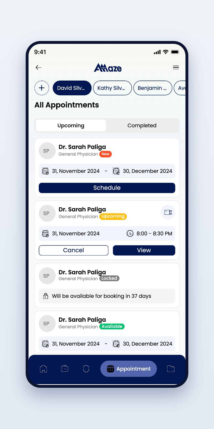
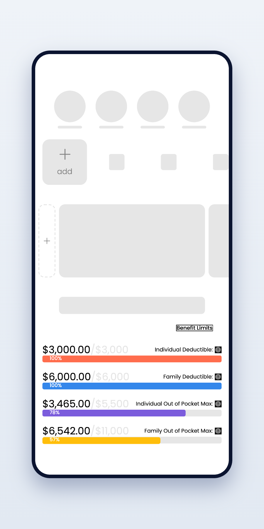
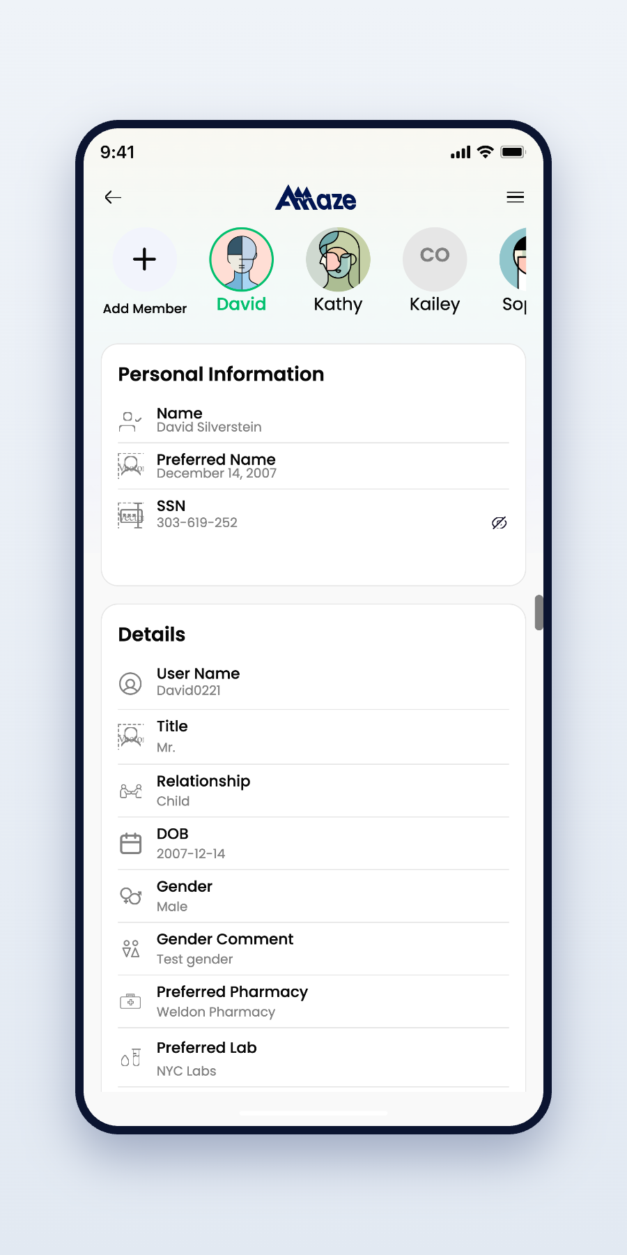
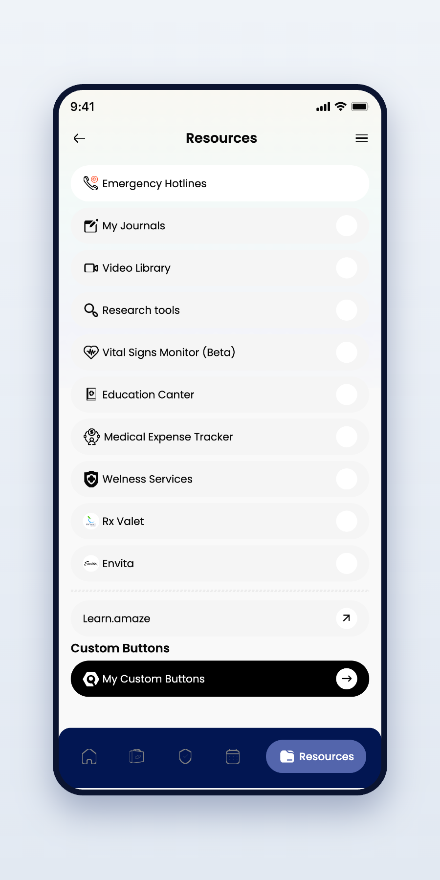
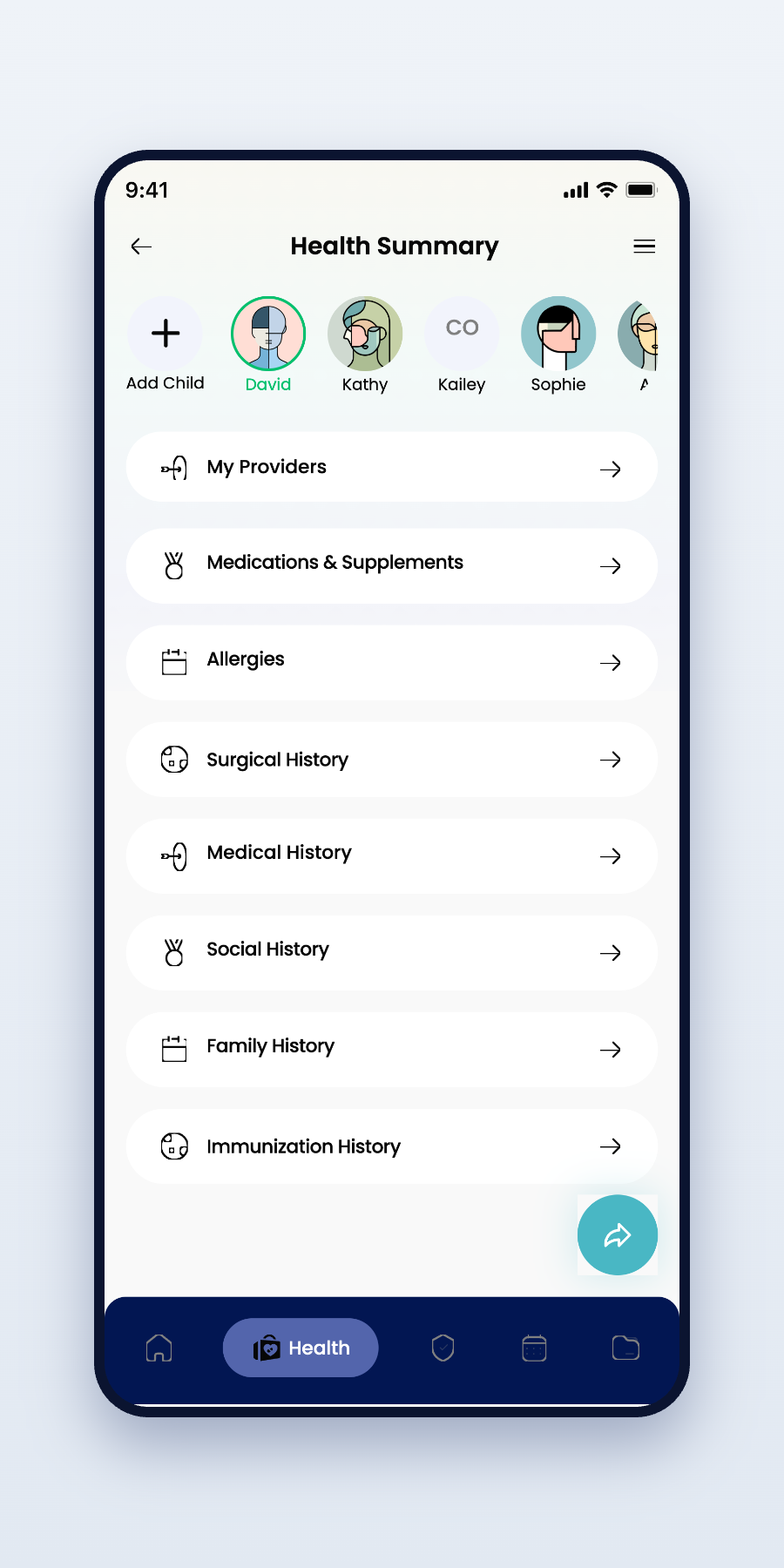
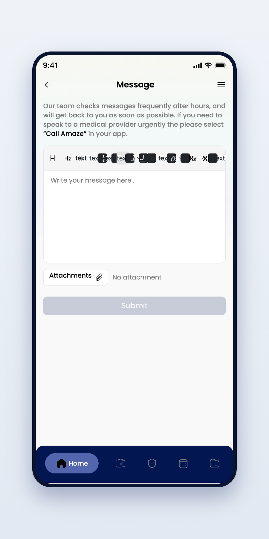
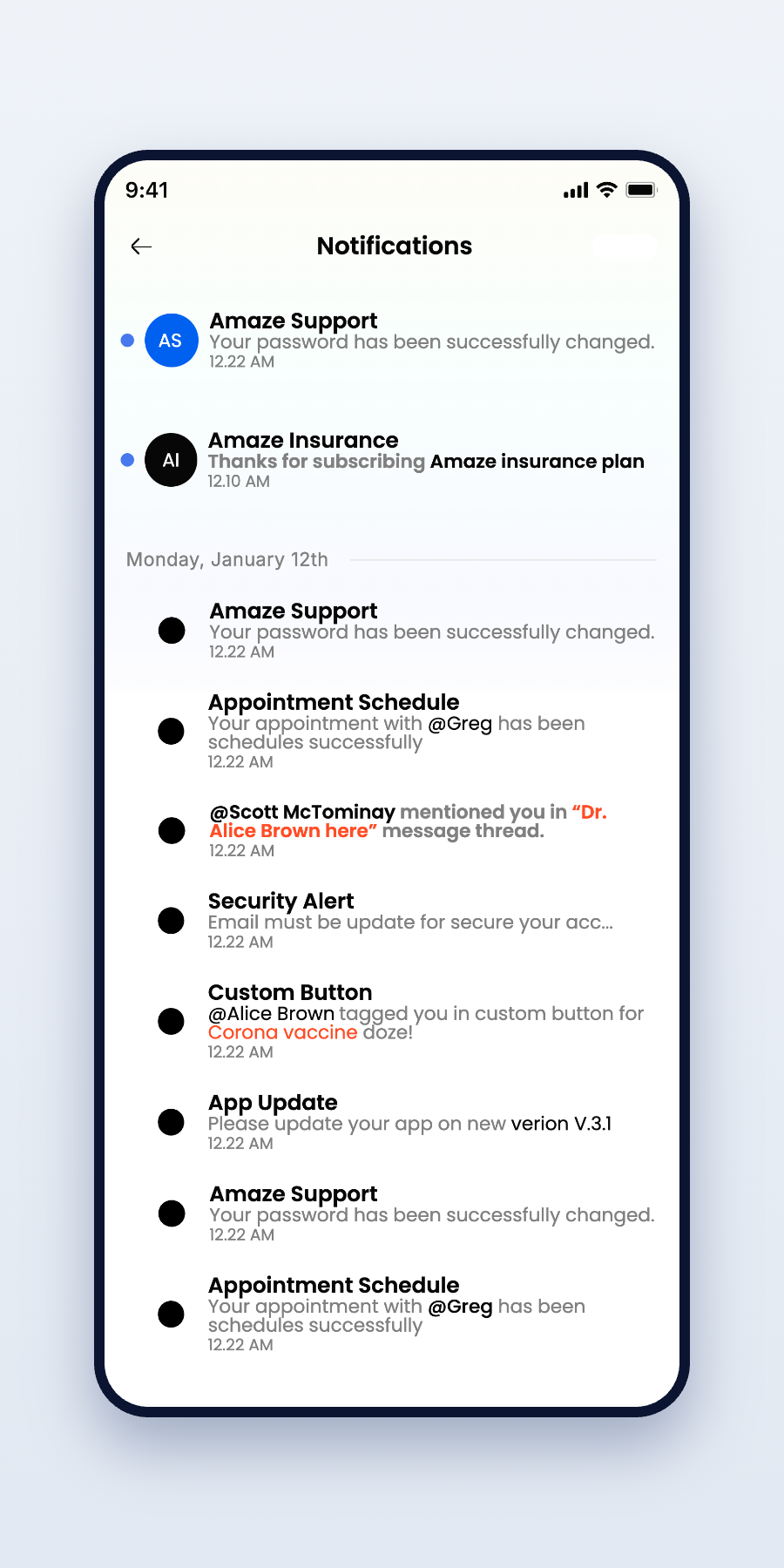
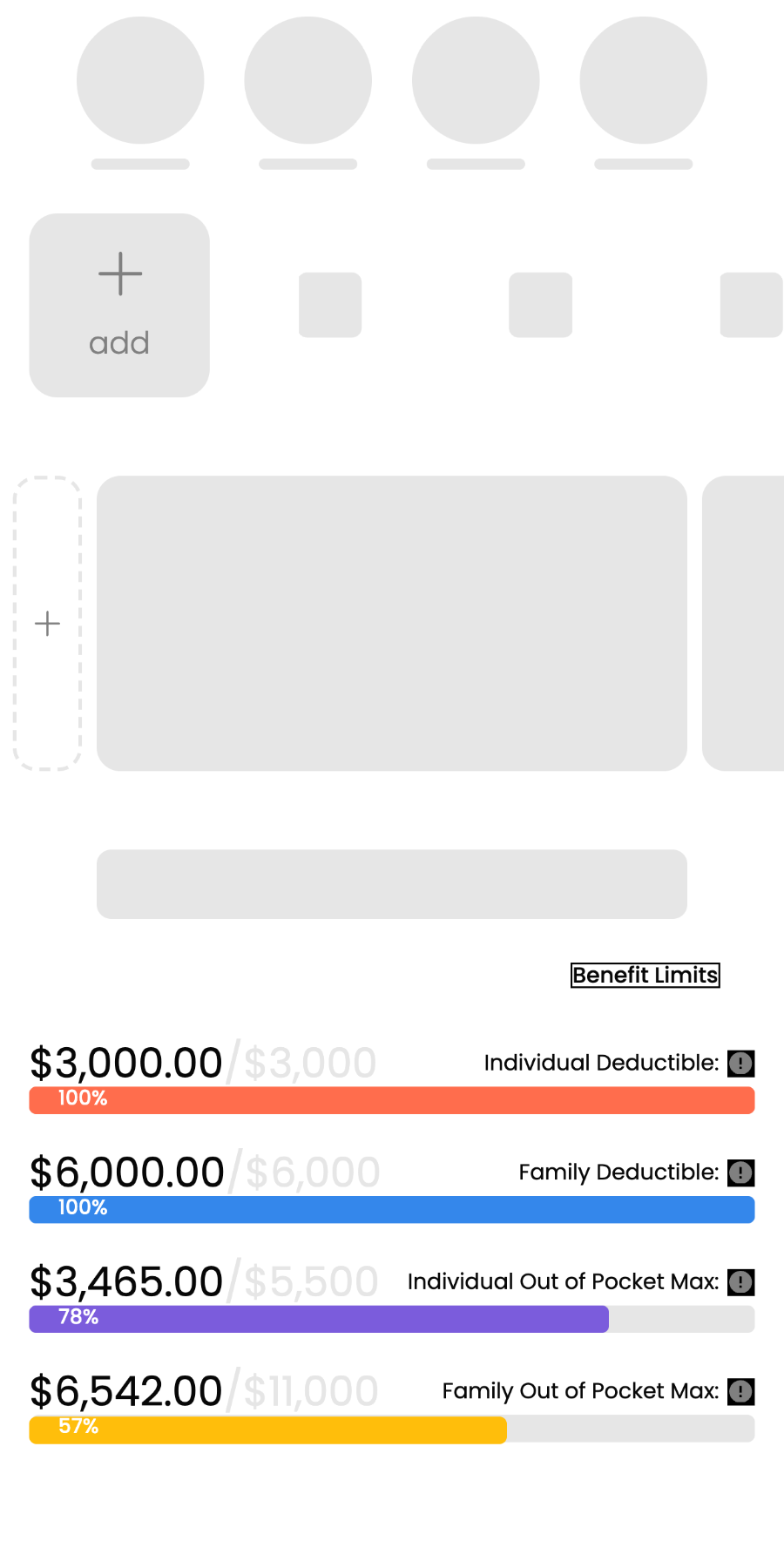
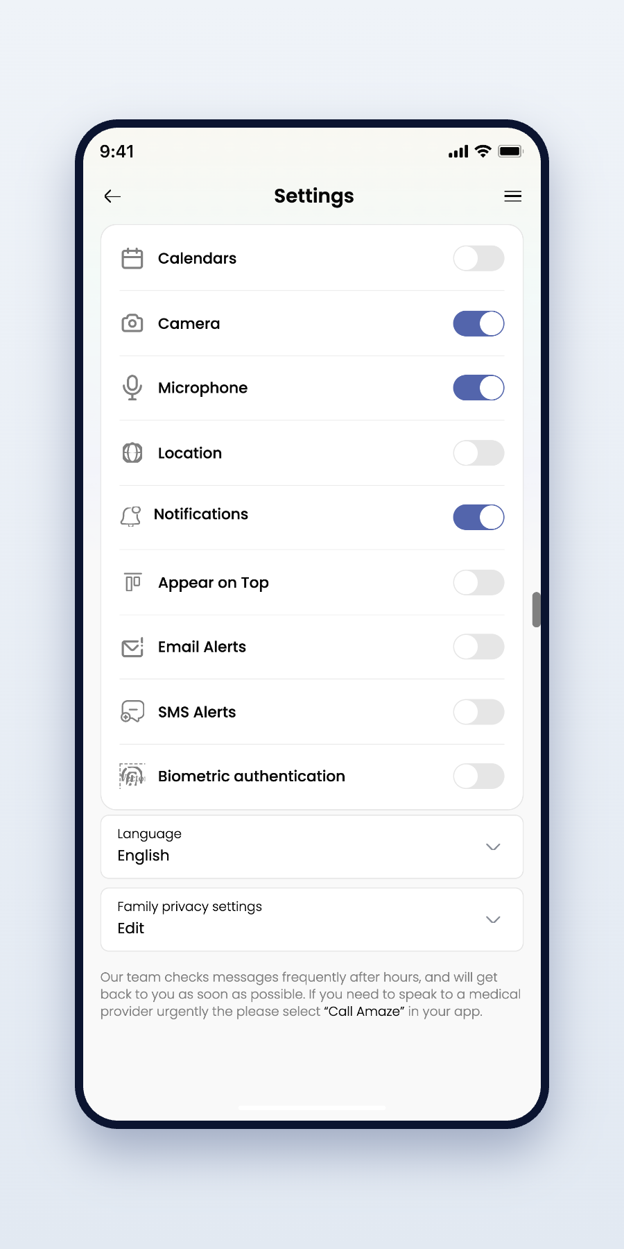
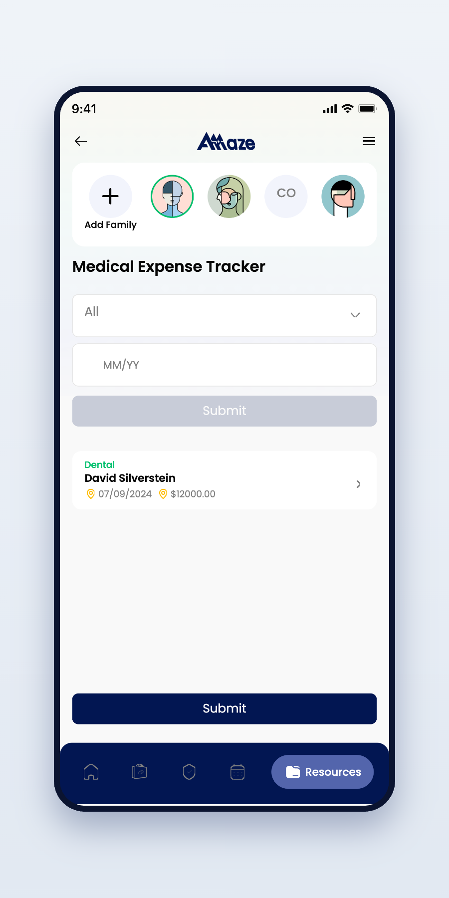
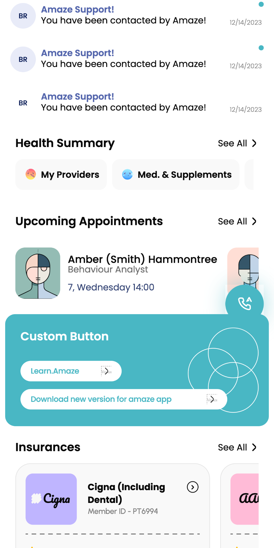

Healthcare isn't about adding features — it's about reducing uncertainty. Every screen was designed to help patients access care with confidence, clarity, and as little friction as possible.
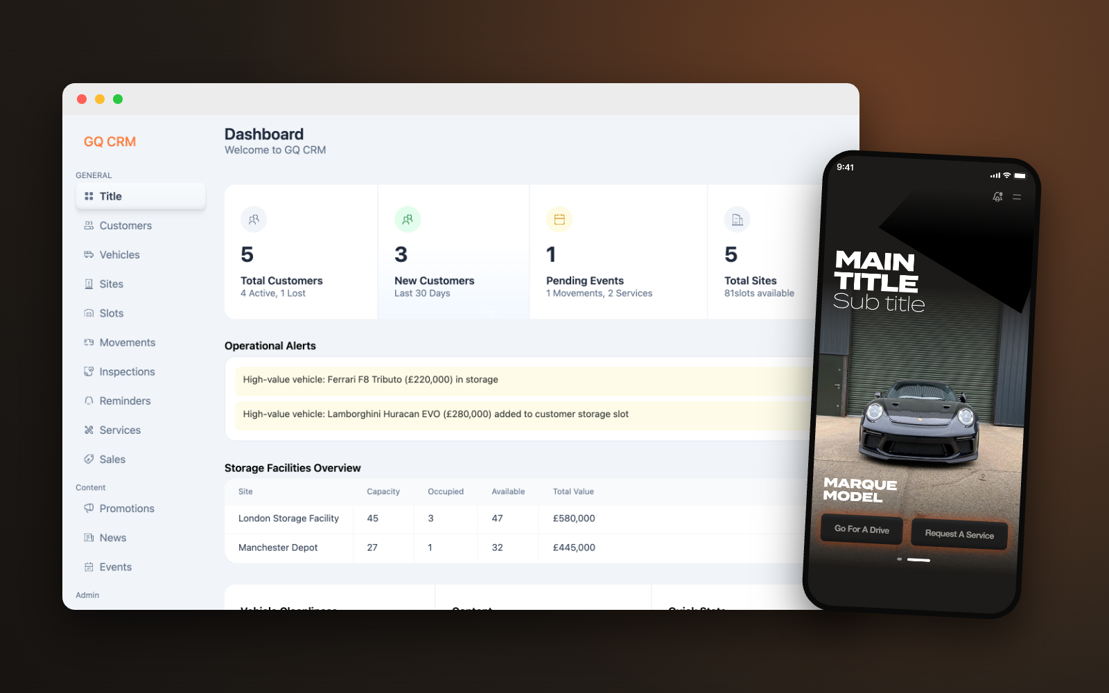
Transforming luxury vehicle operations into one connected platform.
A centralized CRM designed to replace manual workflows with a streamlined system for managing customers, vehicles, services, and daily operations.
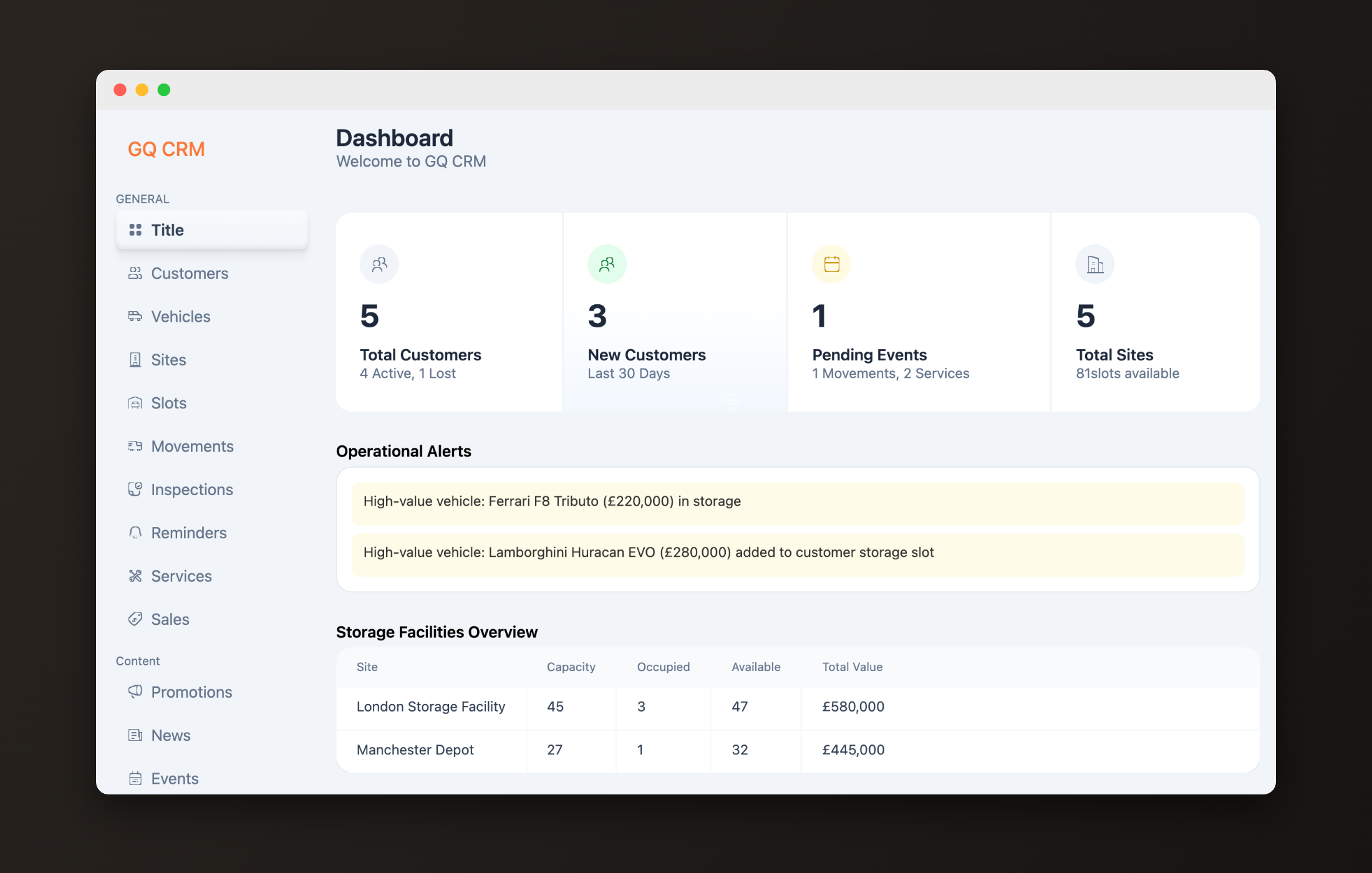
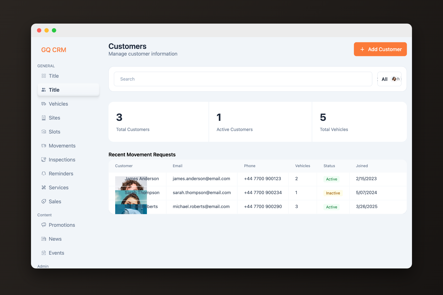
Garage Queens provides secure storage, detailing, transport, inspections, and concierge care for collector vehicles across the UK. Before this platform, operations ran on spreadsheets, WhatsApp threads, and memory. The brief: one connected system for staff, customers, and daily operations.
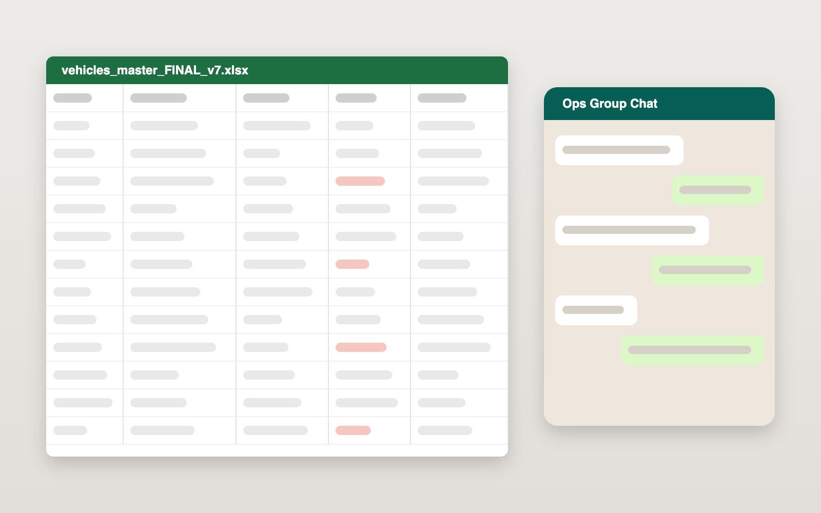
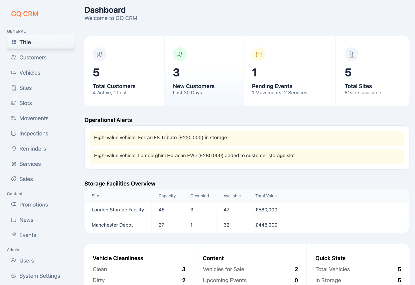
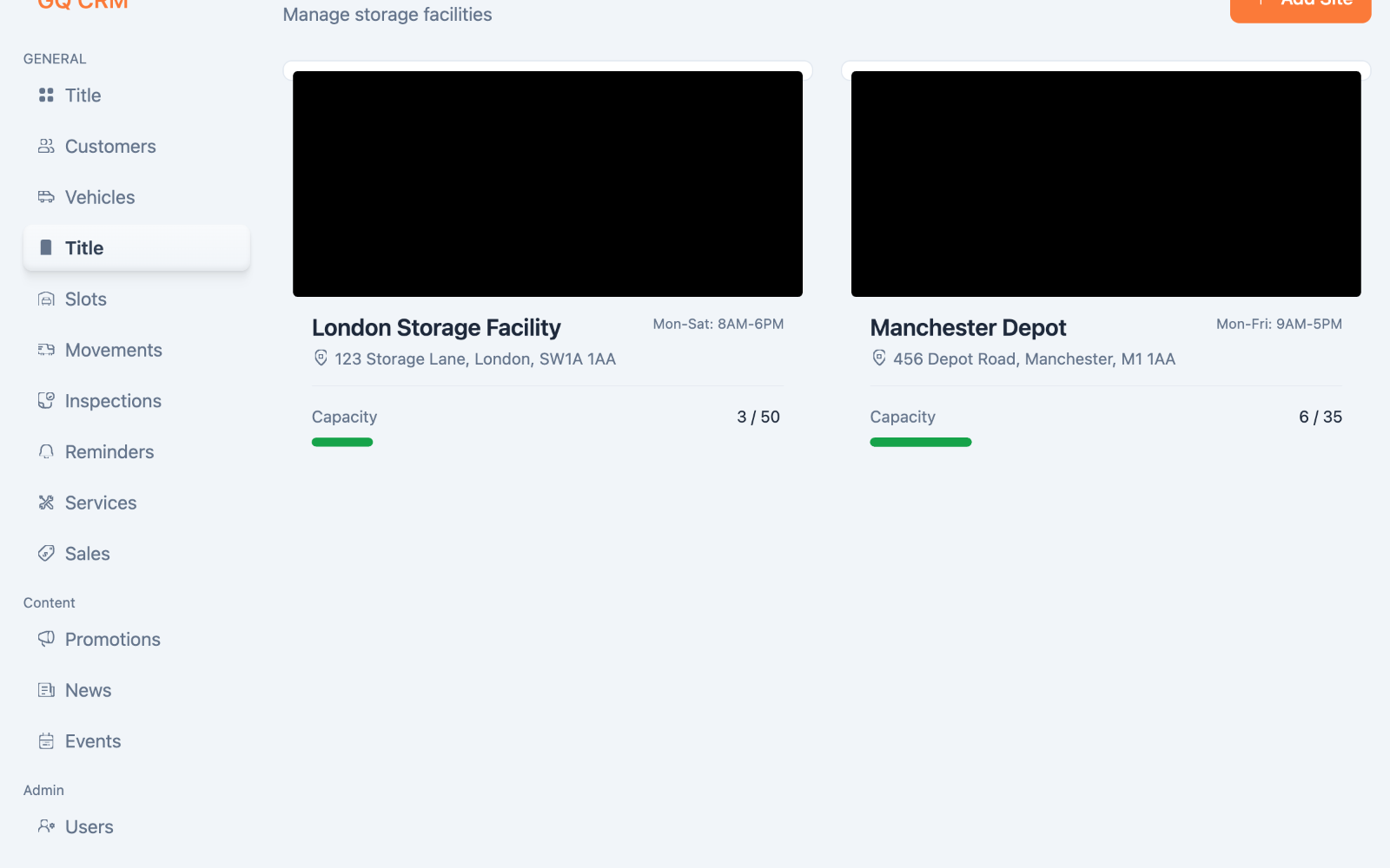
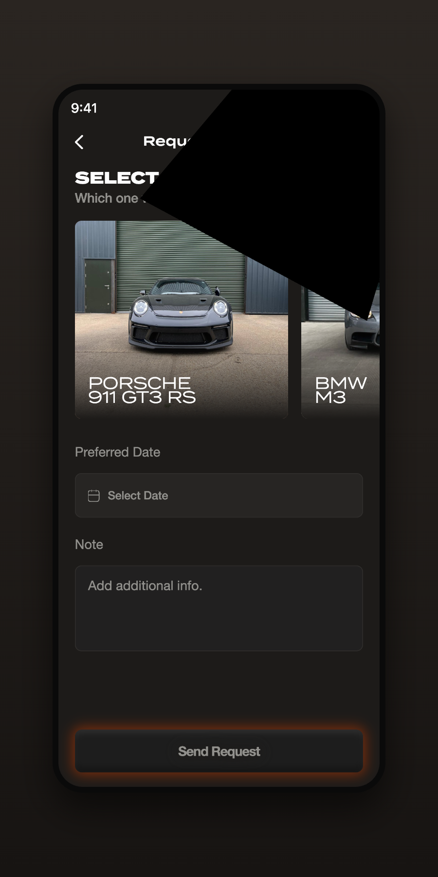
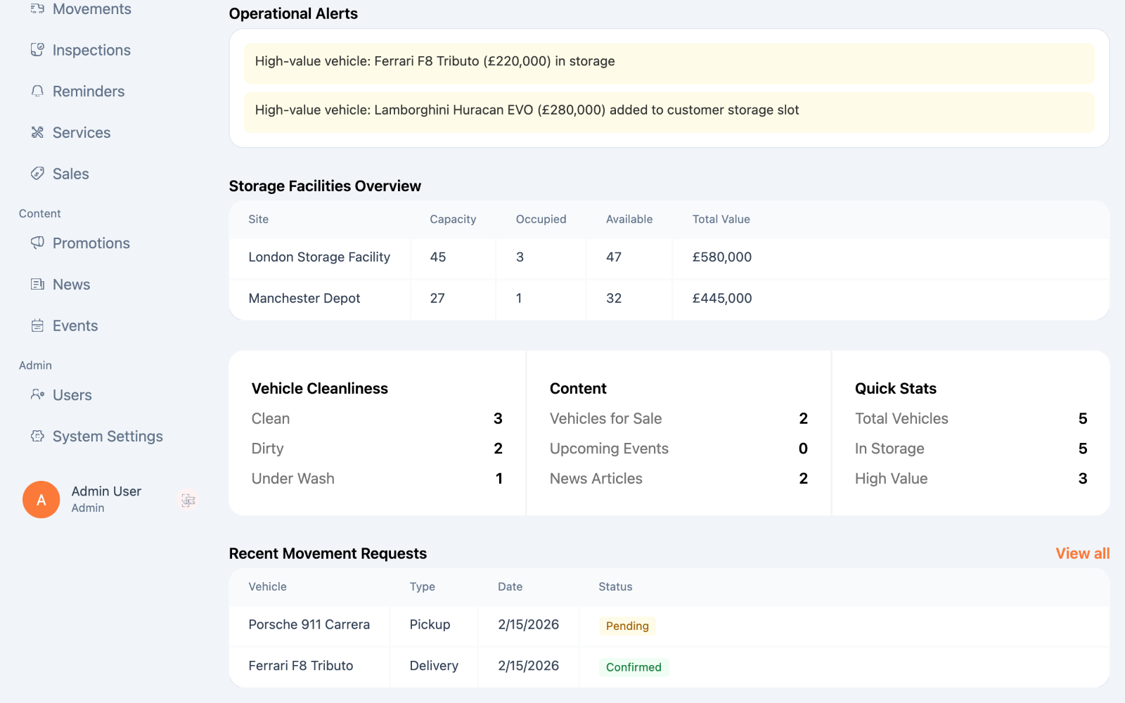
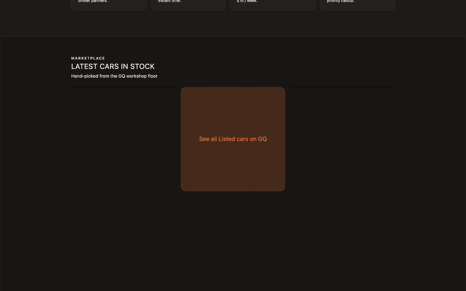
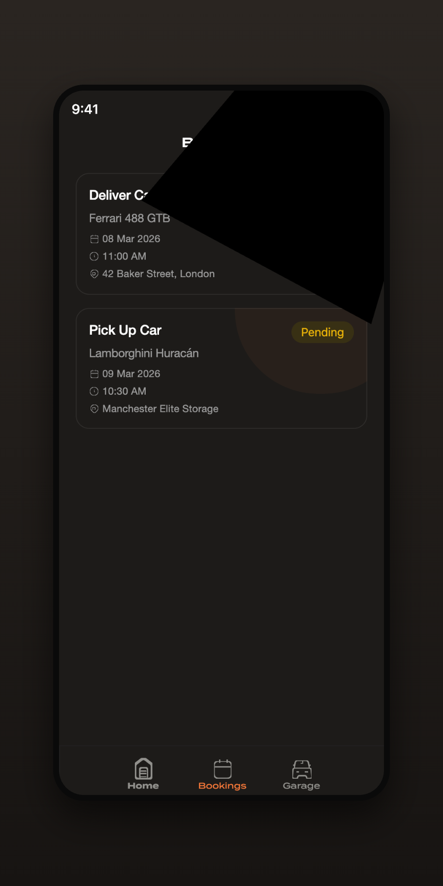
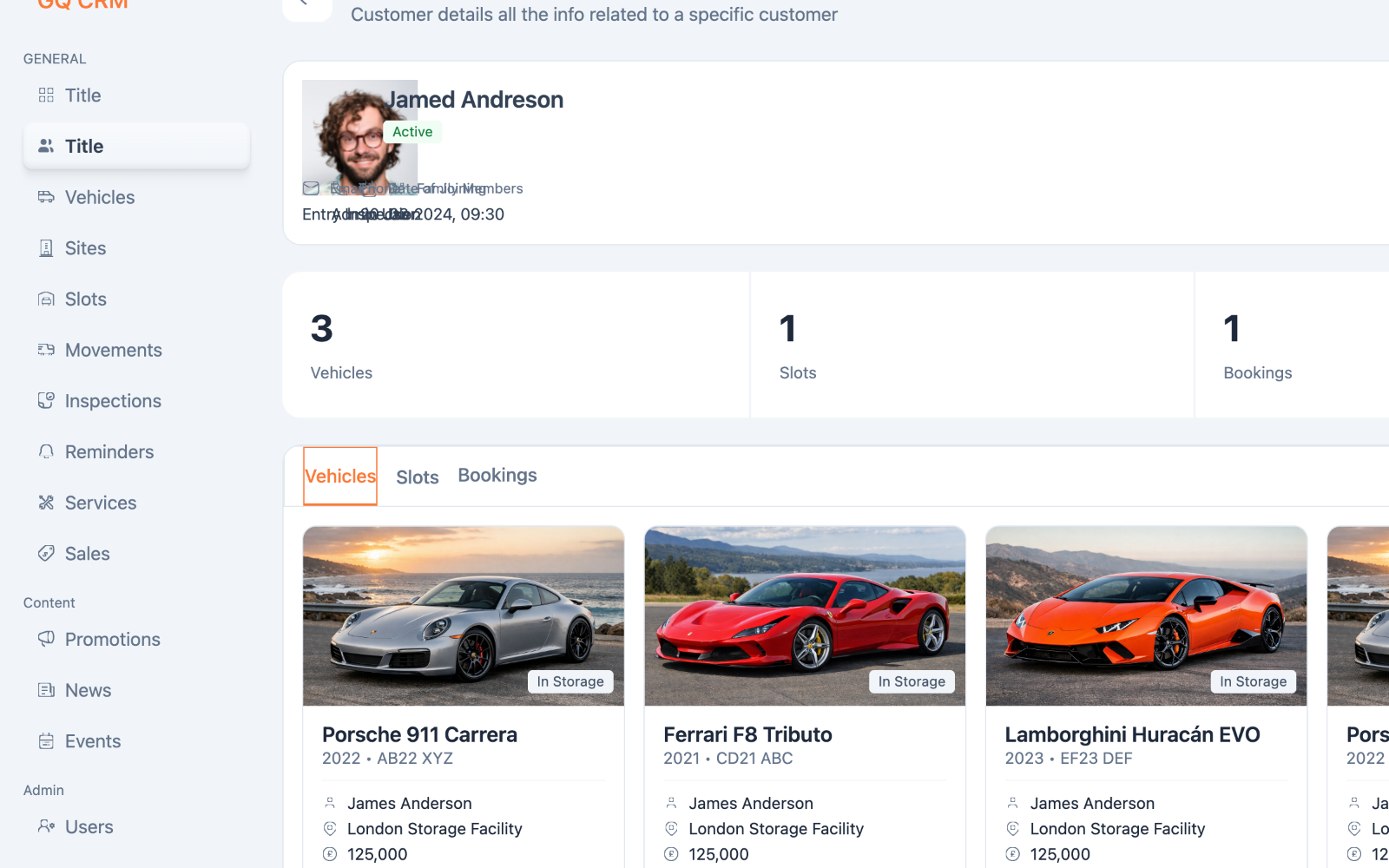
Three connected products — one operational center.
The operational hub used by staff to manage vehicles, customers, bookings, storage, services, and business workflows.
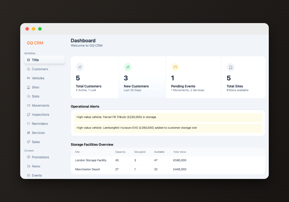
Bookings, vehicles, and requests — from anywhere.
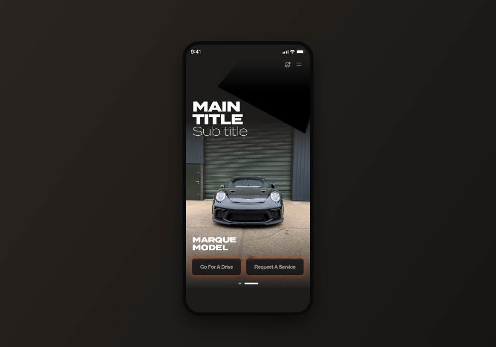
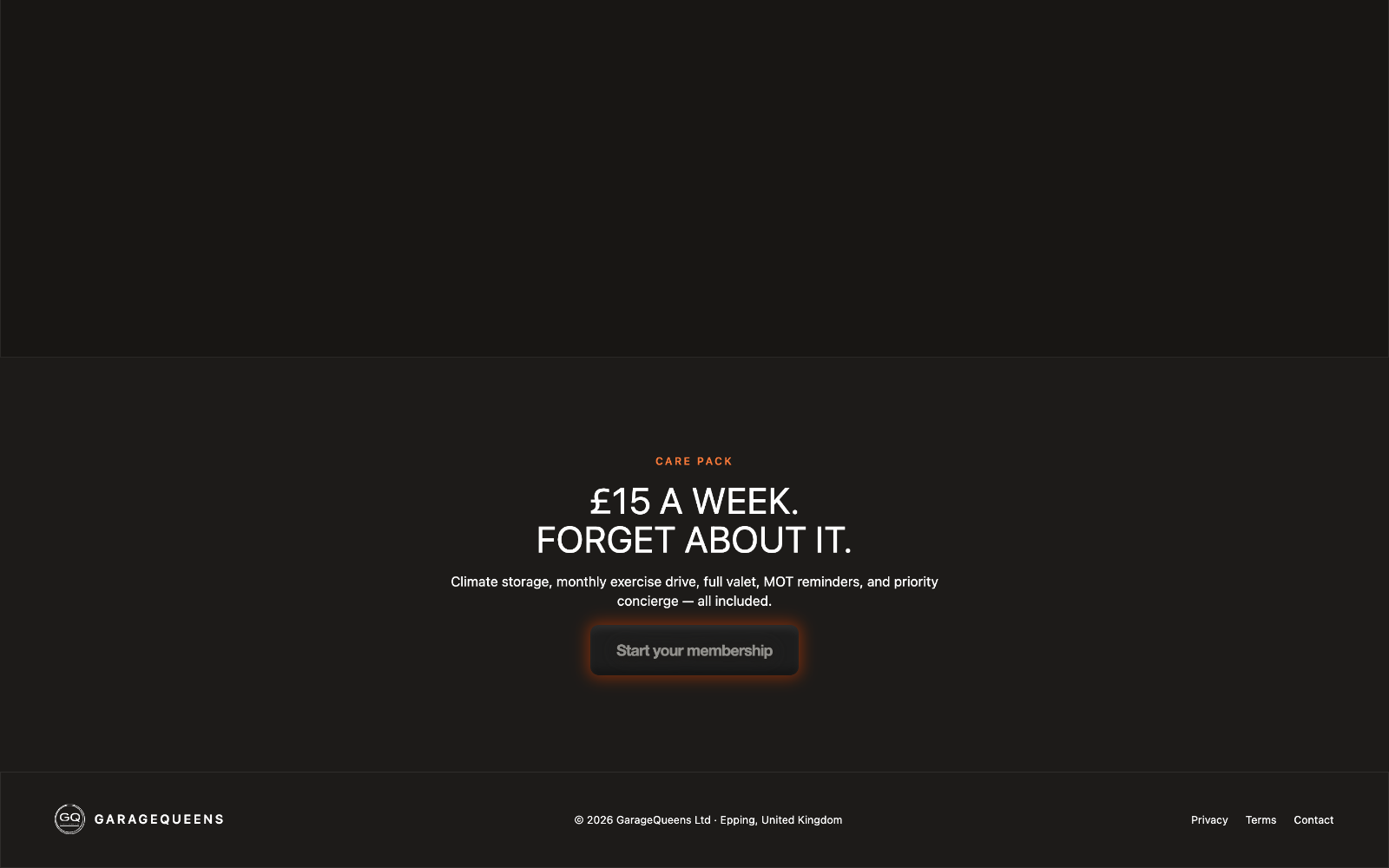
Essential account and vehicle management, on the web.
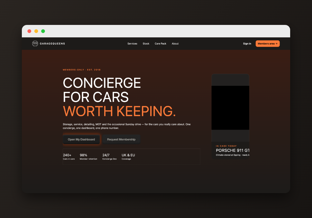
Organized around how the business actually runs — not around pages.
Every customer, their vehicles, memberships, and history — one profile, always current.
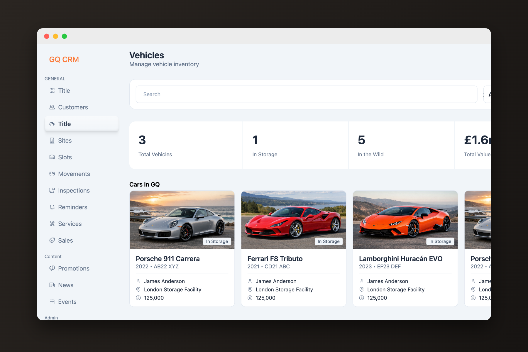
Each vehicle carries its own record: specs, condition, documents, and everything that has happened to it.
Storage, services, and transport requests scheduled and tracked from a single calendar of work.
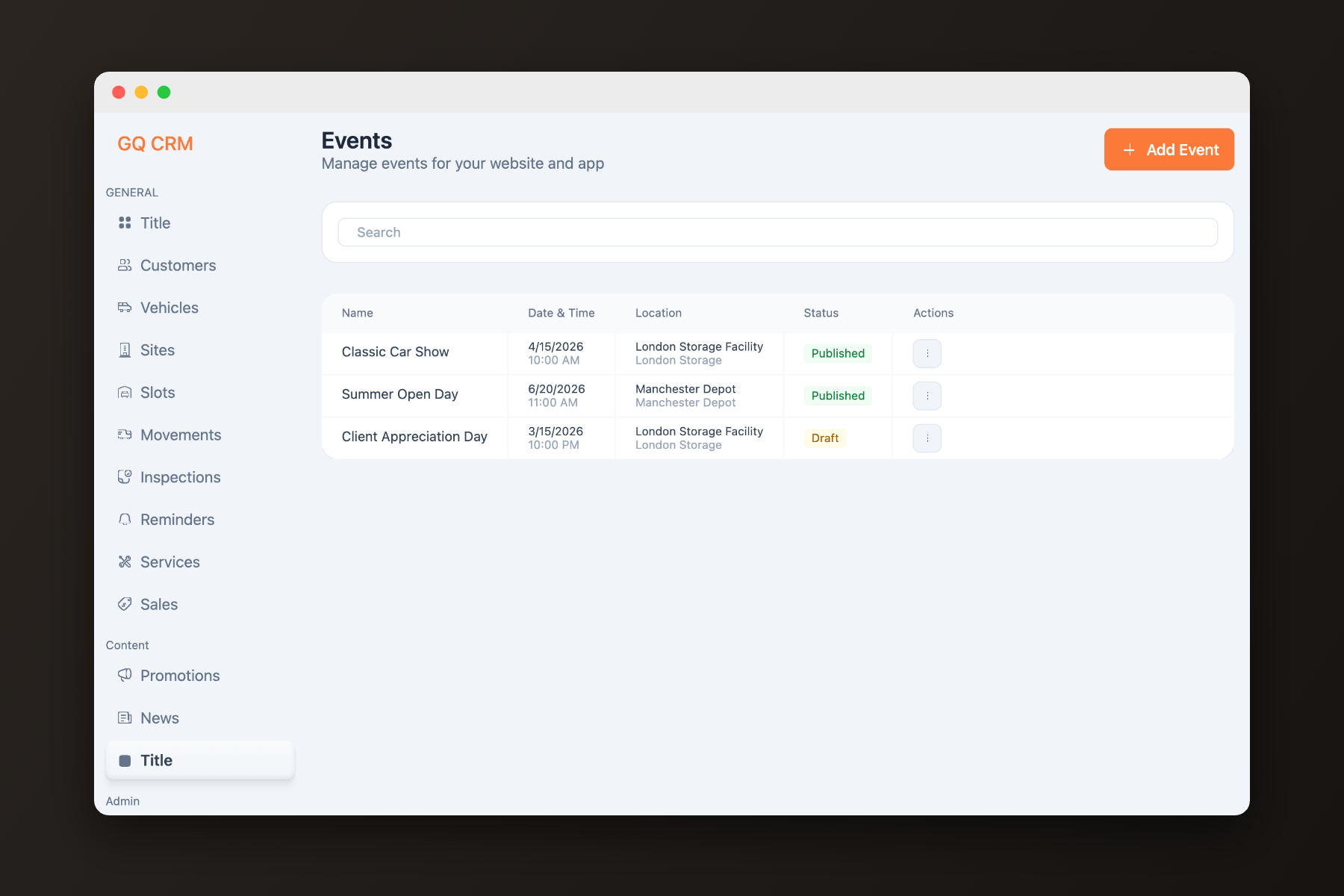
Arrivals, transfers, and collections logged as they happen — location is never a question.
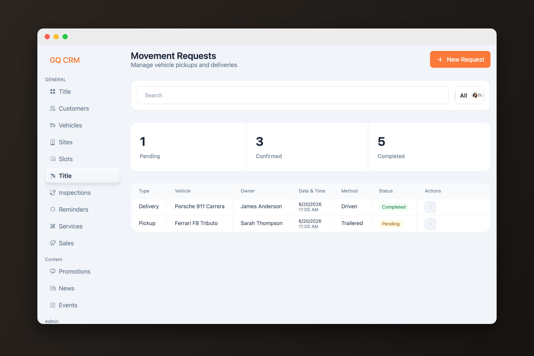
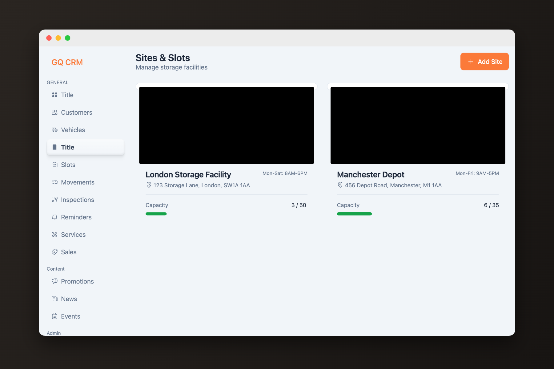
Live occupancy across sites, down to the individual bay.
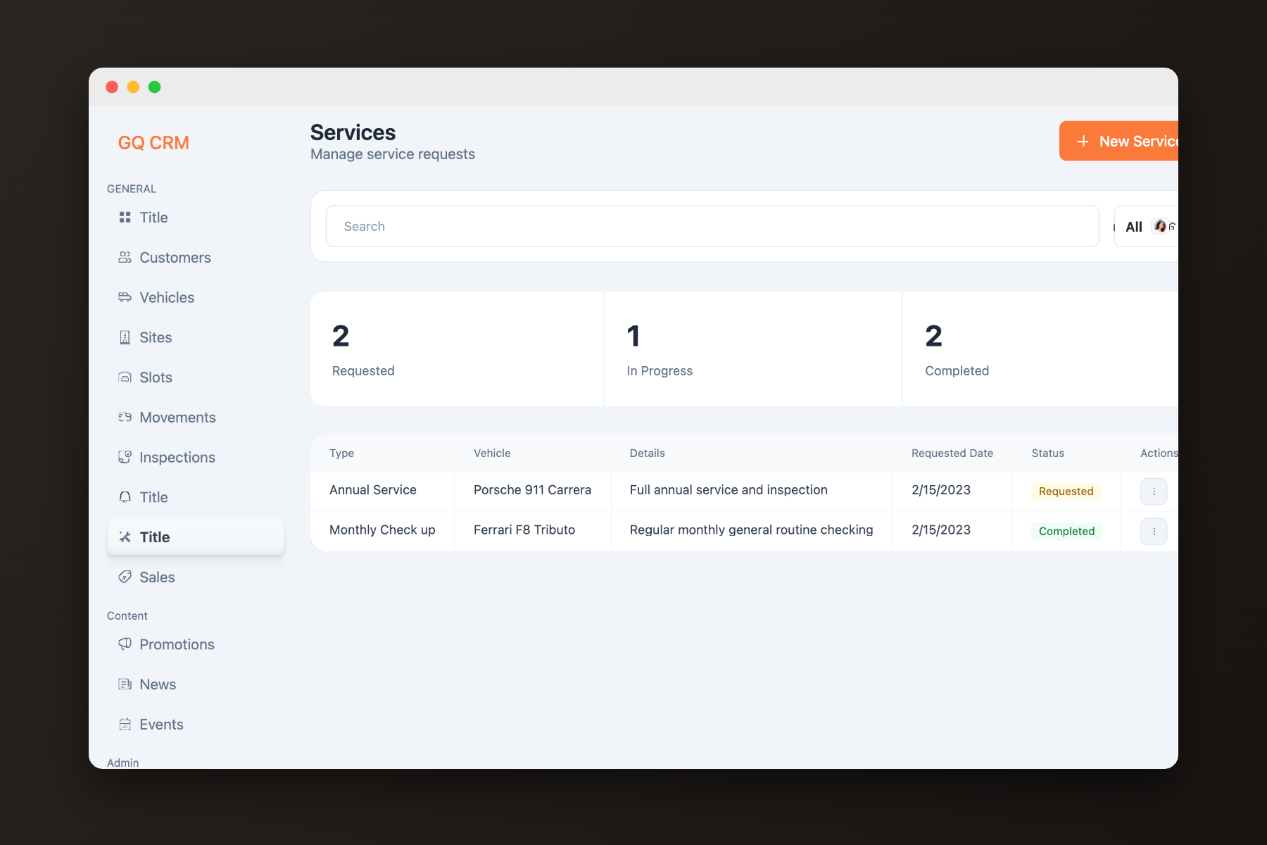
Detailing, maintenance, and inspections managed from request to completion.
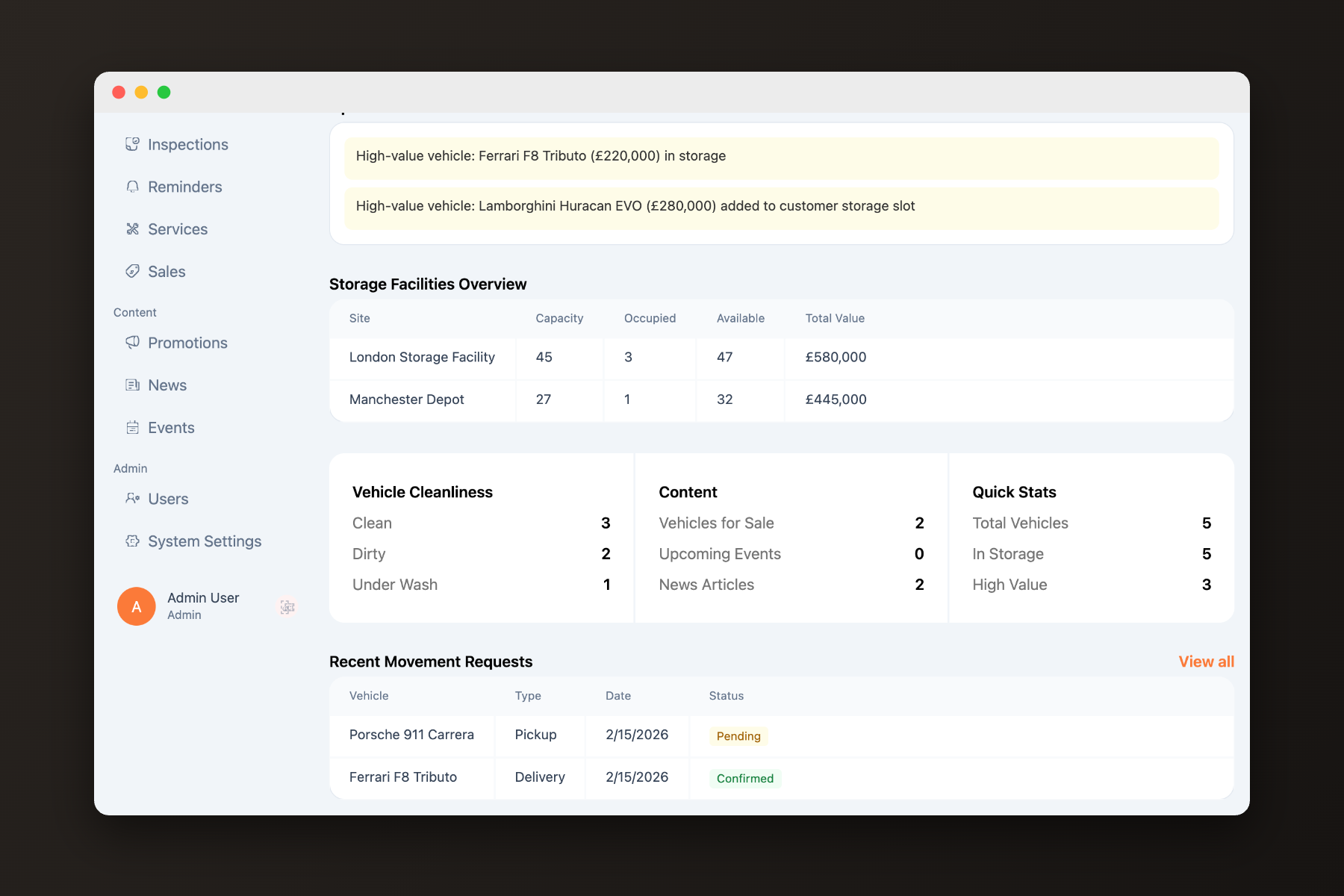
Operational activity summarized for the owners — without exporting a thing.
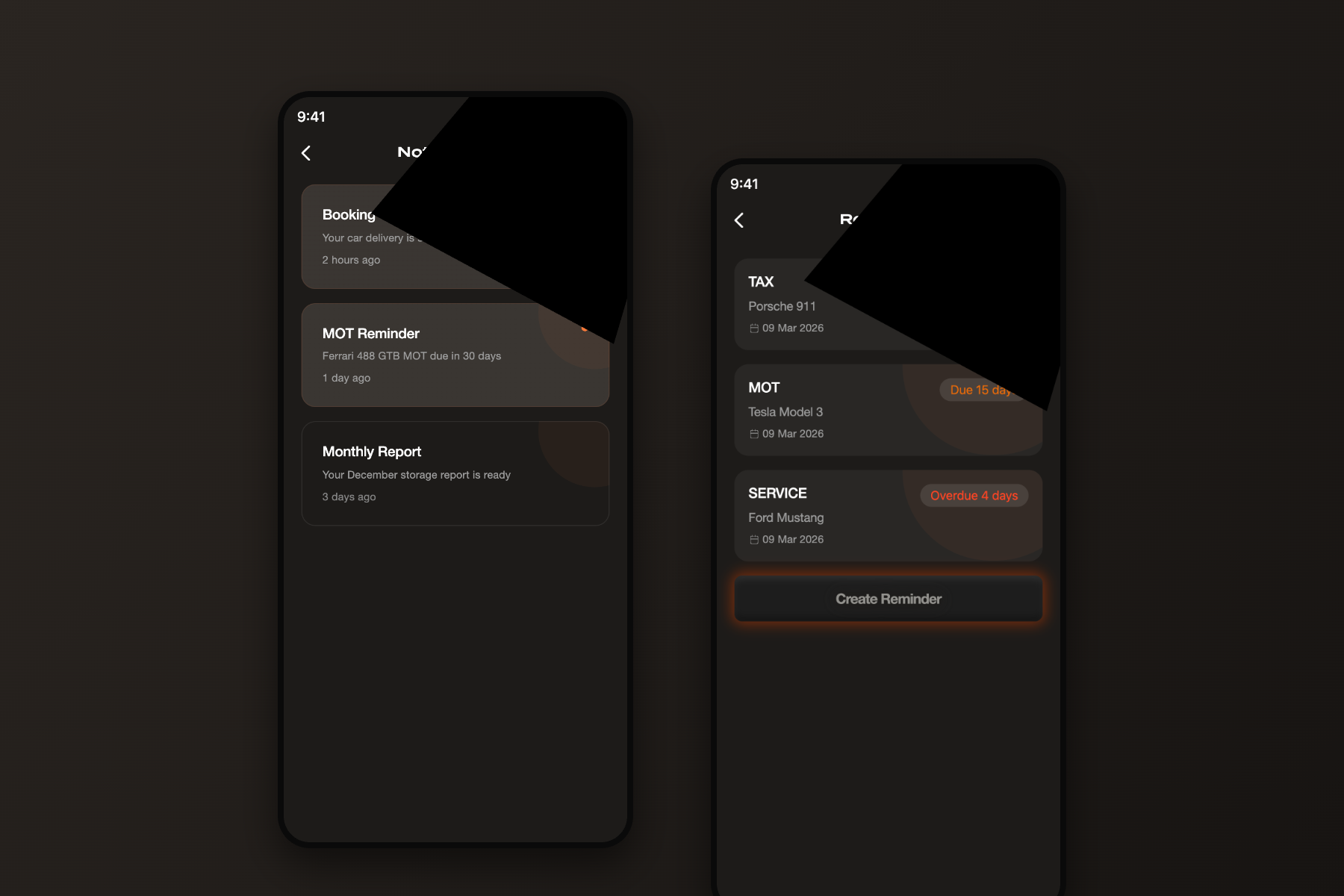
The right people informed at the right moment — automatically.
Internal tools are judged differently. Staff live in this system all day — so the goal was never to impress. It was to reduce repetitive work, surface information quickly, and support fast decisions: dense where density helps, quiet everywhere else, workflows that follow how the team already works.
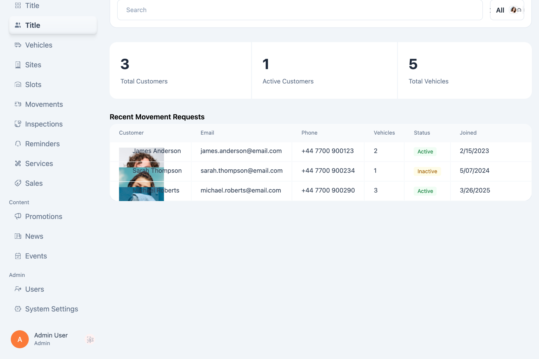
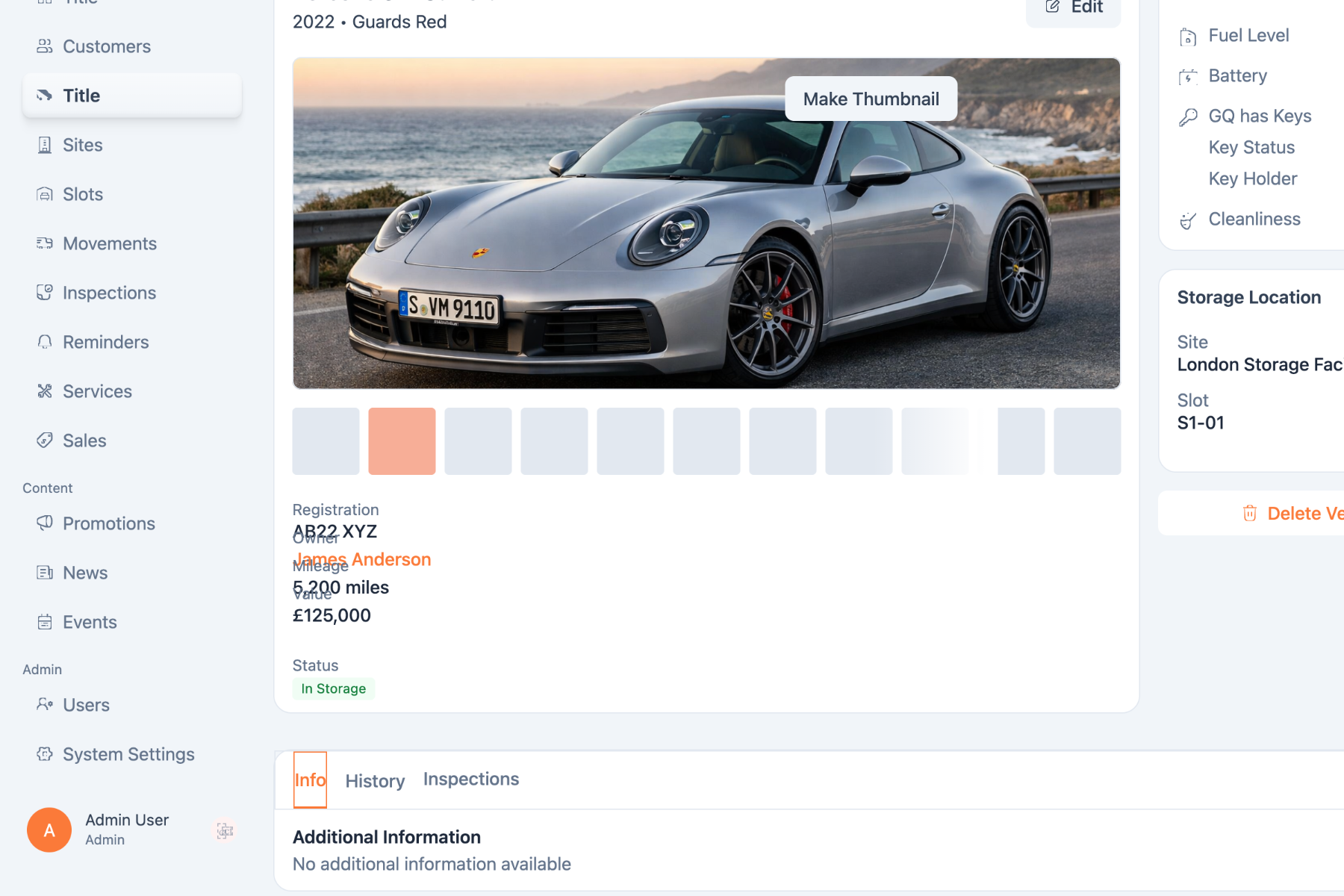
One journey, end to end.
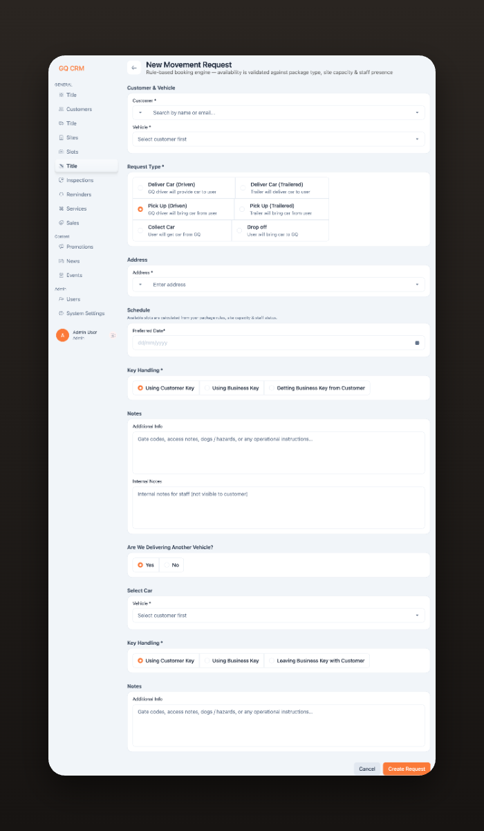
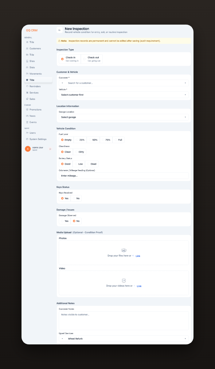
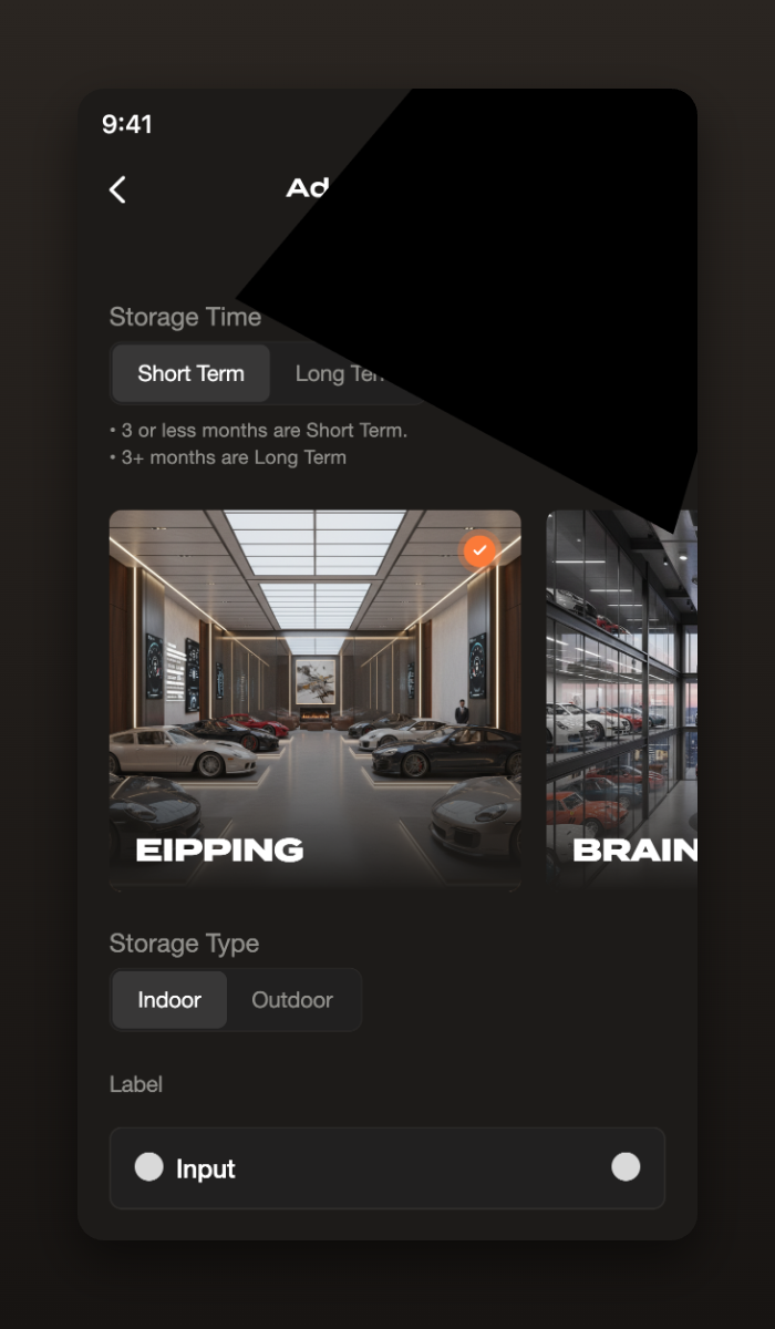
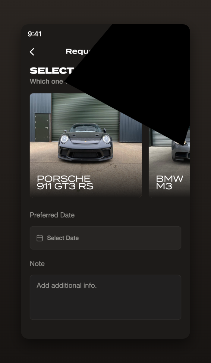
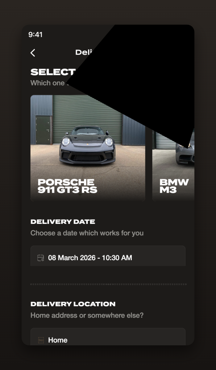
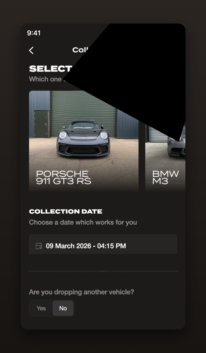
The quality lives in the details.
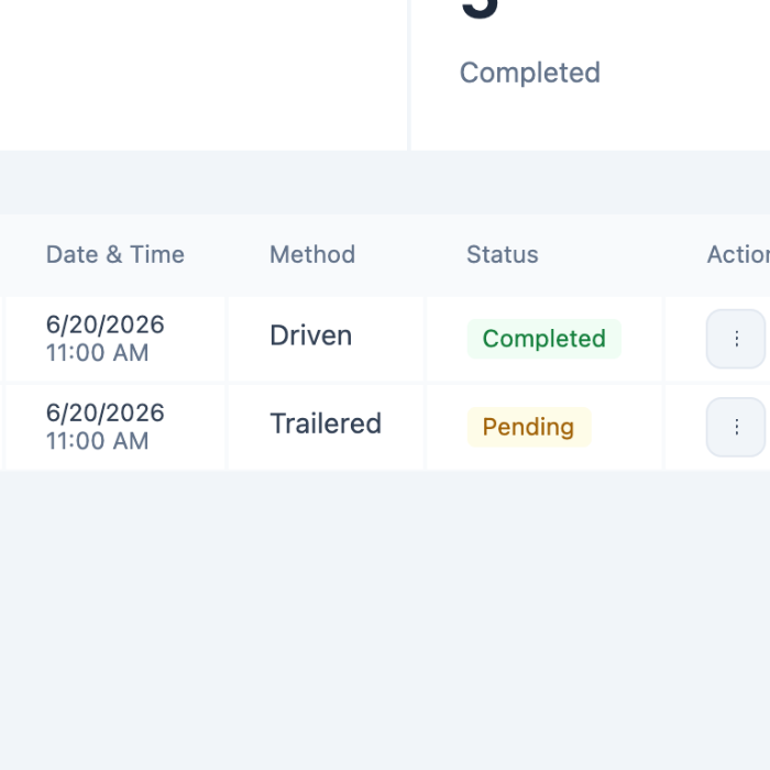
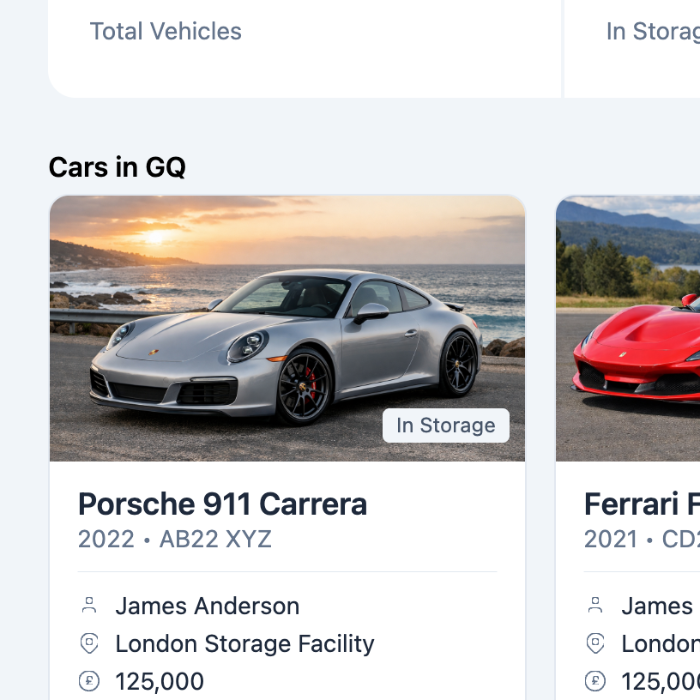
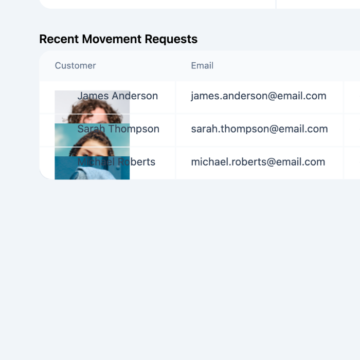
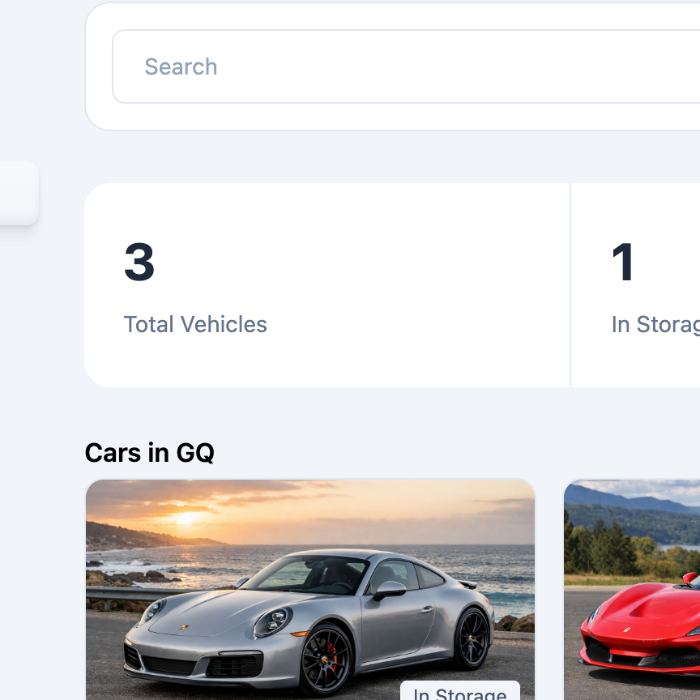
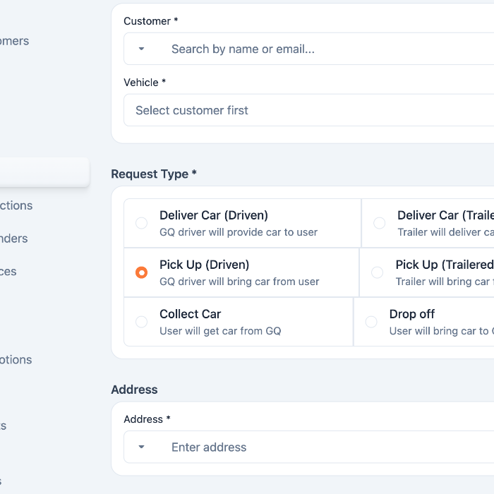
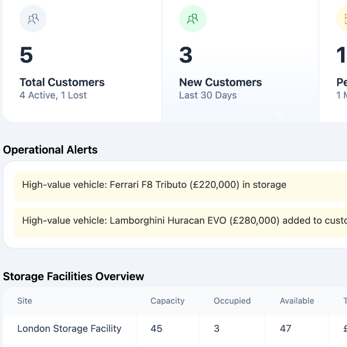
Good operations software disappears into the workday.
The decisions that mattered most were invisible ones — keeping critical information on screen, reducing context switching, and simplifying the workflows staff repeat dozens of times a day. Nothing was designed to impress; everything was designed to help someone finish faster.
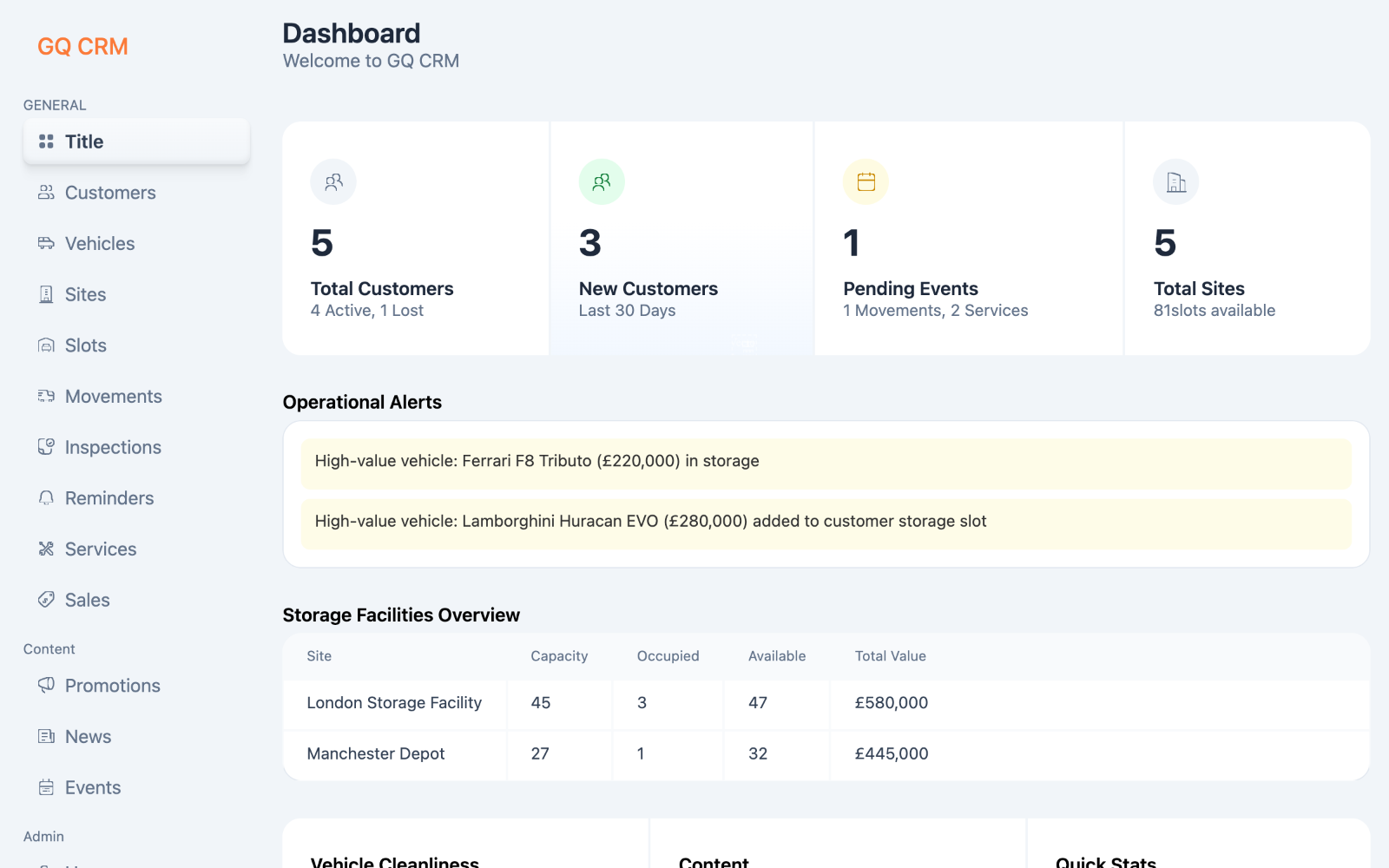
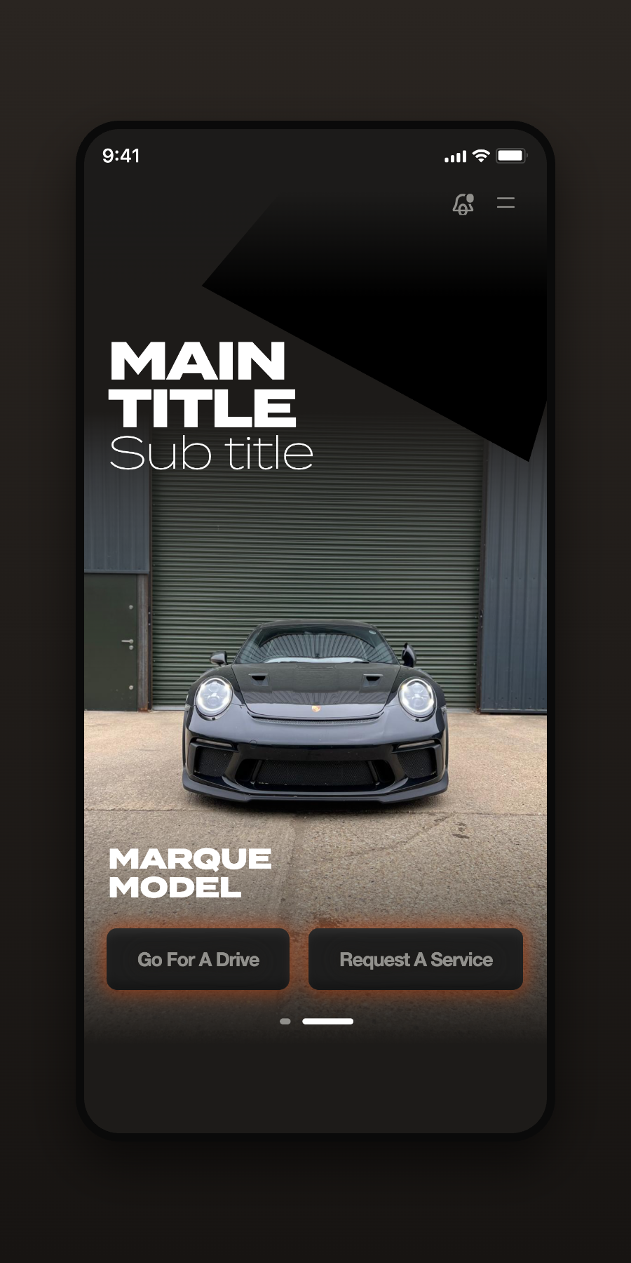
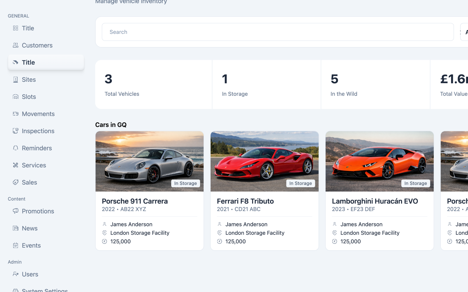
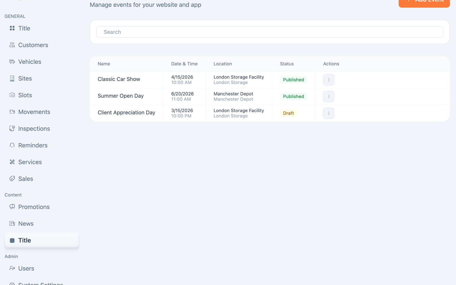
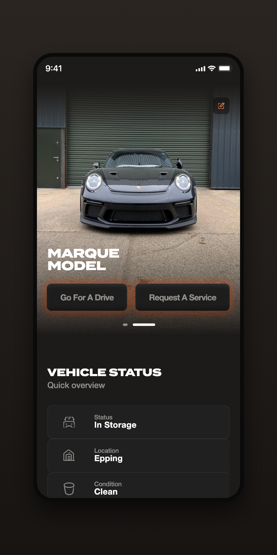
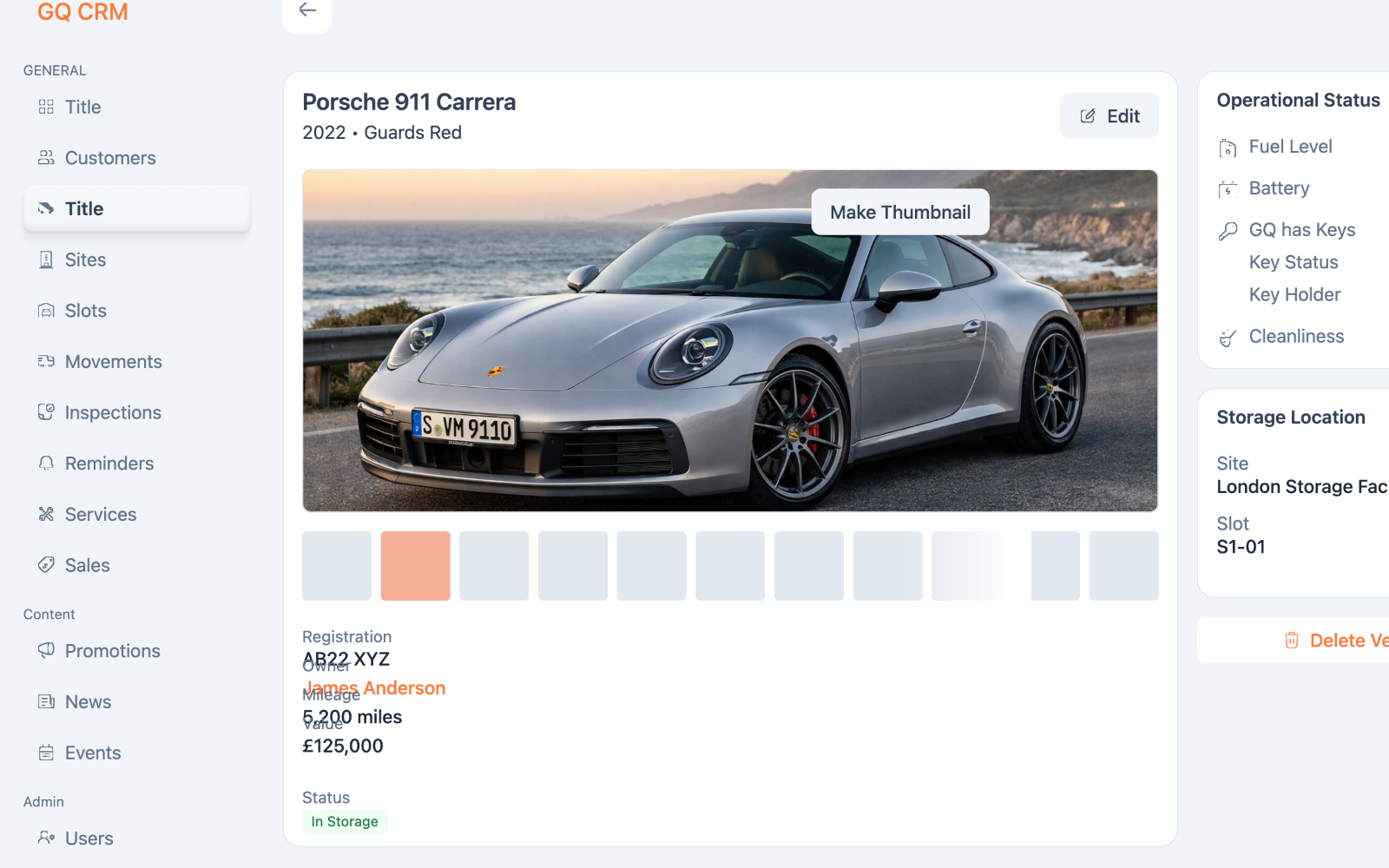
Garage Queens expanded my perspective — from crafting individual interfaces to designing connected operational systems. The focus was always on making everyday work simpler, faster, and more reliable for the people running the business.
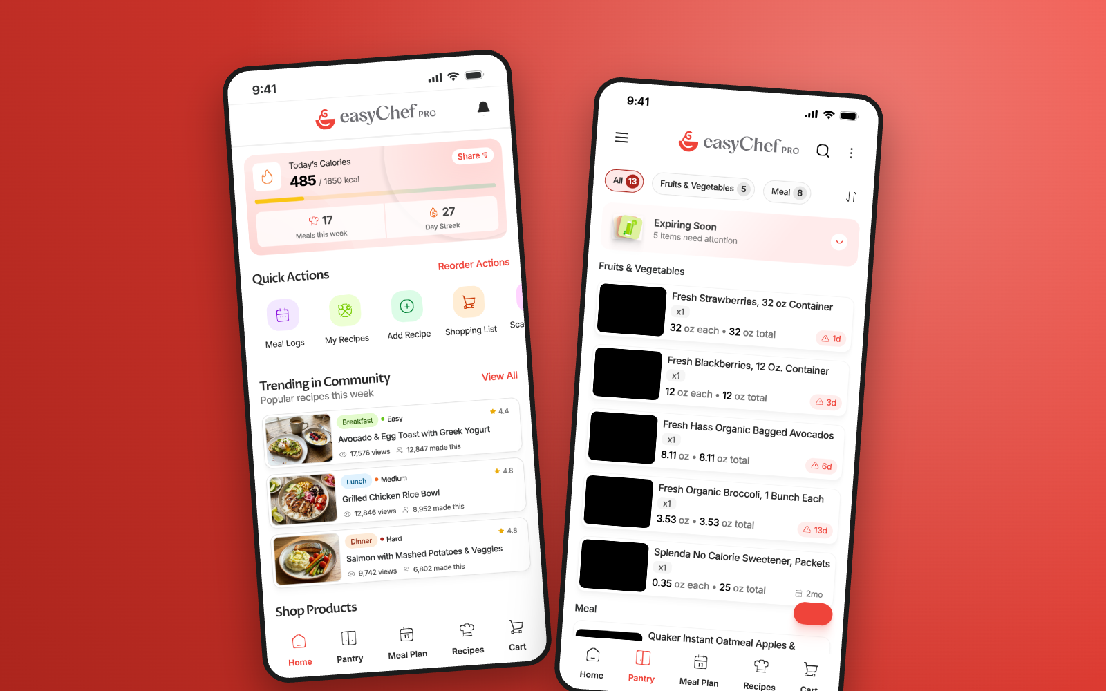
Designing the story behind a smarter kitchen.
A marketing website built to introduce a new Health Operating System — translating a technically complex product into a clear, engaging experience that invites visitors onto the early-access waitlist.
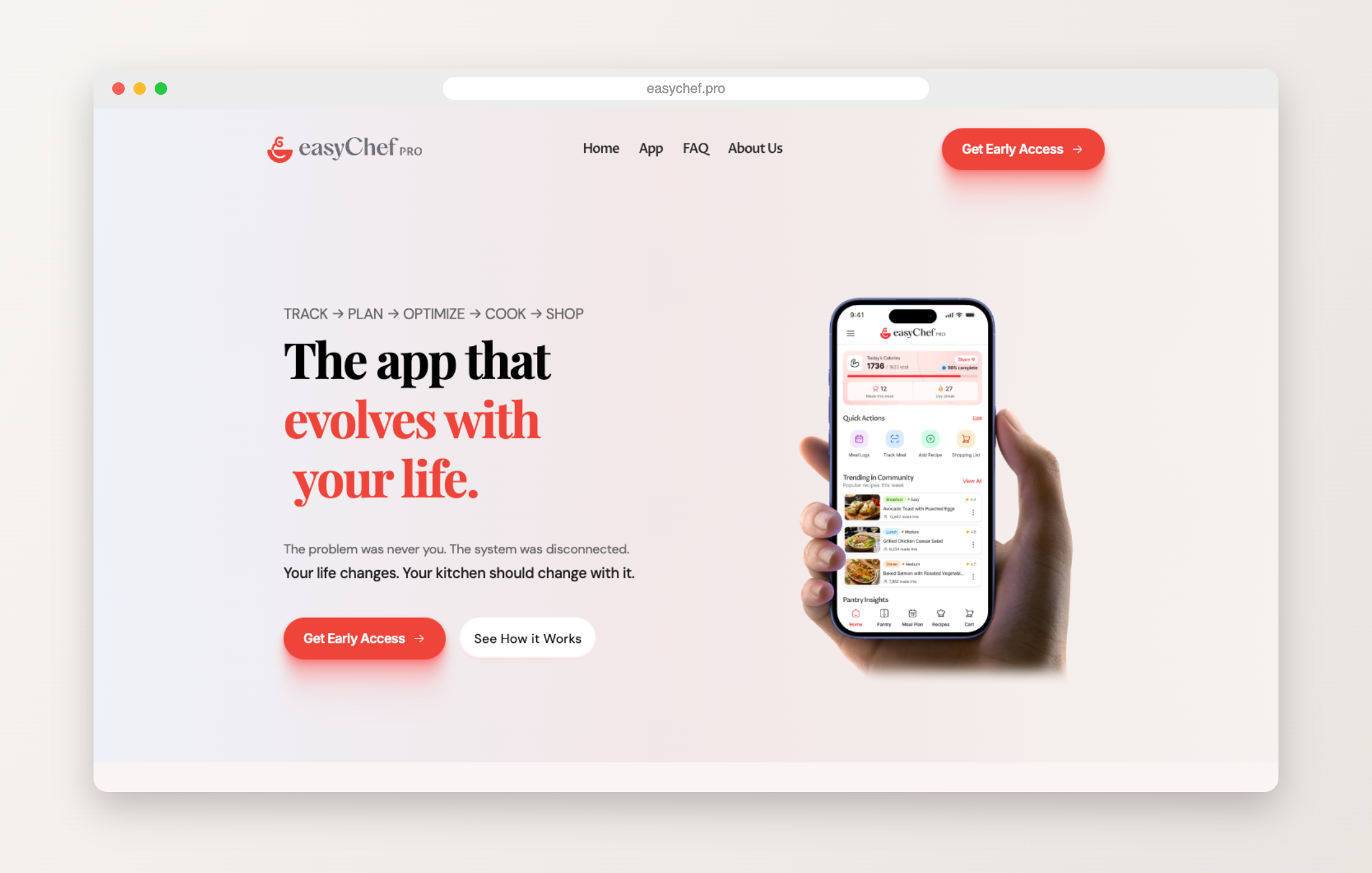
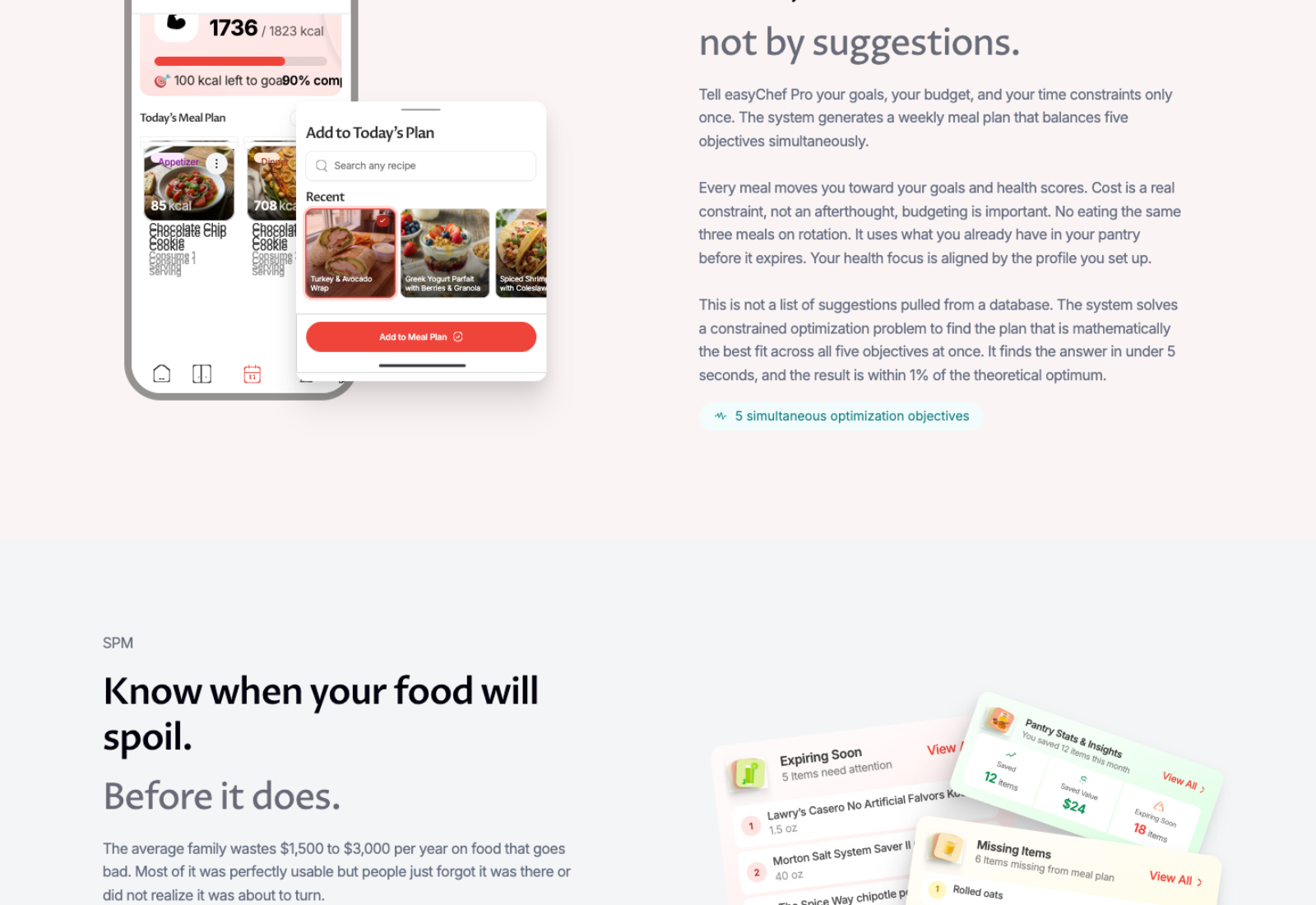
easyChef Pro brings meal planning, pantry management, grocery shopping, health scoring, cooking, and nutrition tracking — tools usually scattered across separate apps — into one connected experience.
Before the website could tell that story, the product had to define it.
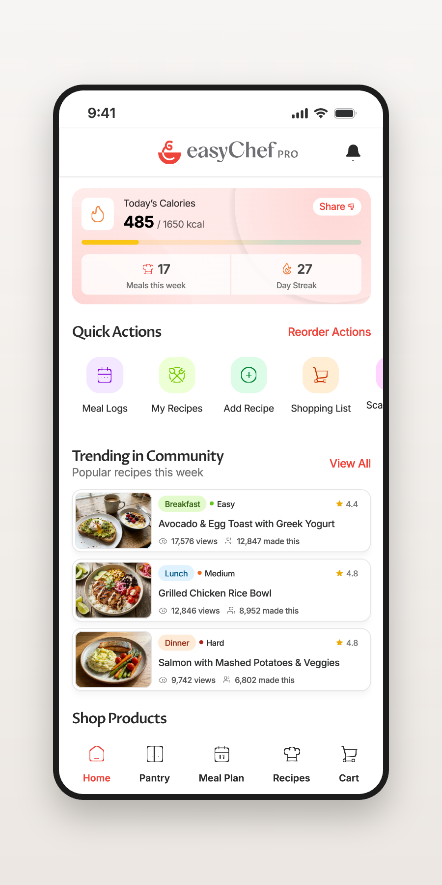
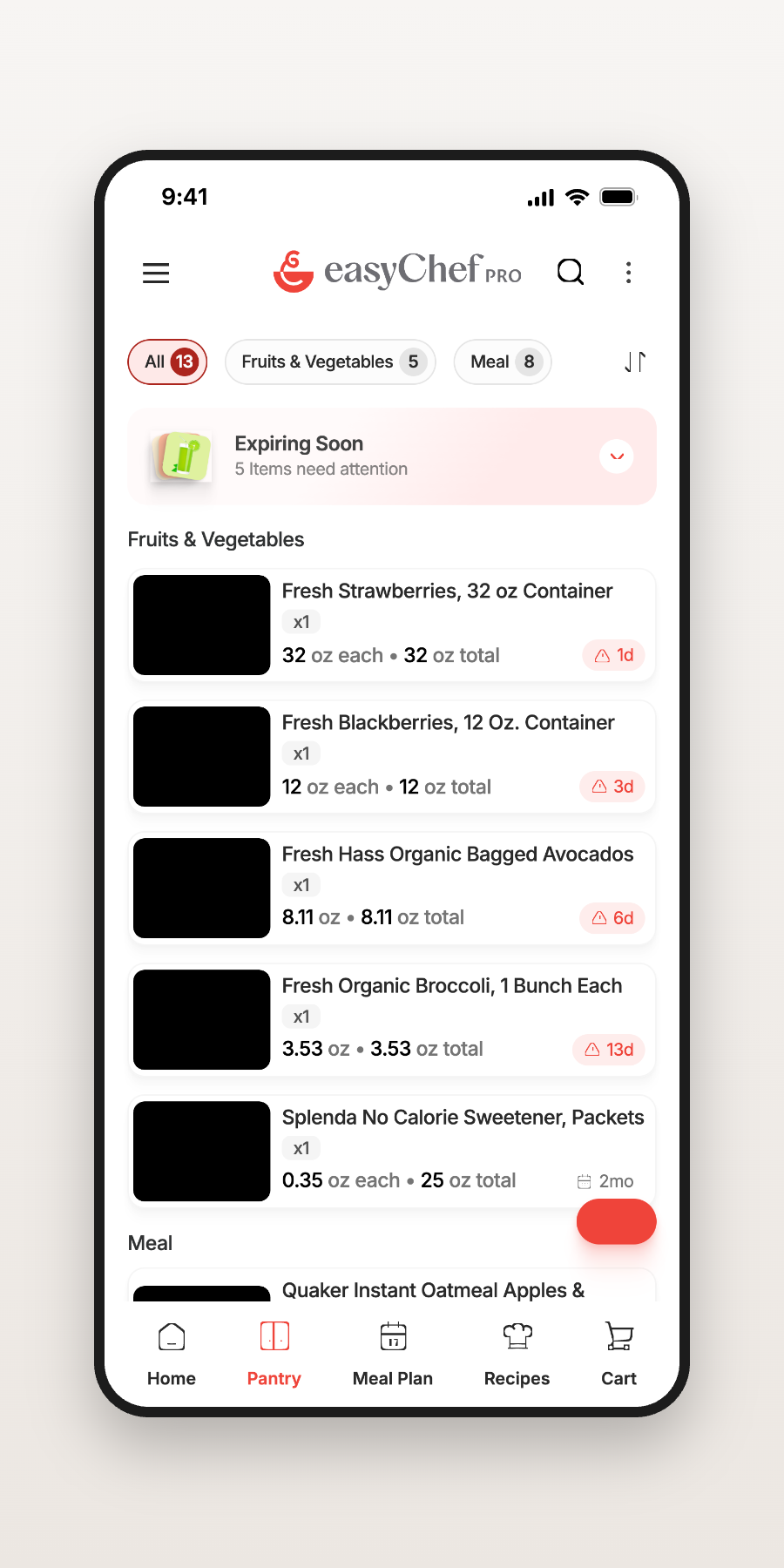
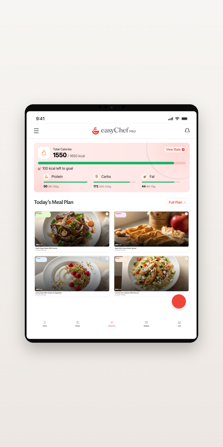
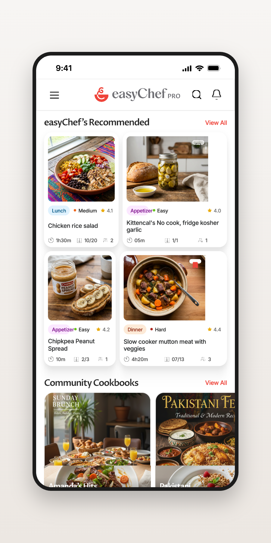
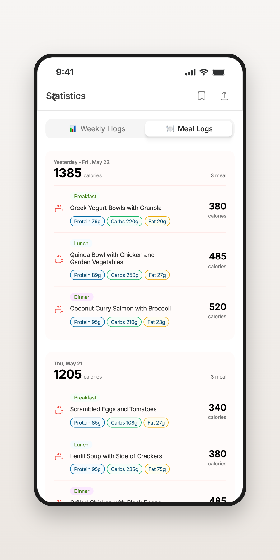
Not a feature list — one continuous journey from profile to plate.
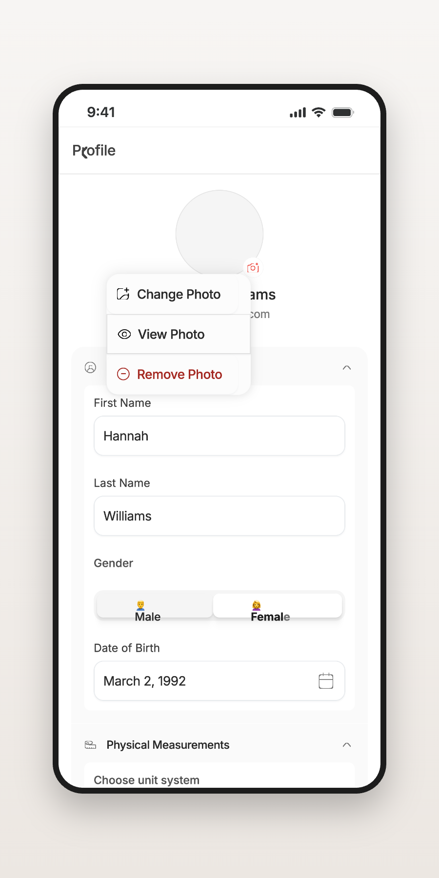
Goals, preferences, and dietary needs shape everything that follows.
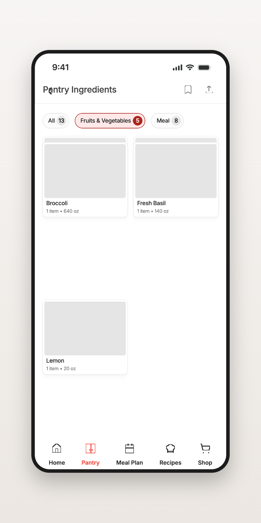
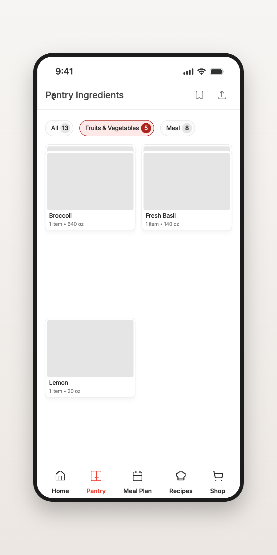
What you already have, tracked intelligently.
Recommendations scored against your health goals.
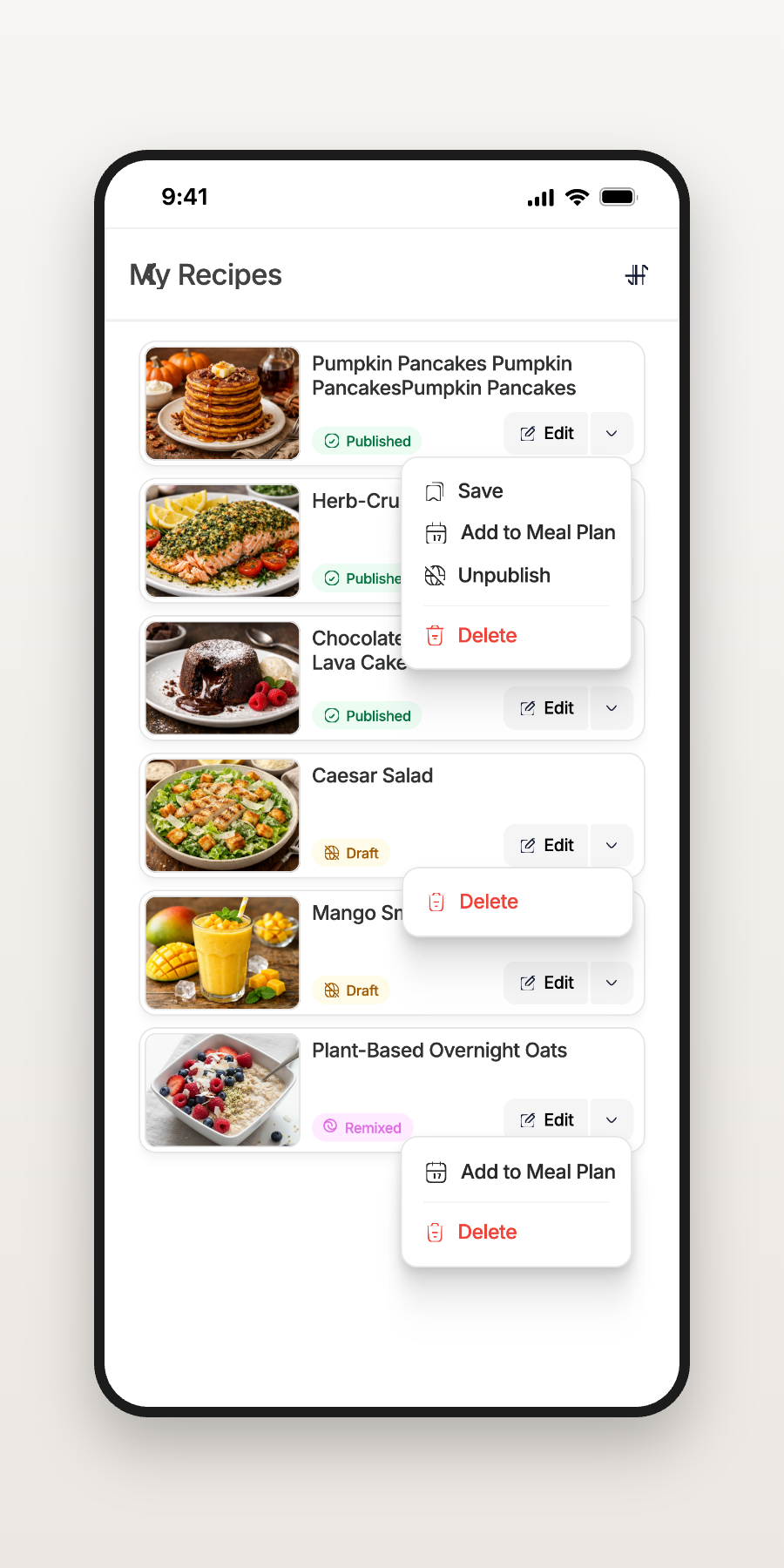
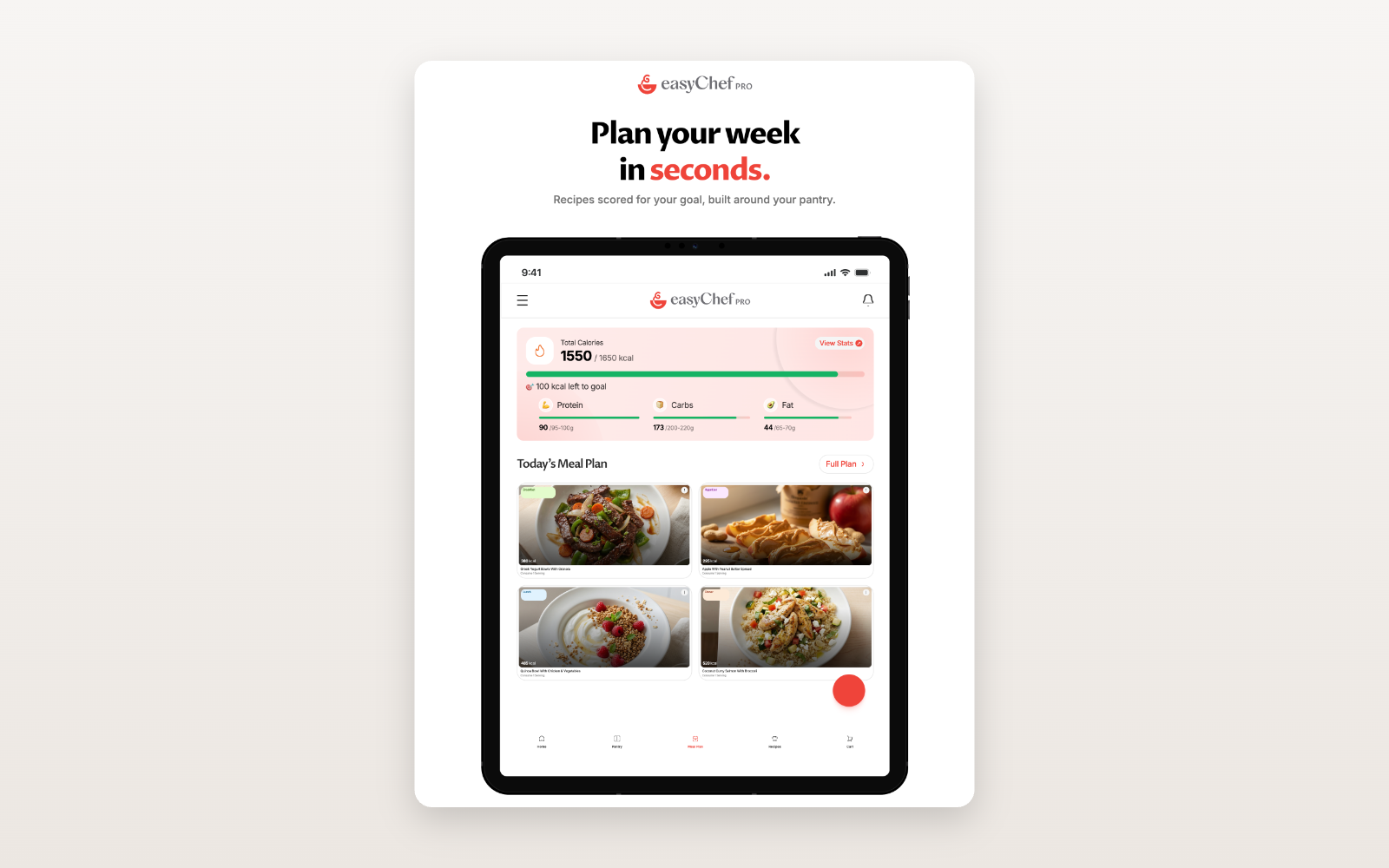
A week of eating, planned in minutes.
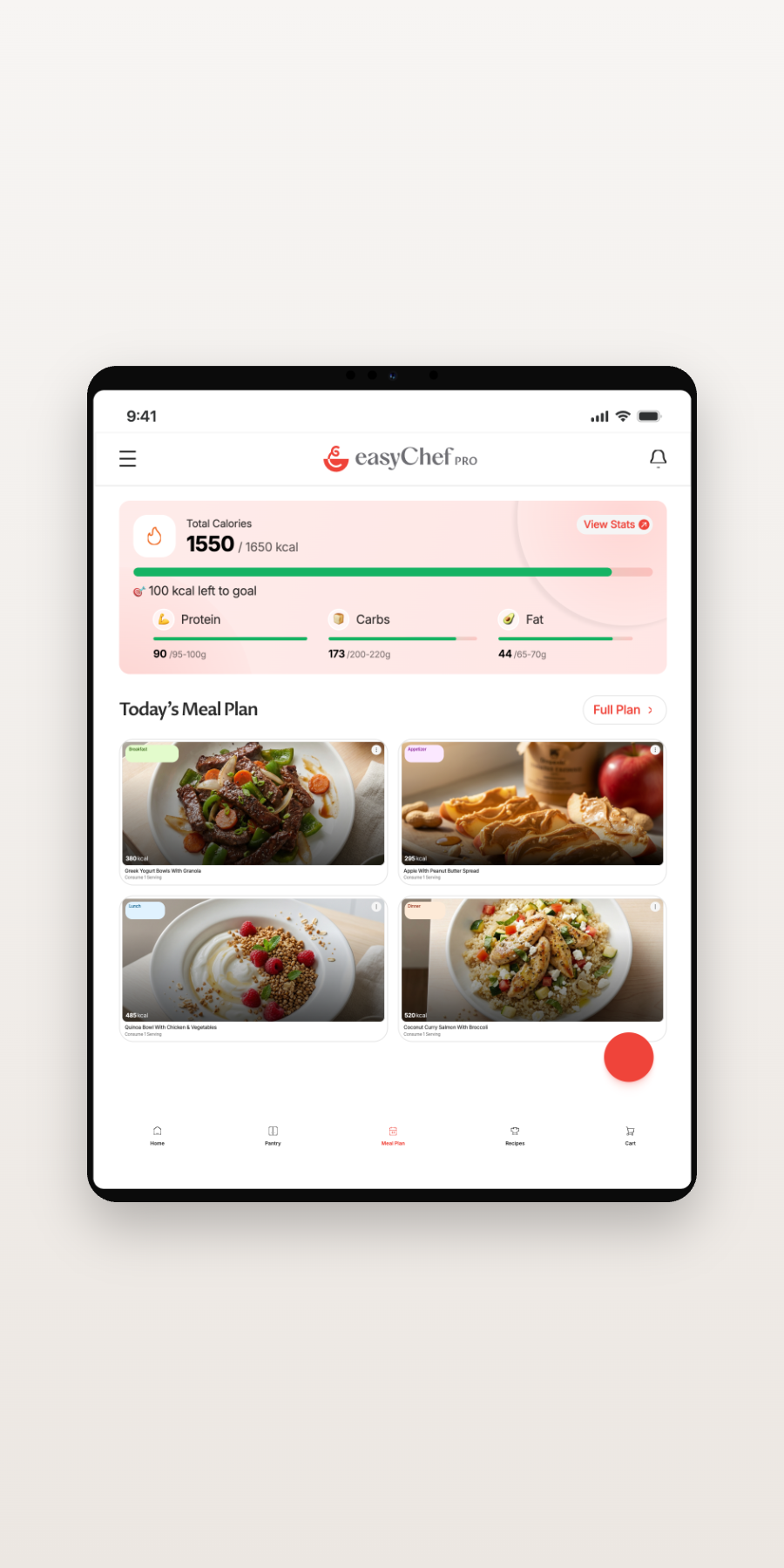
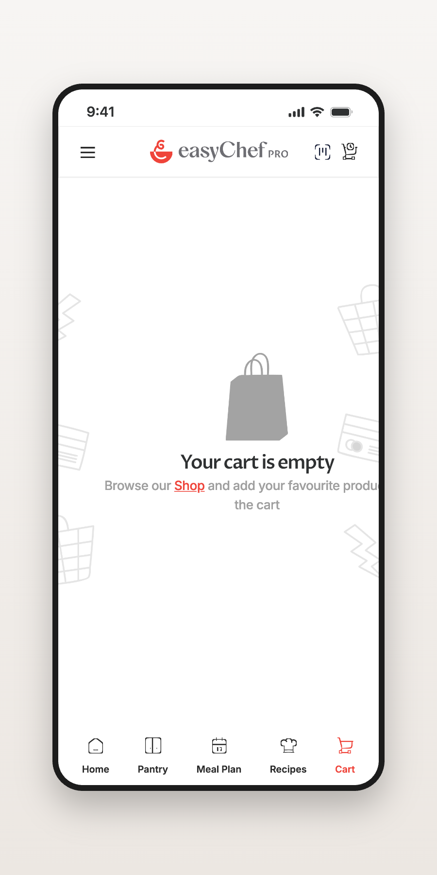
A grocery list built from the gap between plan and pantry.
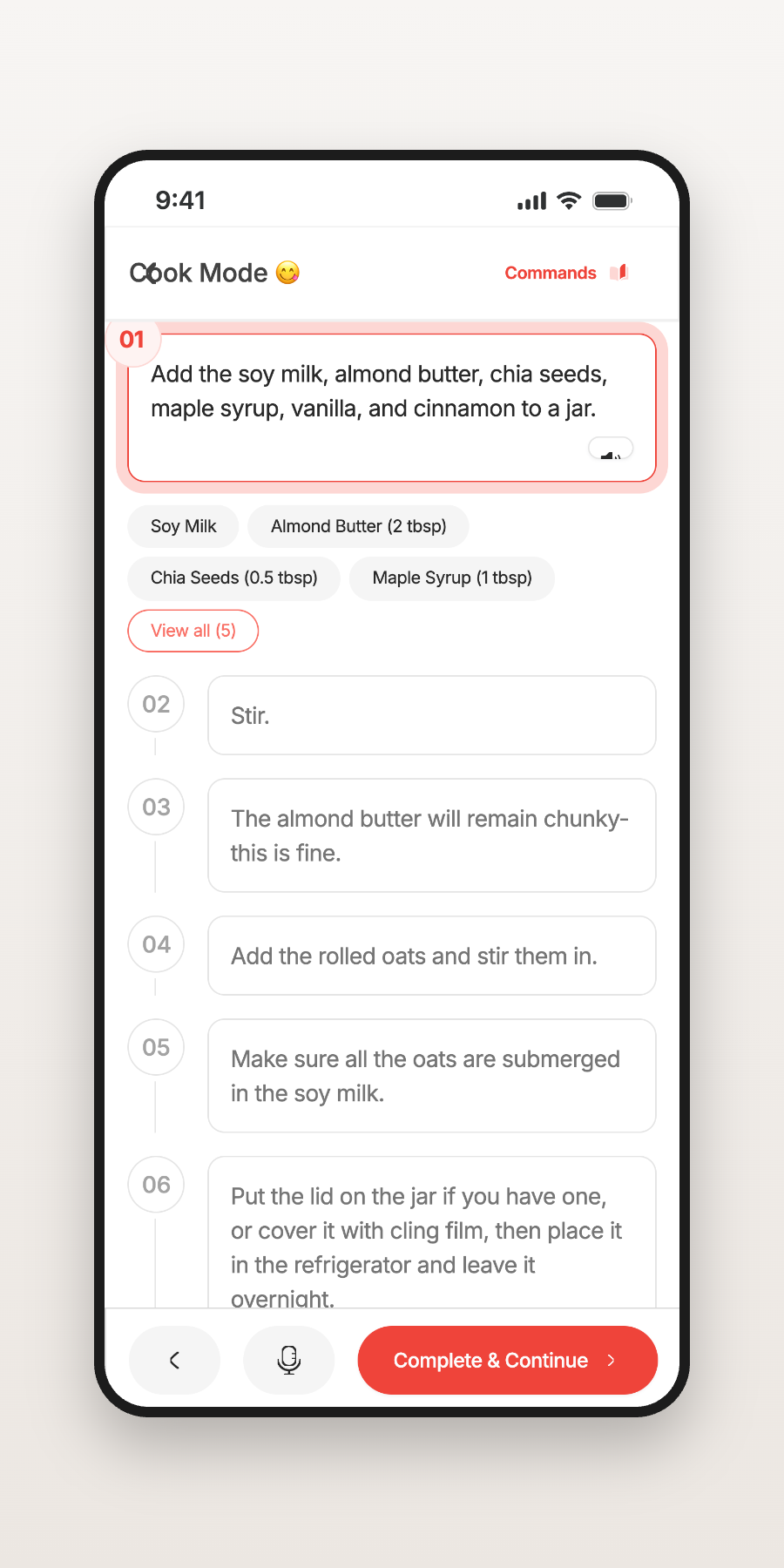
Step-by-step guidance when it’s time to cook.
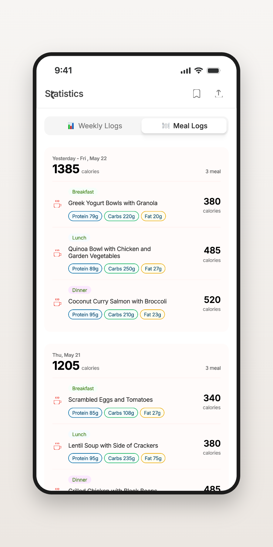
Every meal logged back into your health picture.
The challenge wasn’t designing another marketing page. It was helping visitors understand a completely new product category — without overwhelming them.
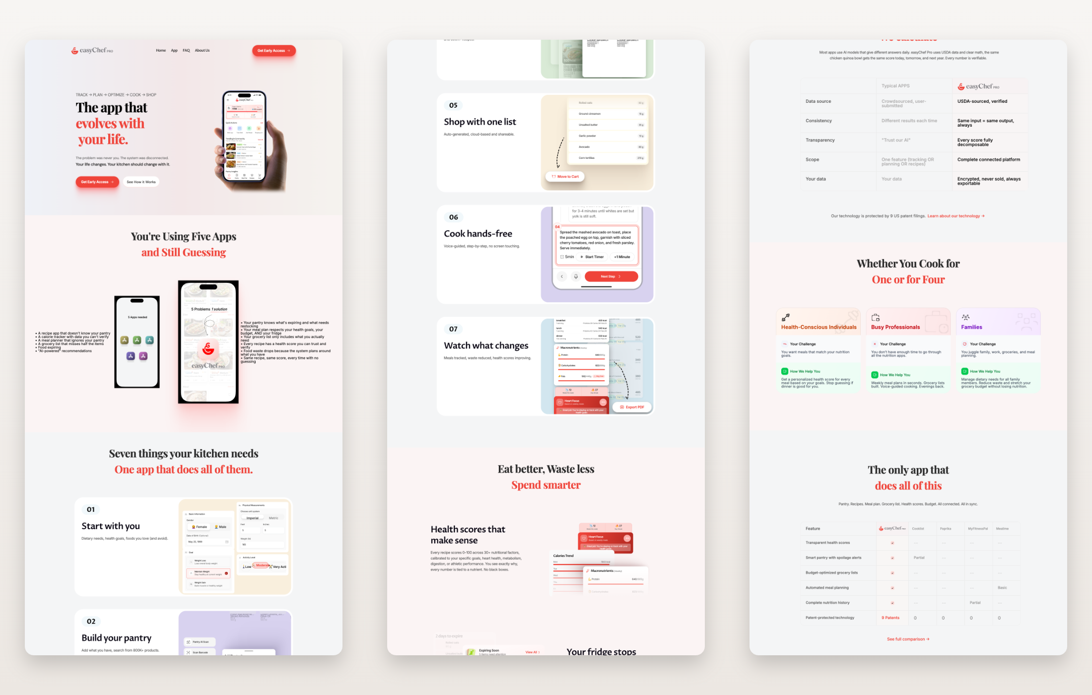
The website doesn’t explain pages. It builds understanding, one section at a time.
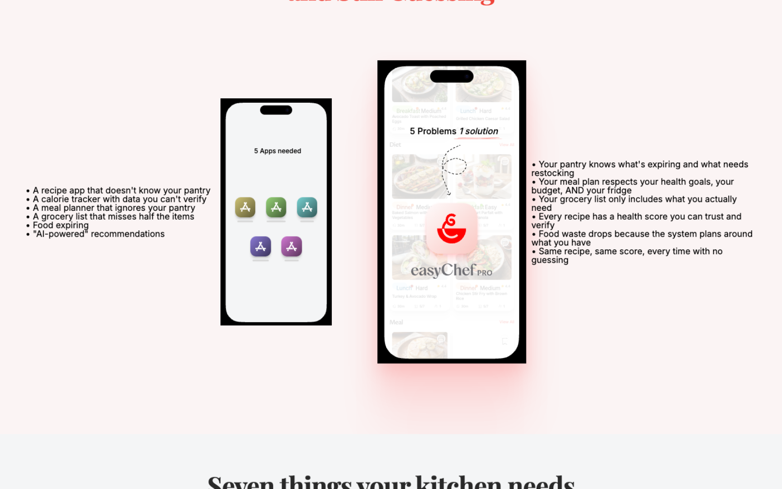
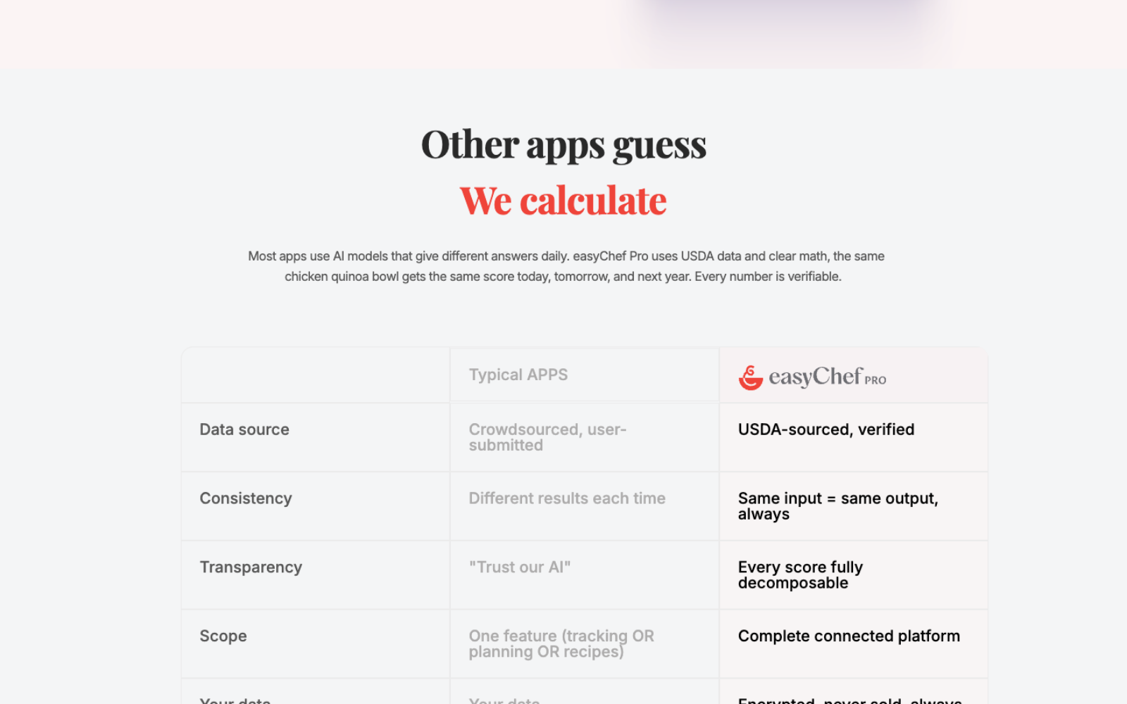
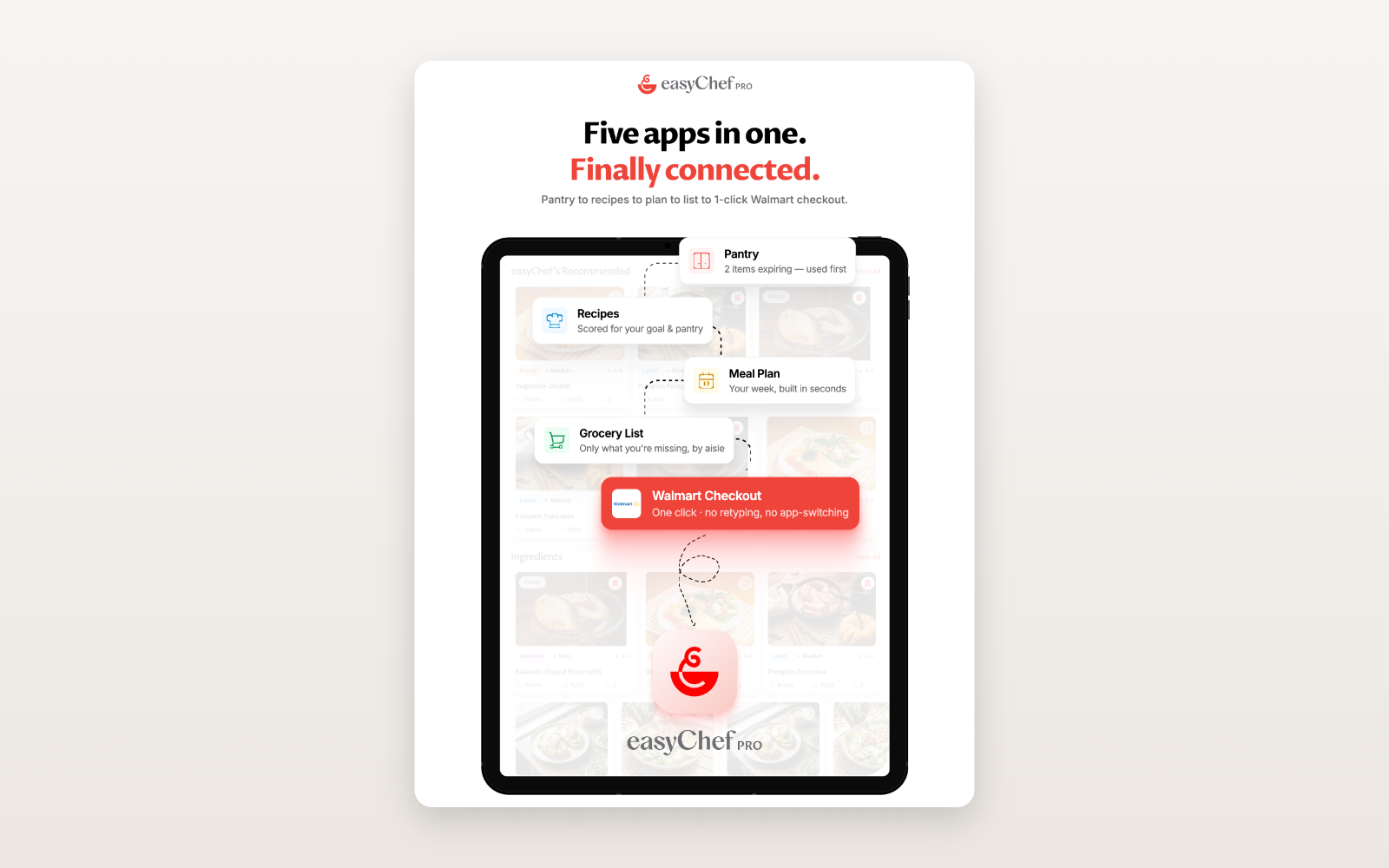
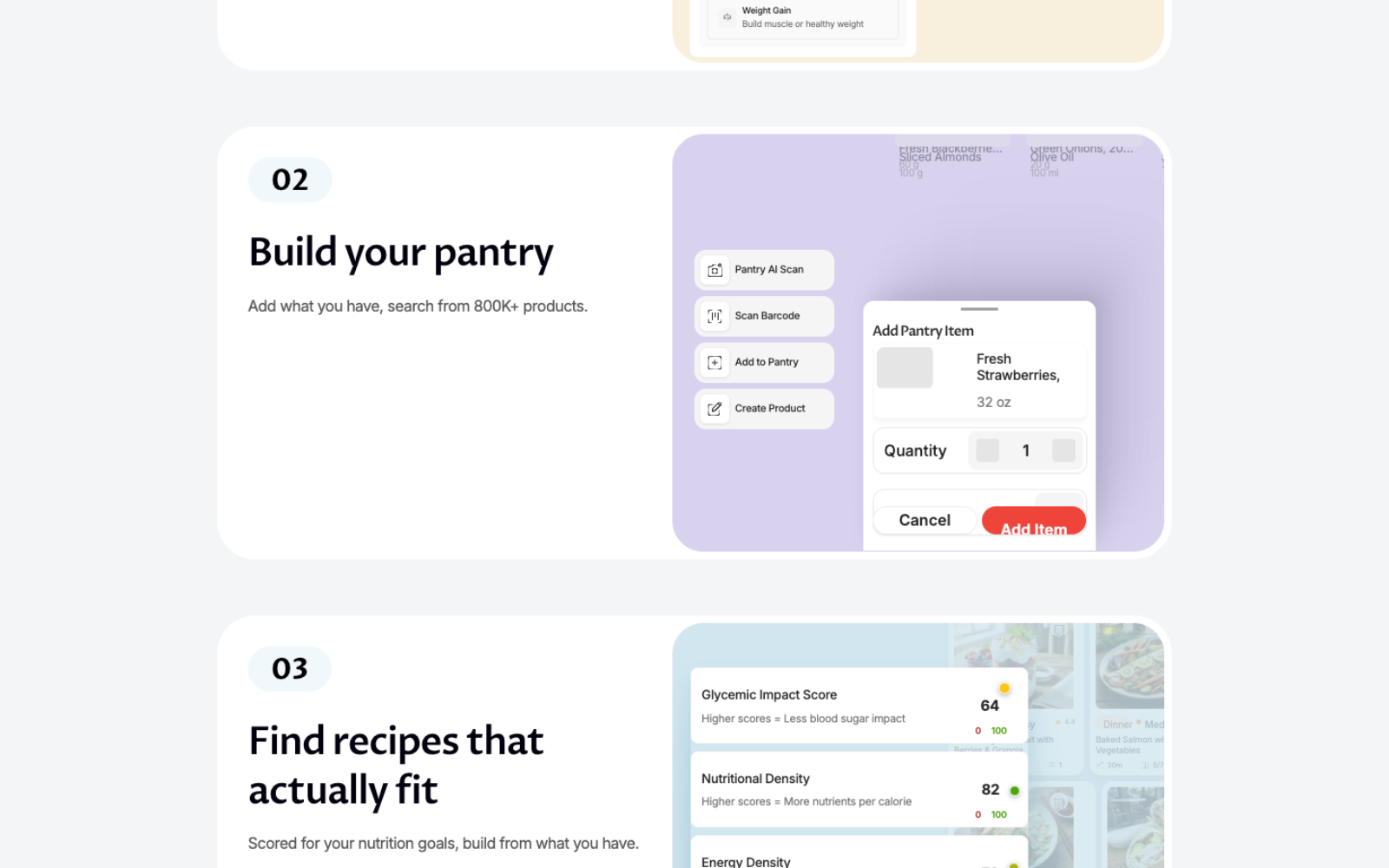
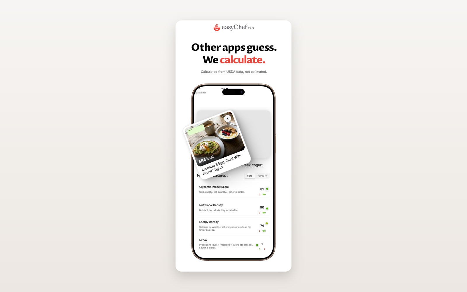
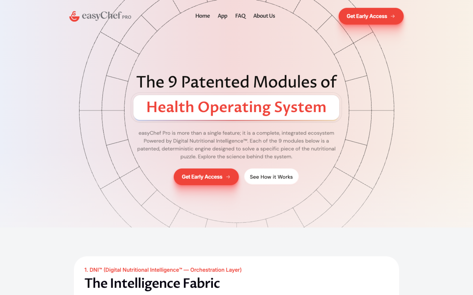
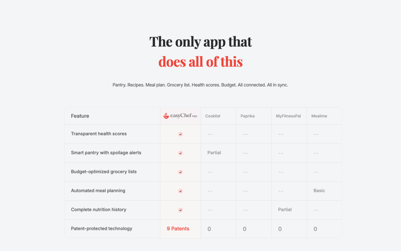
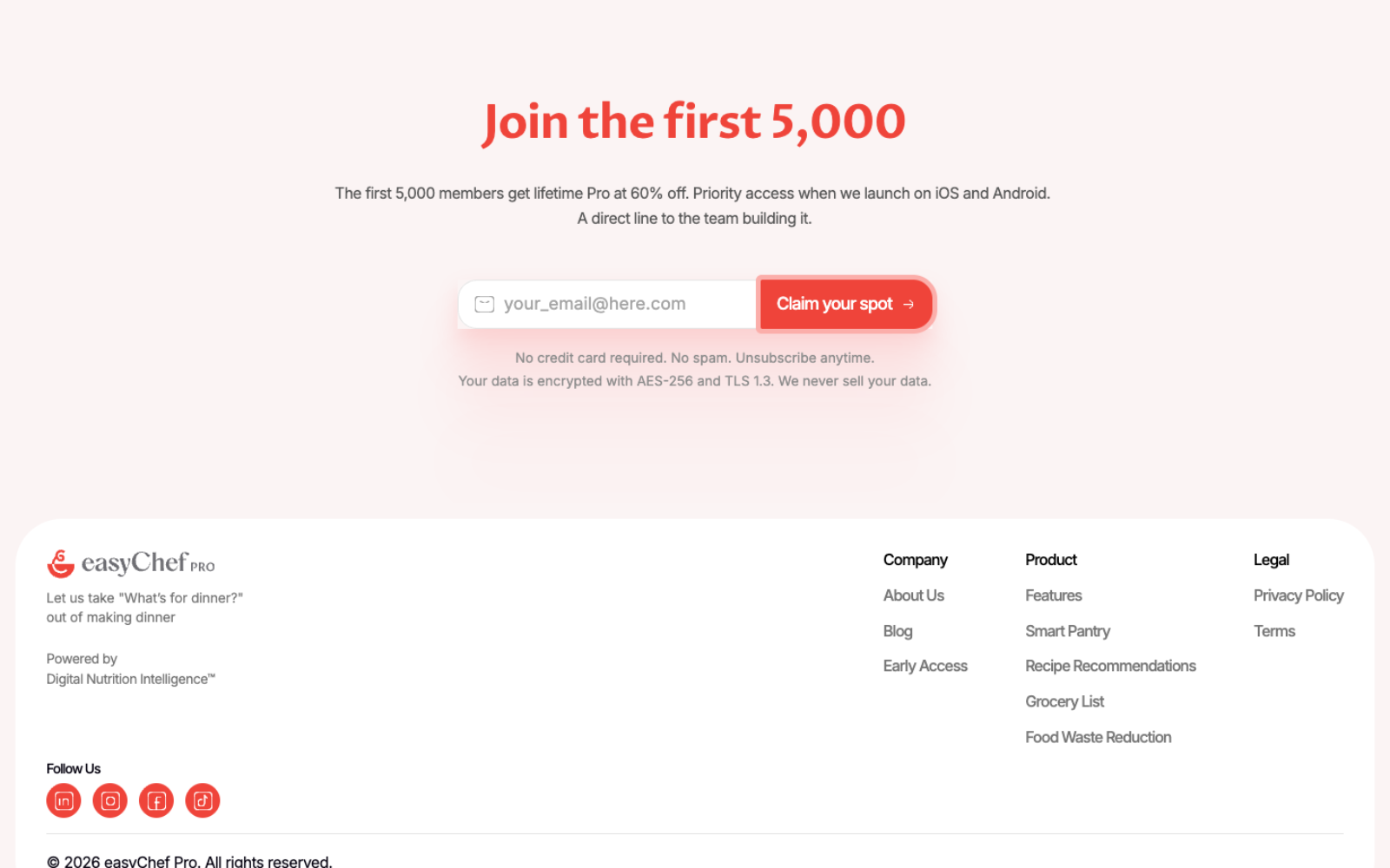
Nutrition science, pantry intelligence, shopping optimization, meal planning, health tracking — never presented all at once.
The website introduces each concept gradually, pairing every claim with a visual example so understanding builds section by section — progressive storytelling instead of a feature dump.
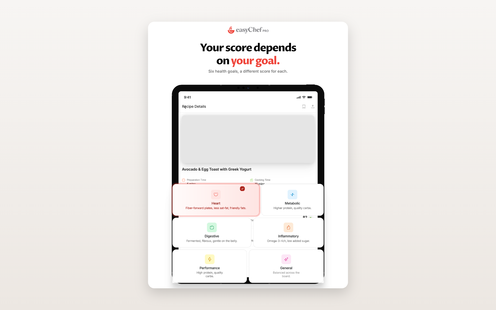
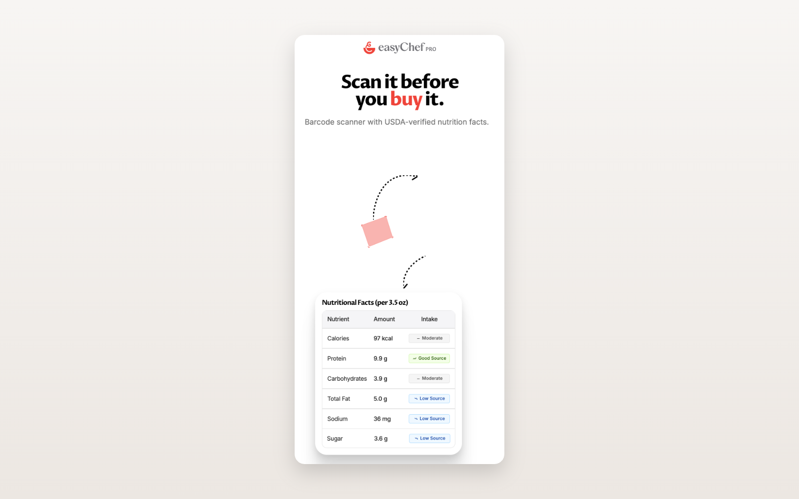
No illustrations. No abstract graphics. Real product UI runs through the entire website — the product itself becomes the visual language.
A new category is only as strong as the reasons to believe it.
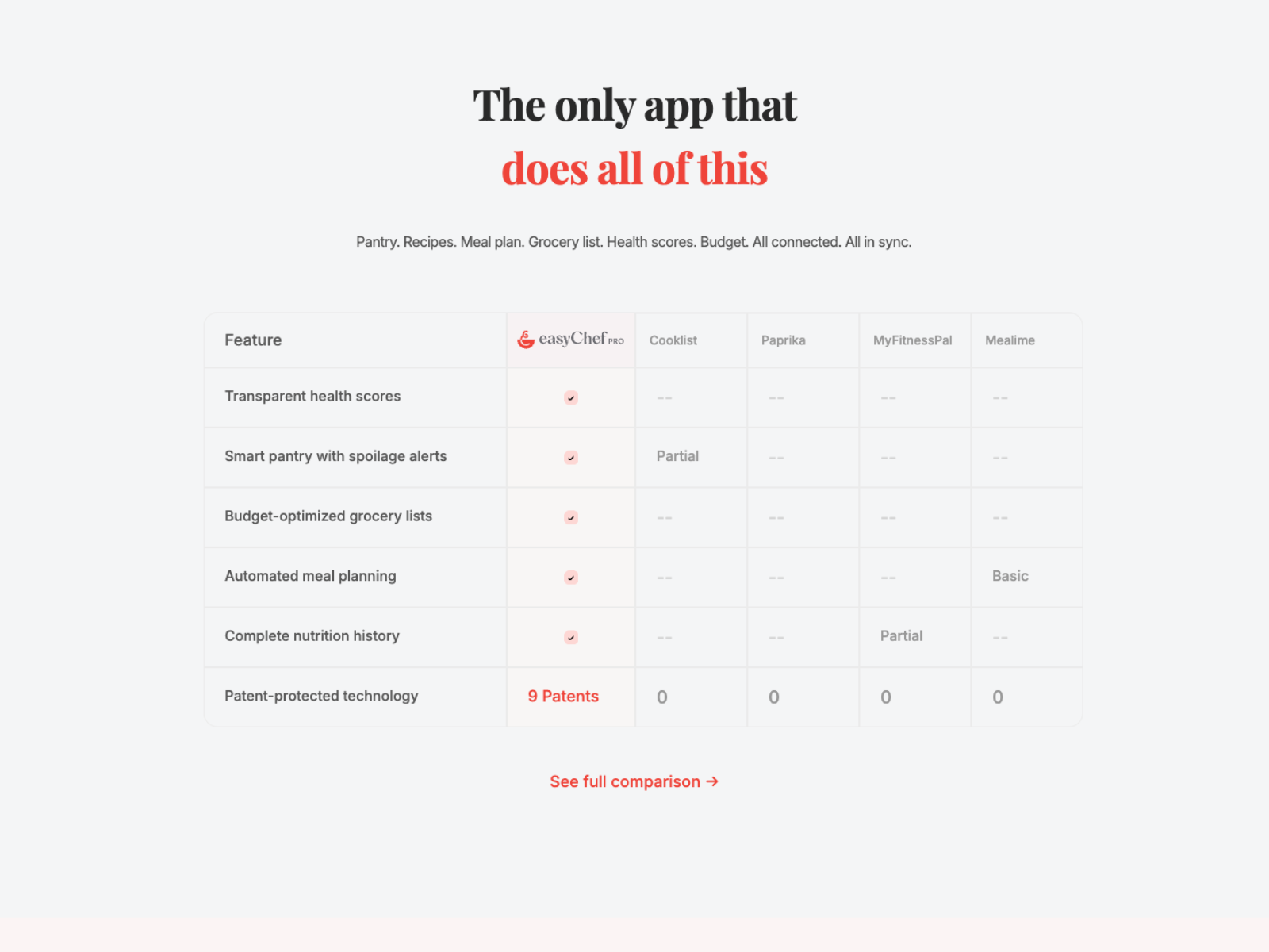
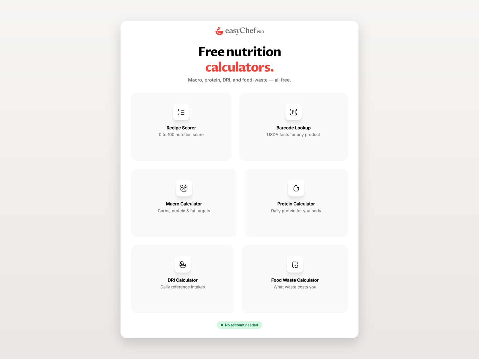
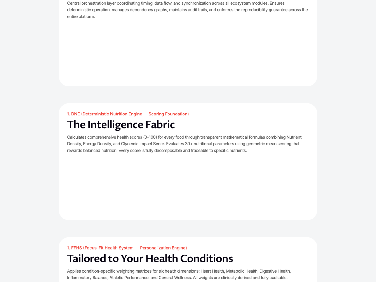
One scroll from problem to waitlist — on any screen.
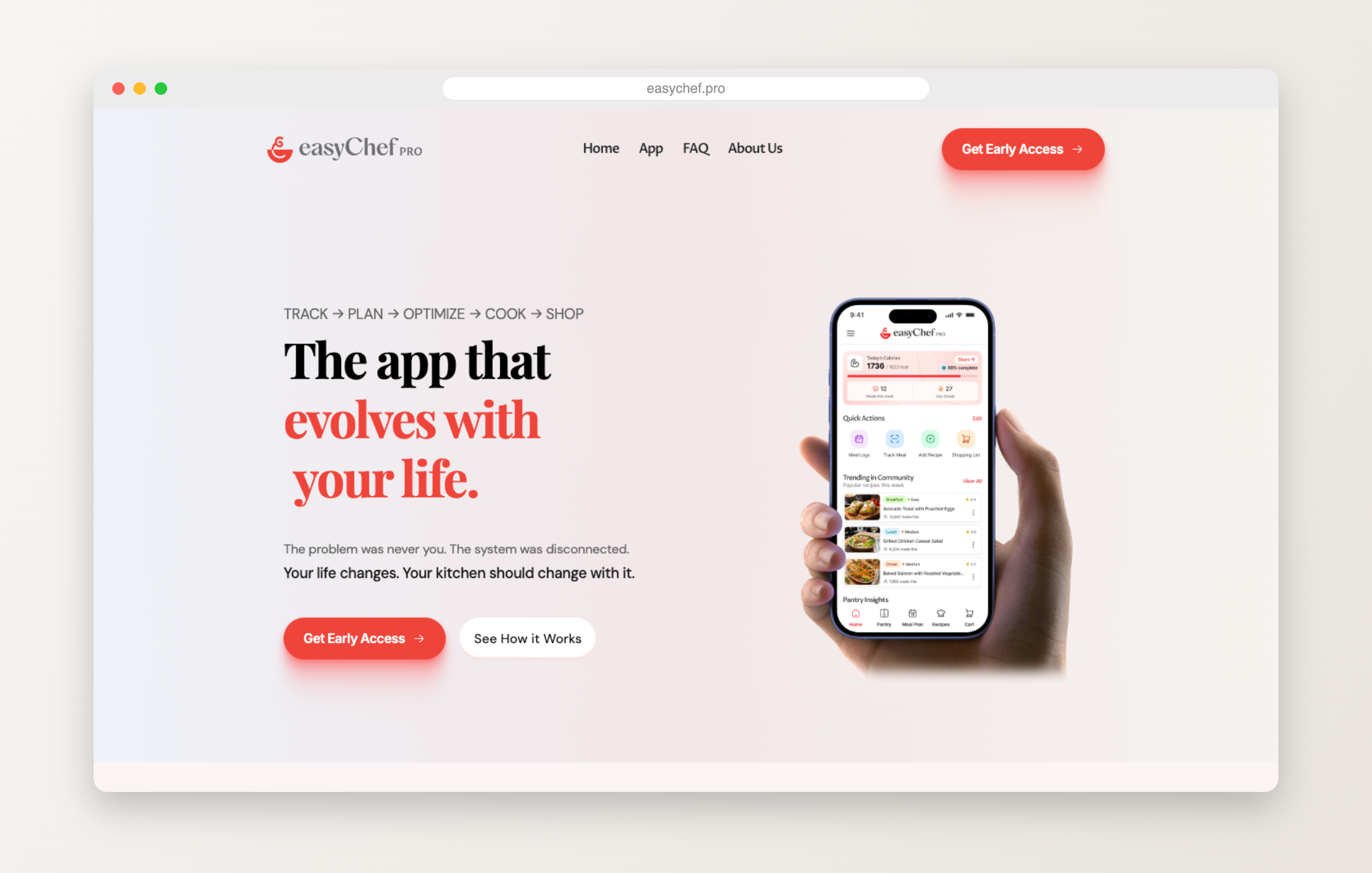
Each capability gets room to breathe: one page, one idea.
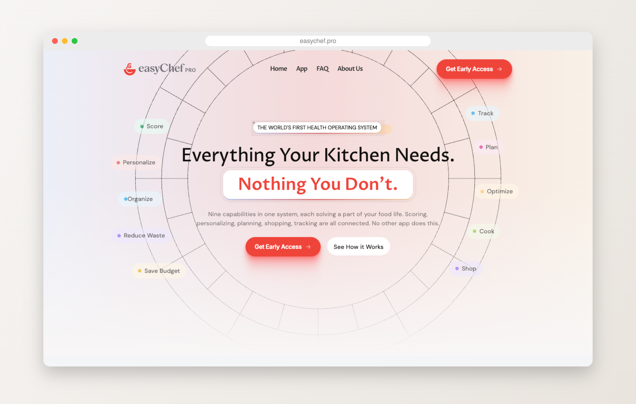
The science and systems behind the scores, made readable.
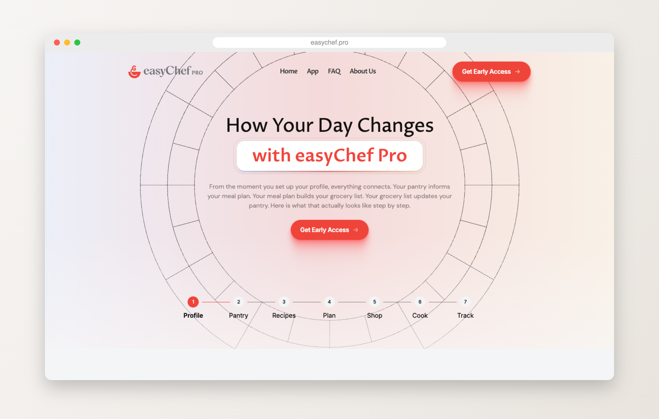
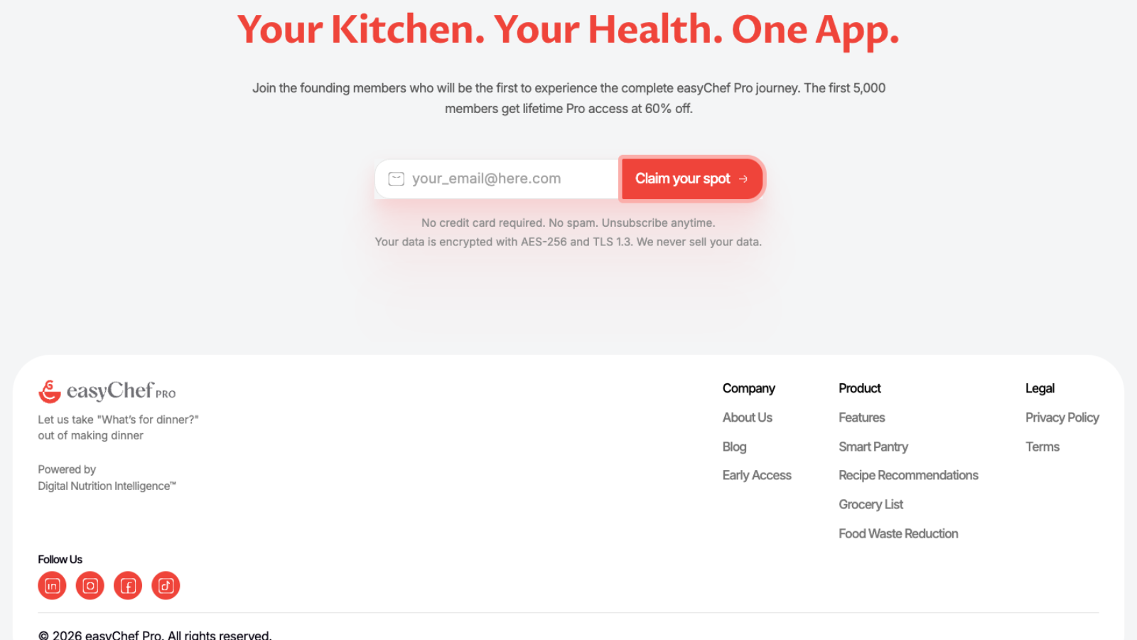
A single, focused ask once the story lands.
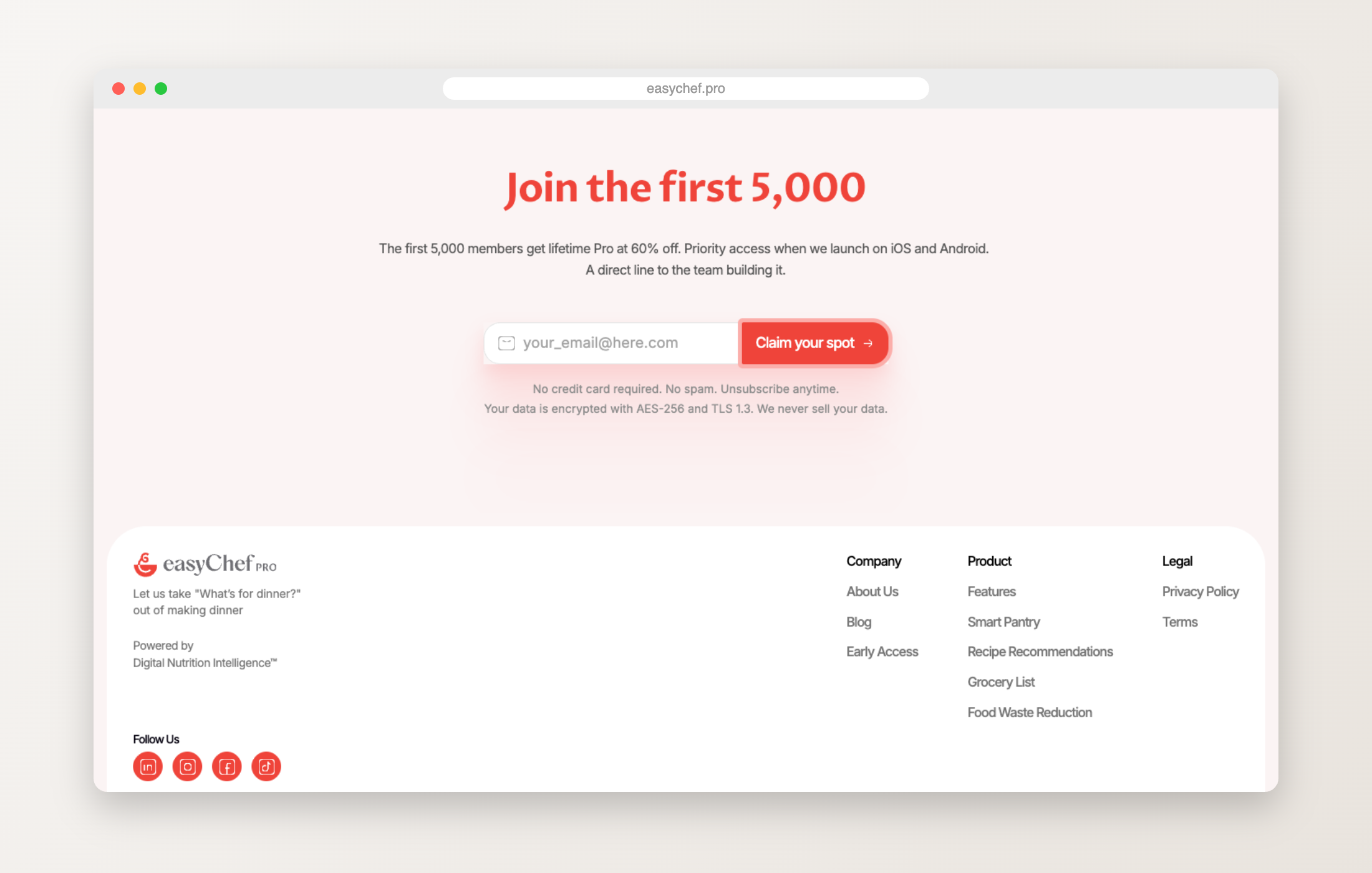
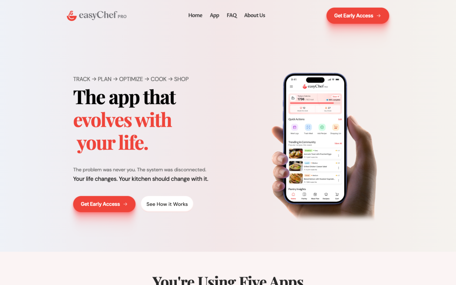
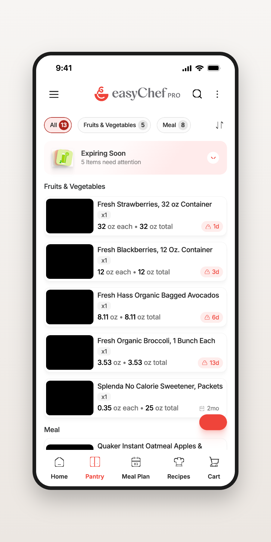
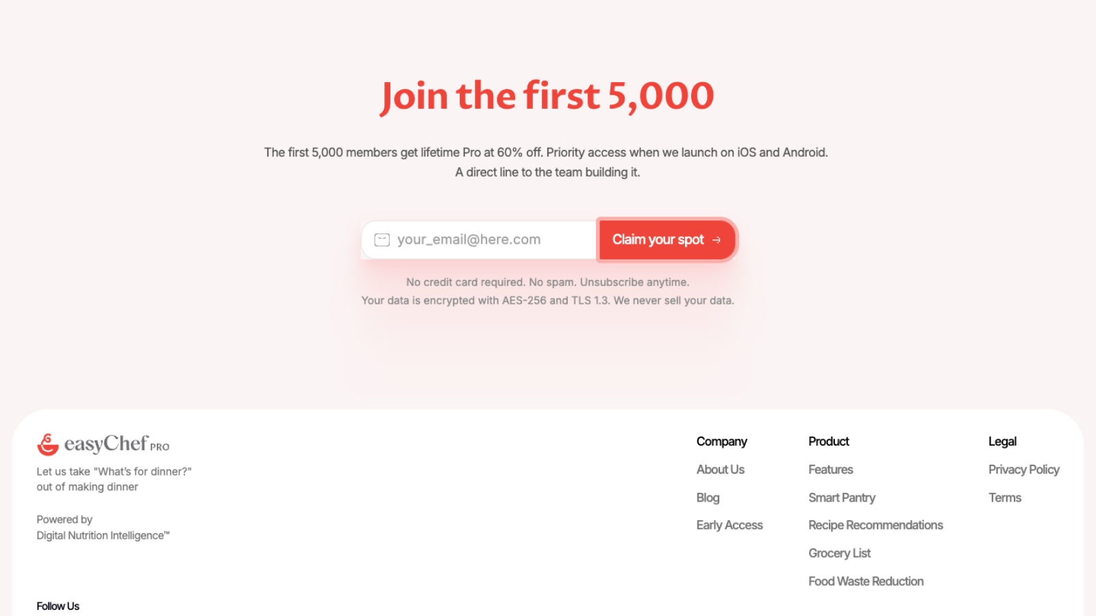
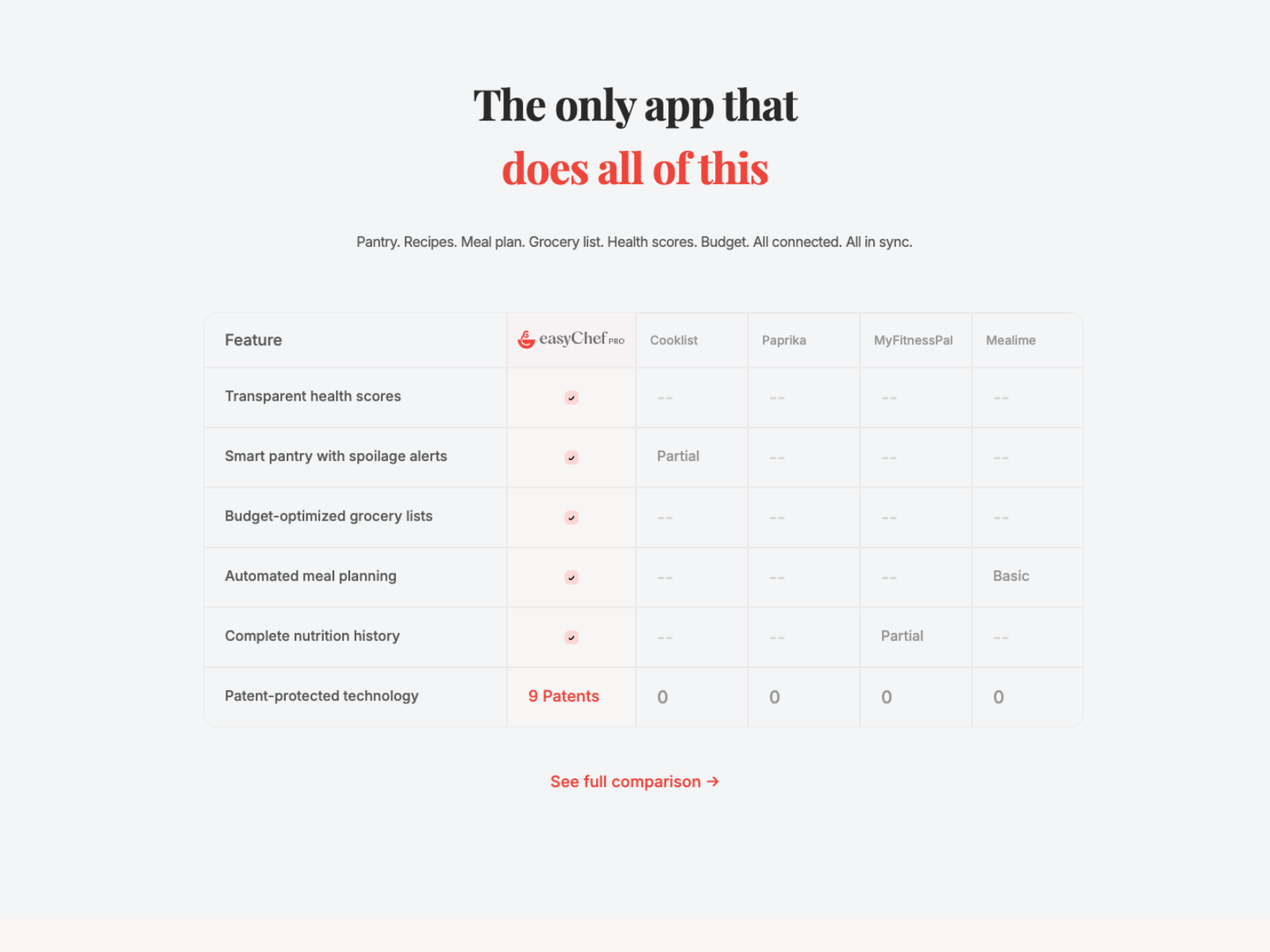
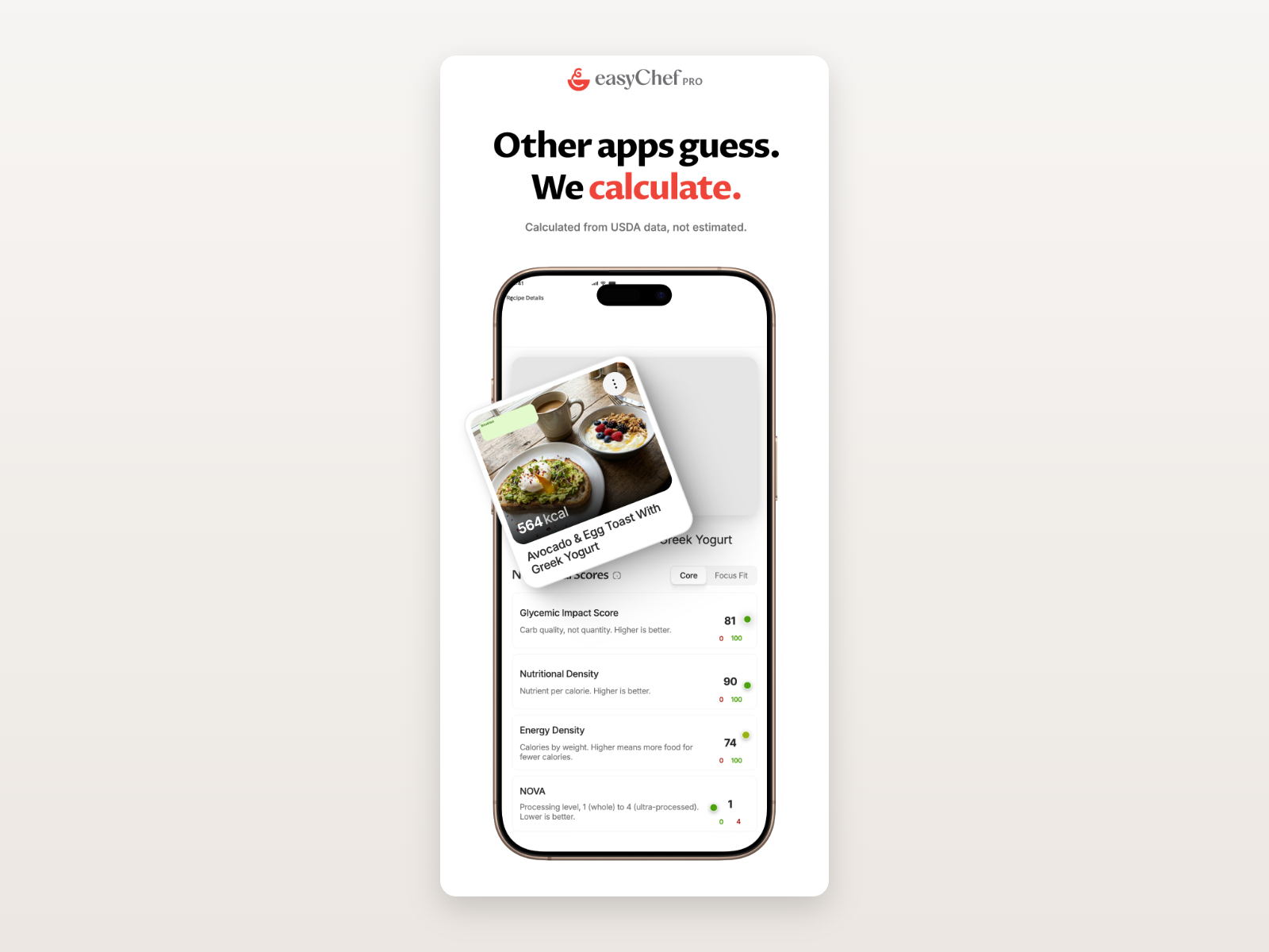
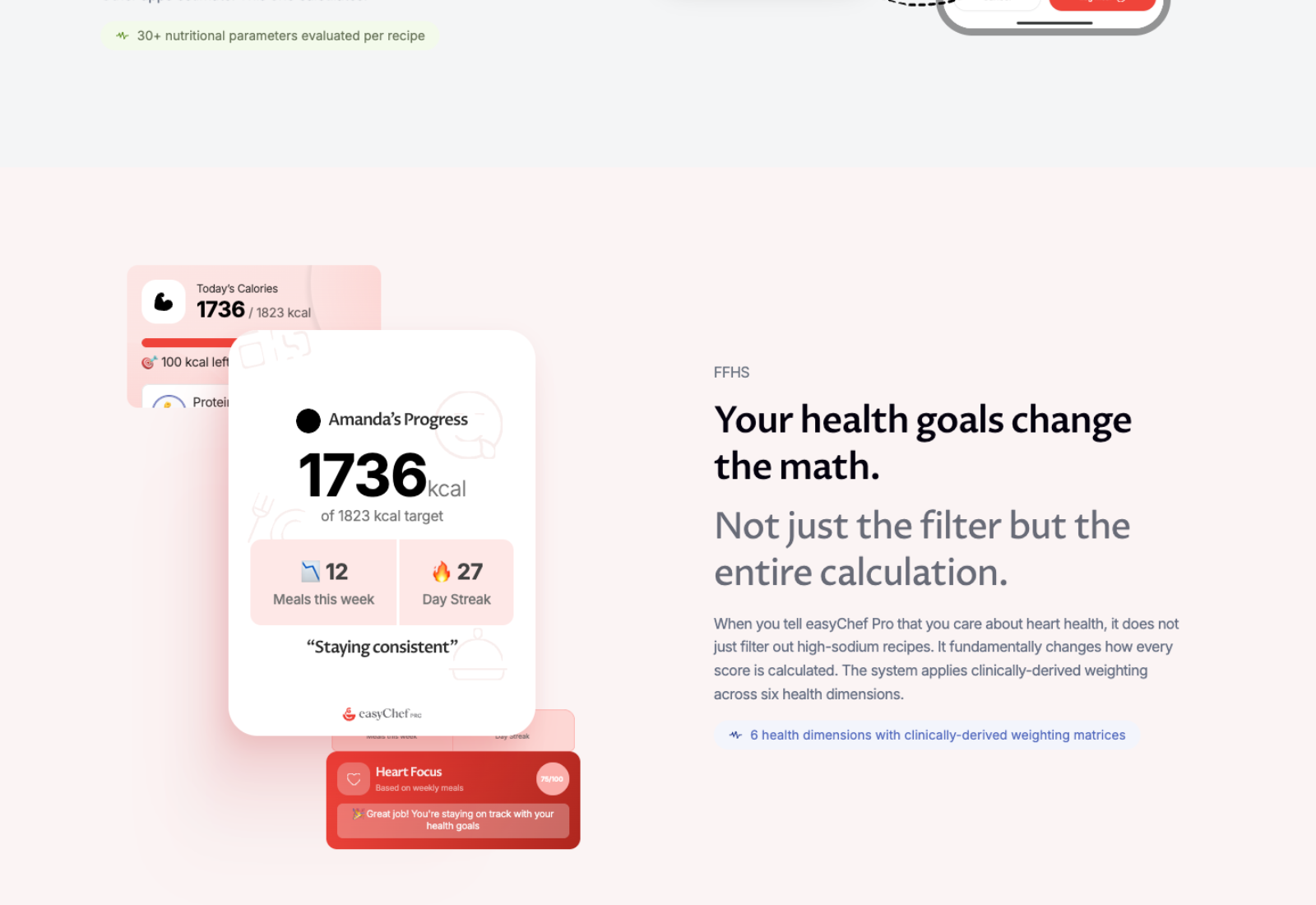
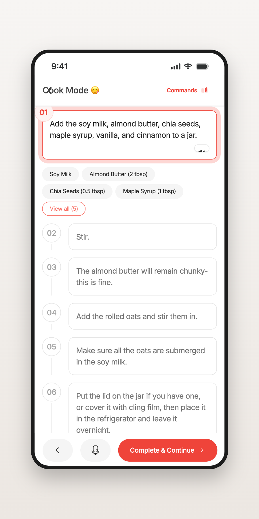
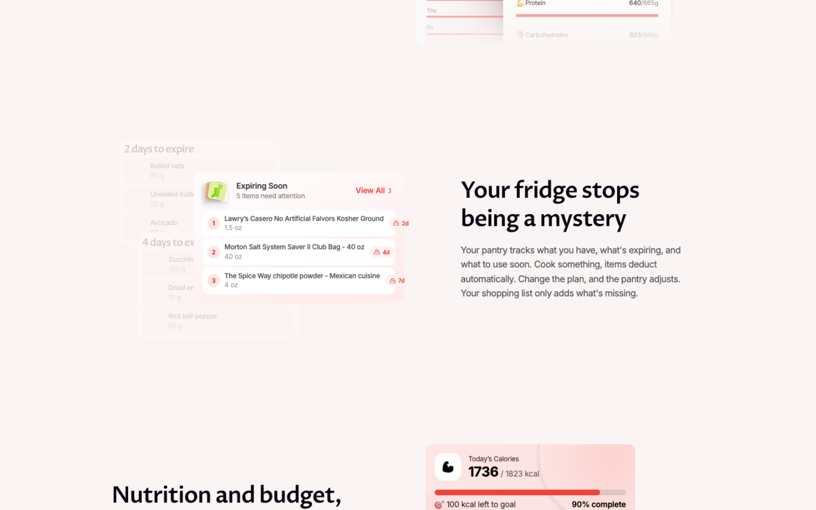
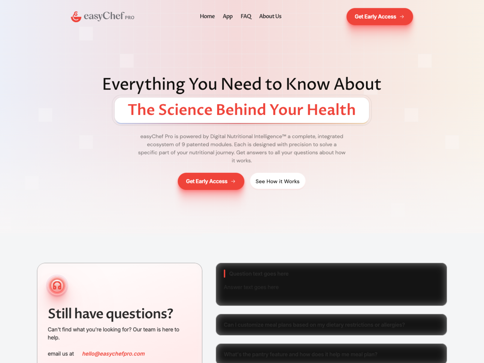
Designing easyChef Pro wasn’t about presenting features. It was about helping people understand a new way of thinking about nutrition — through a product story that feels simple, trustworthy, and approachable.
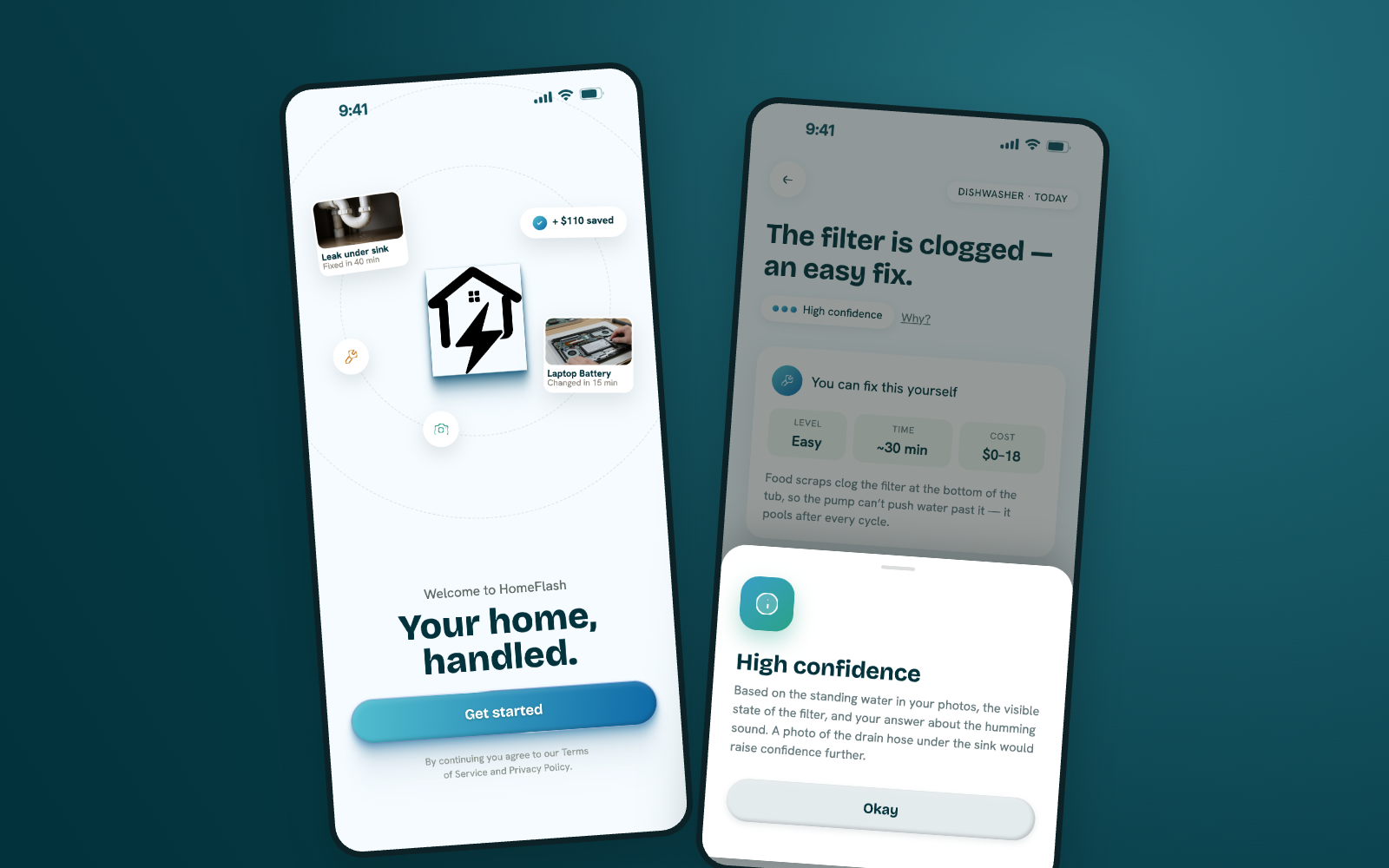
Designing confidence into home maintenance through AI.
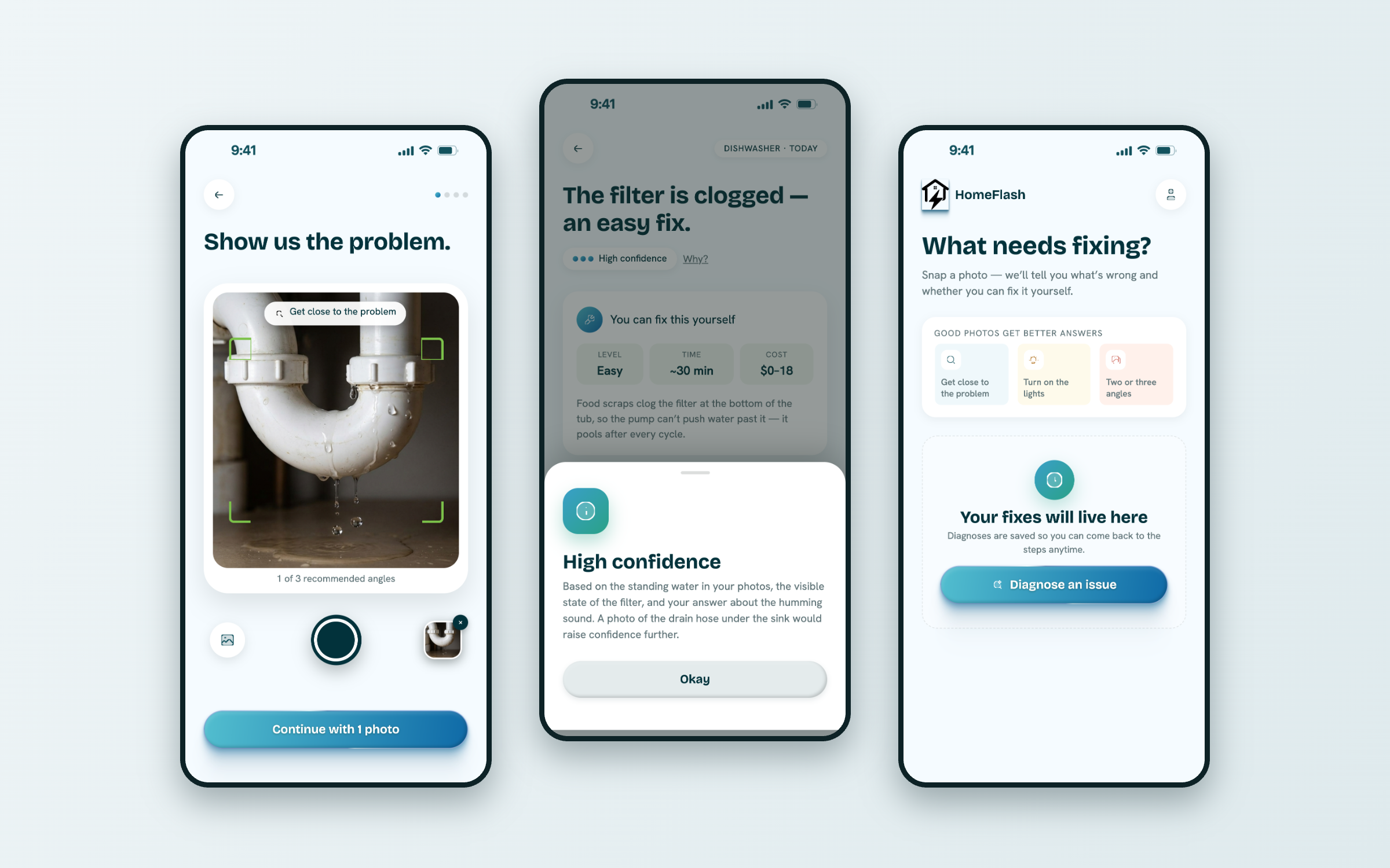
Something breaks at home. Searching online gives overwhelming, contradictory answers. Professional inspections take time. People just want to know three things:
Turn uncertainty into confidence.
From a moment of worry to a clear next step.
An AI product only works when people believe what it tells them.
So the interface never asks for blind faith. It shows its reasoning, uses plain words, and keeps every screen calm — making the AI feel understandable rather than mysterious.
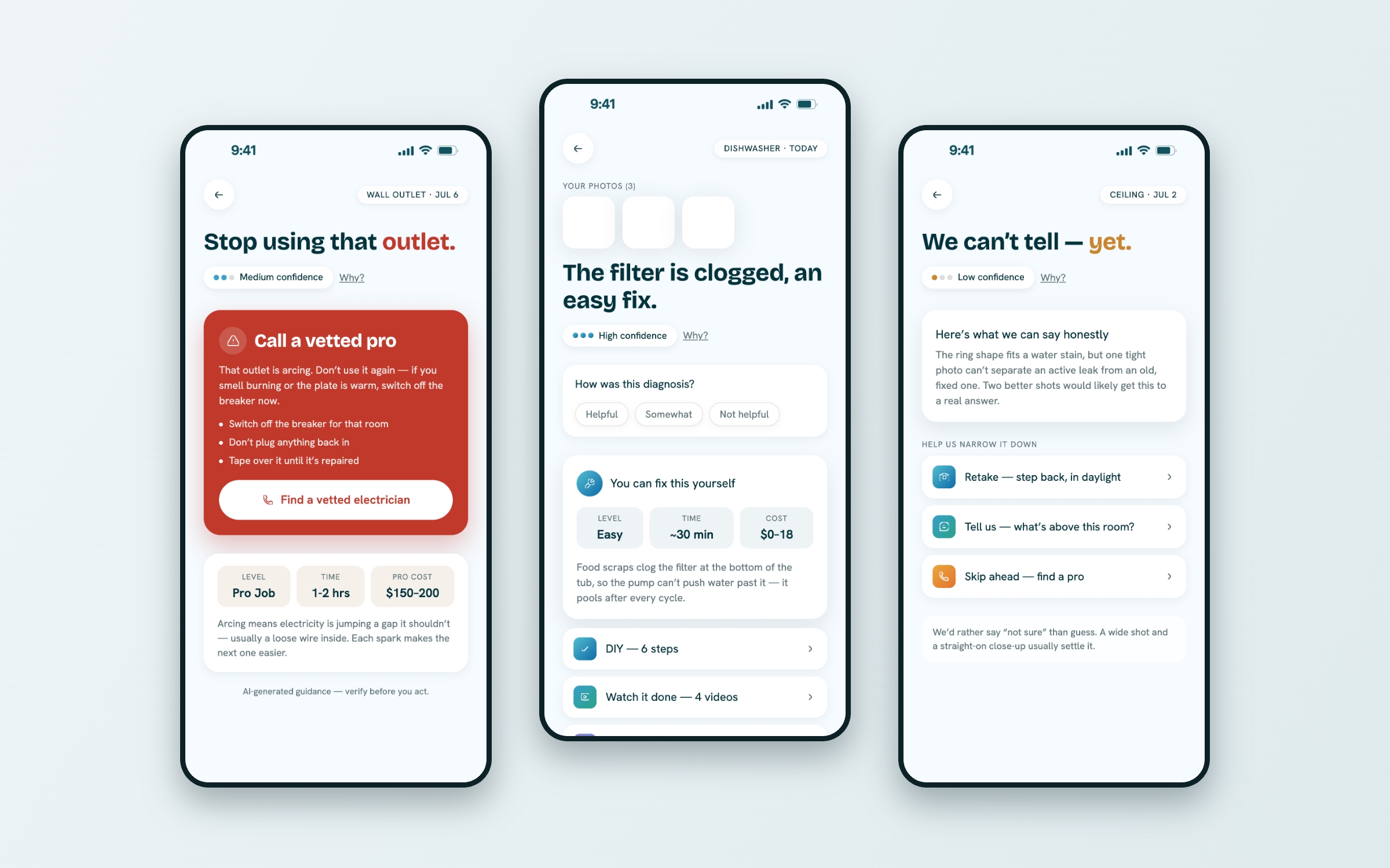
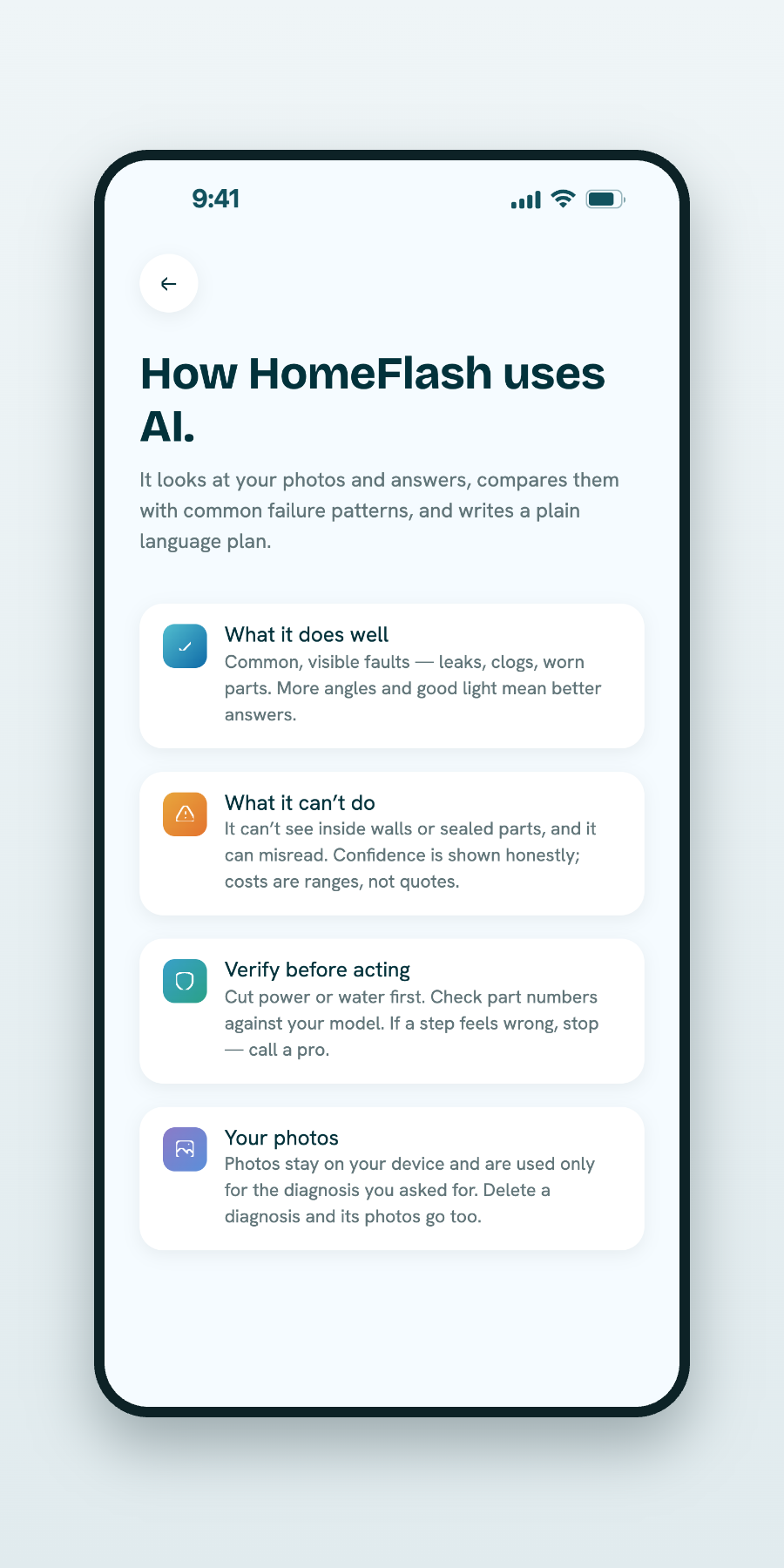
Technology that speaks like a helpful person, not a manual.
Capture to keepsake — the full arc of a single scan.
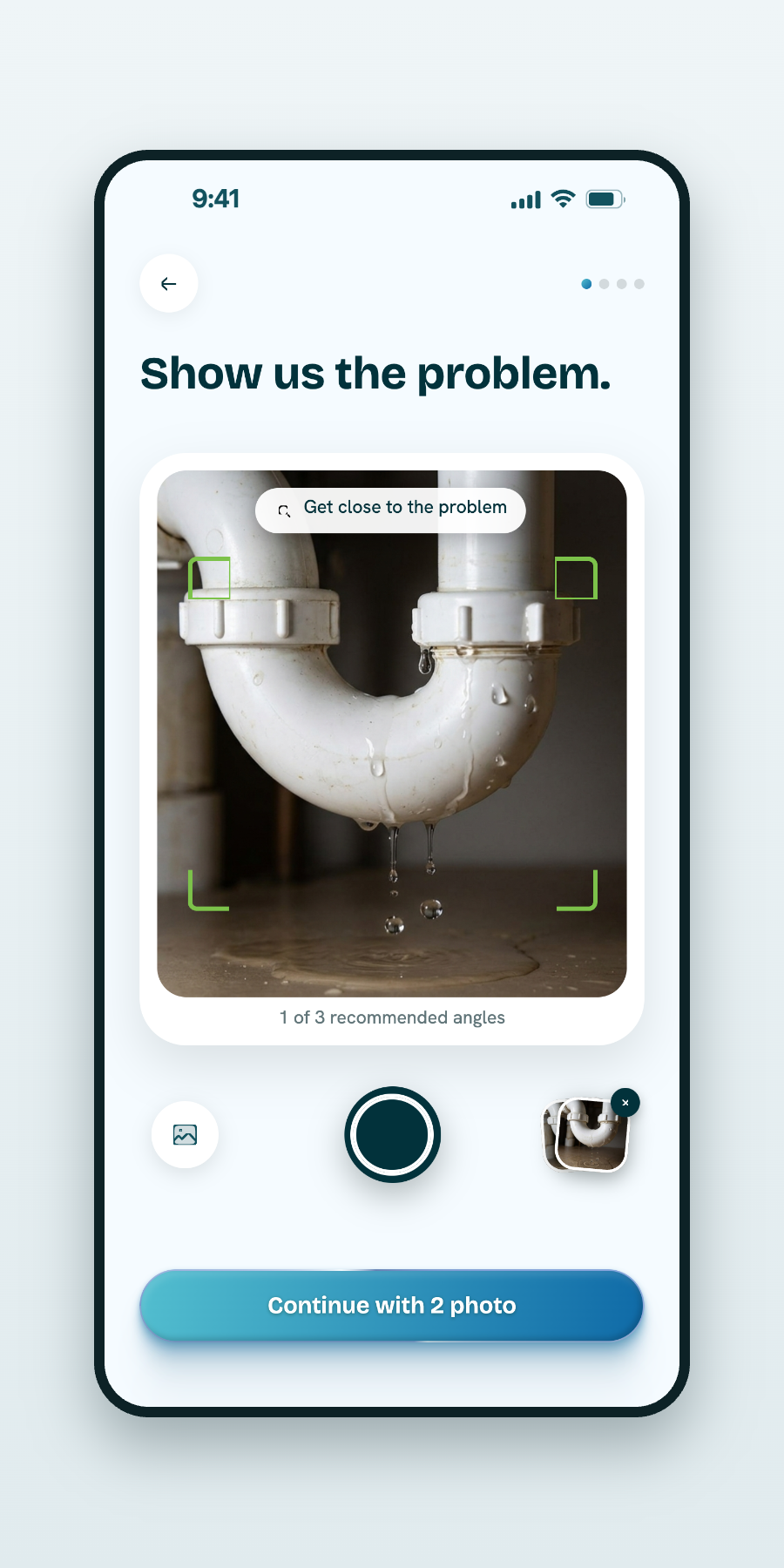
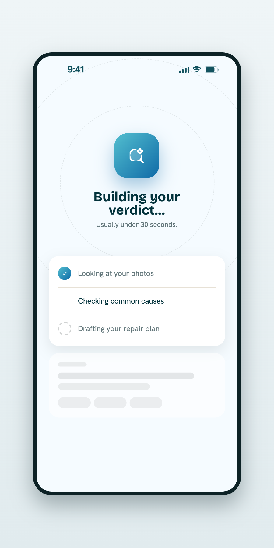
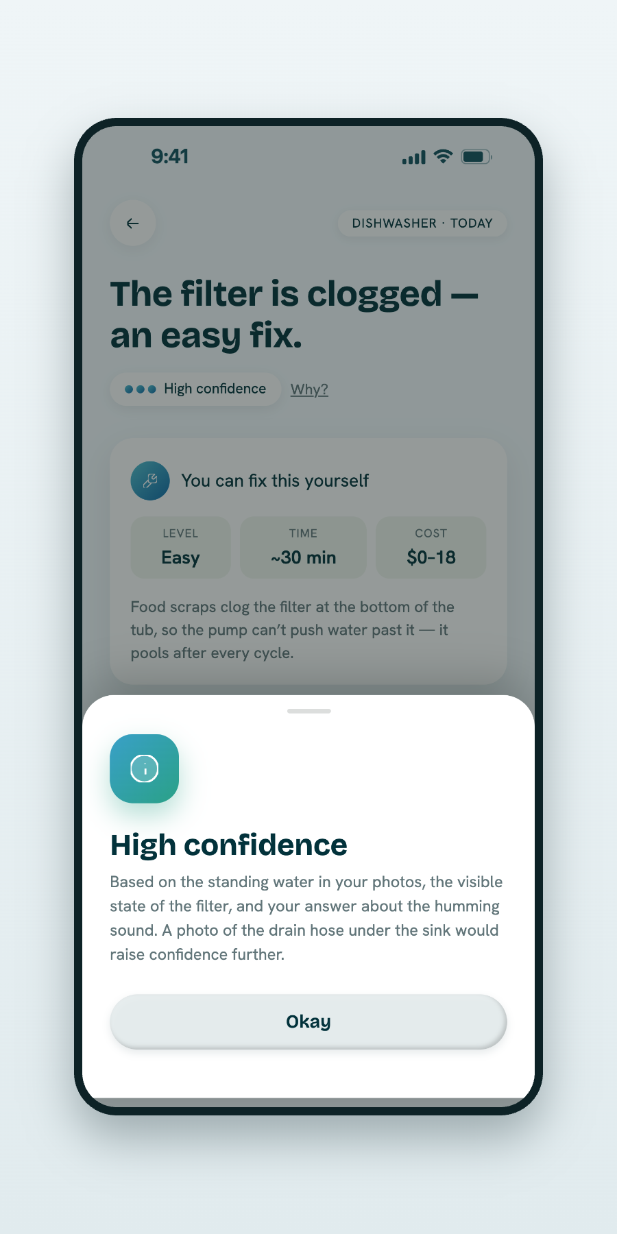
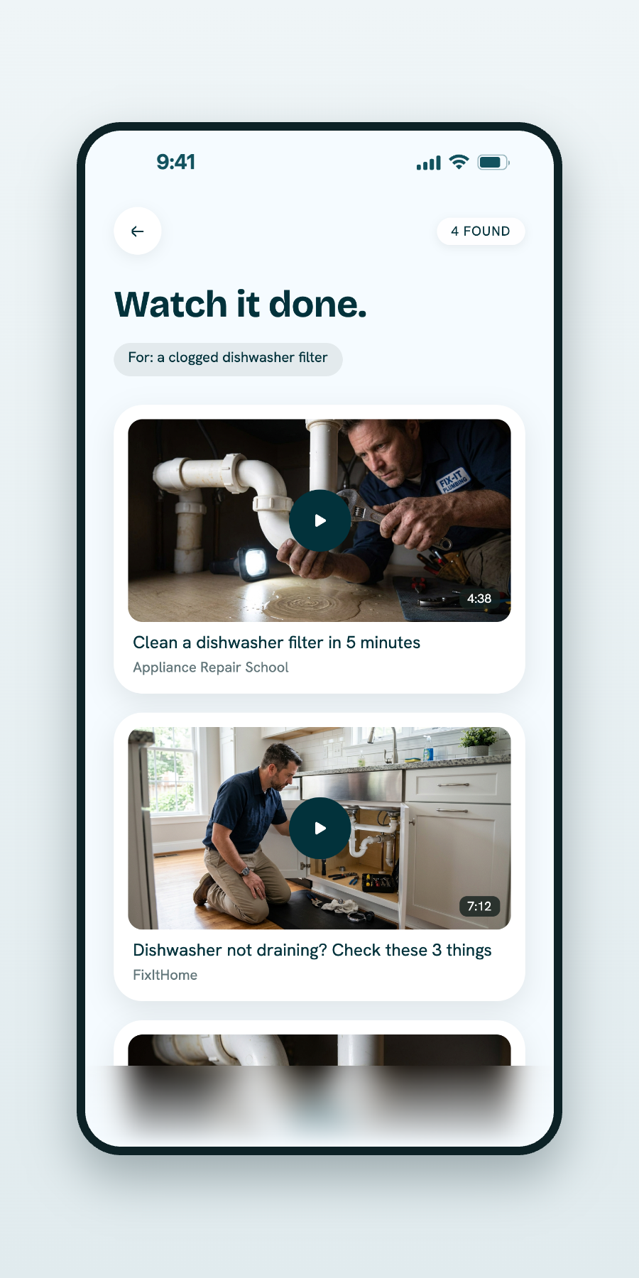
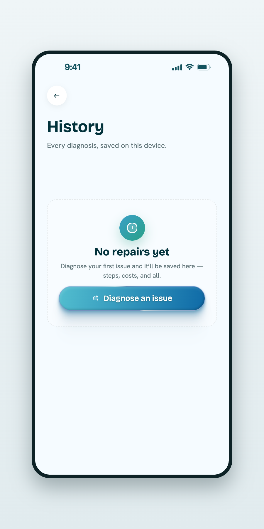
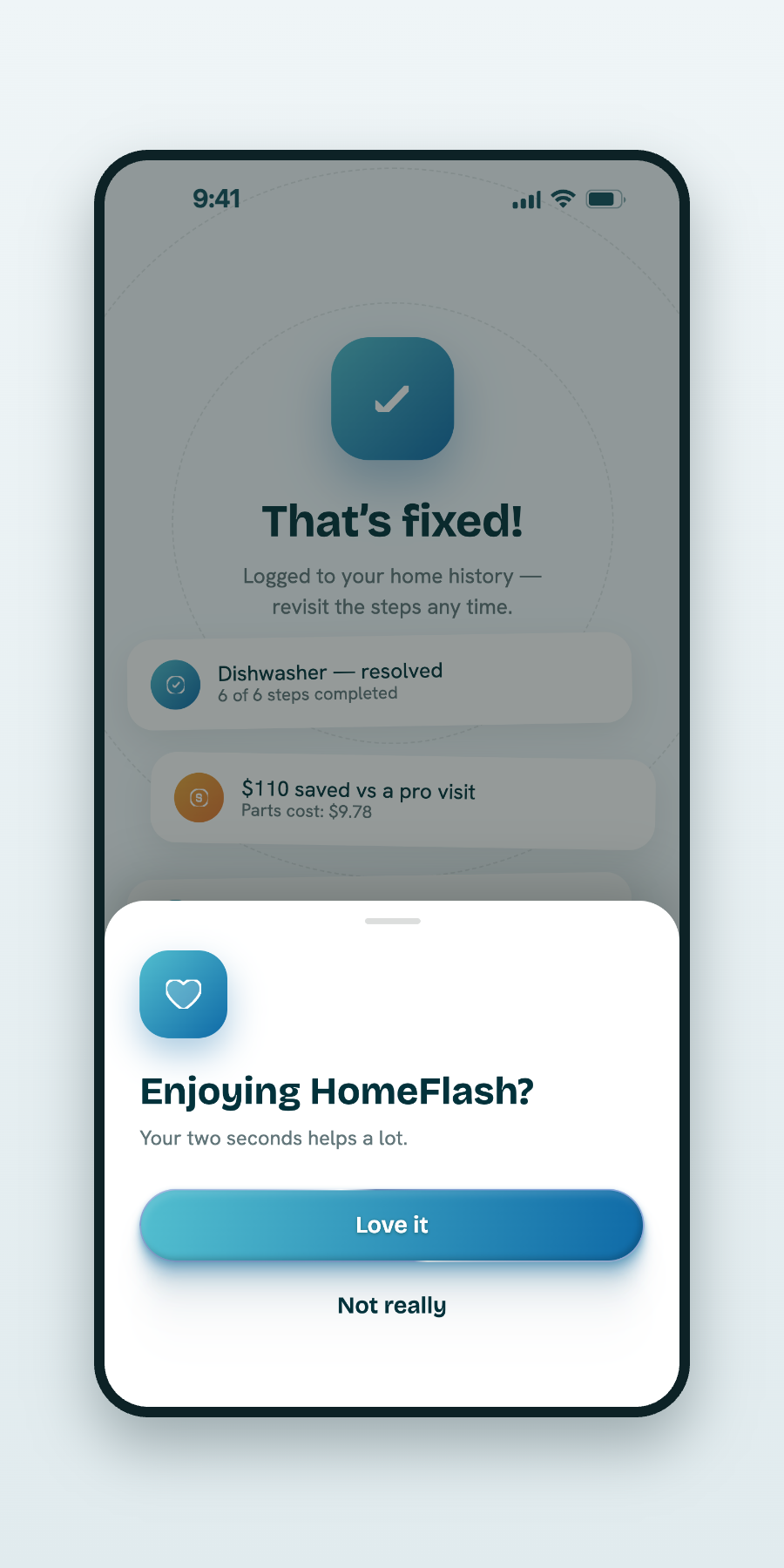
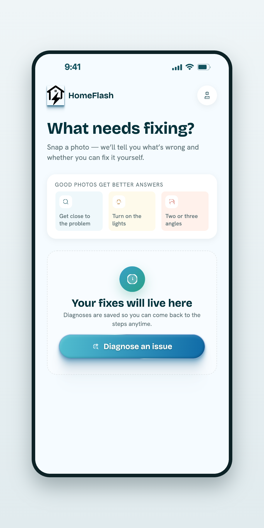
Everything, right where you left it.
Recent scans, quick access to a new photo, and a running history — so continuing previous work takes a single tap.
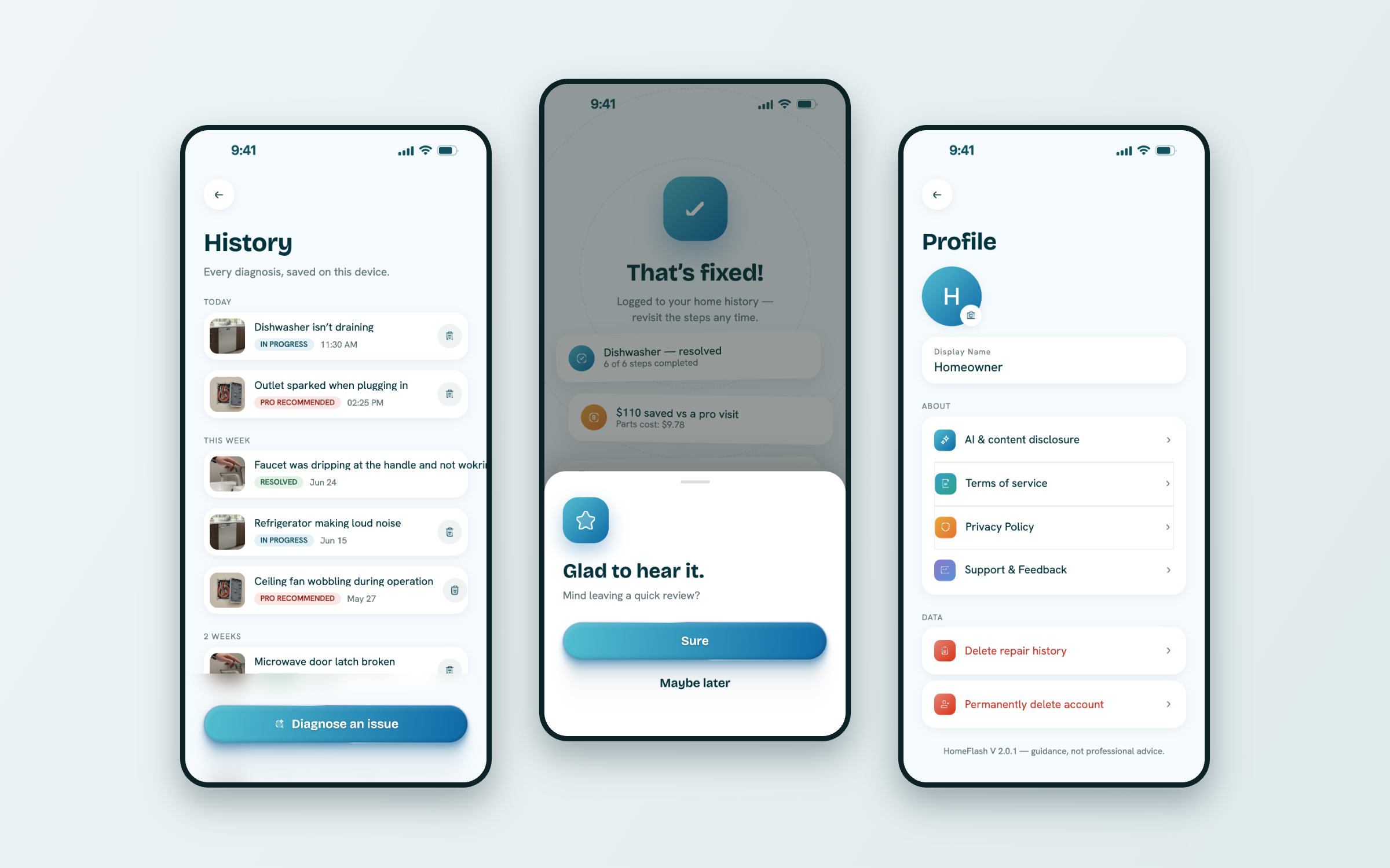
Every scan becomes a saved record — building a maintenance history that holds long-term value for the home.
Homeowners aren’t engineers. The interface never asks them to be.
A quiet, consistent foundation under every screen.
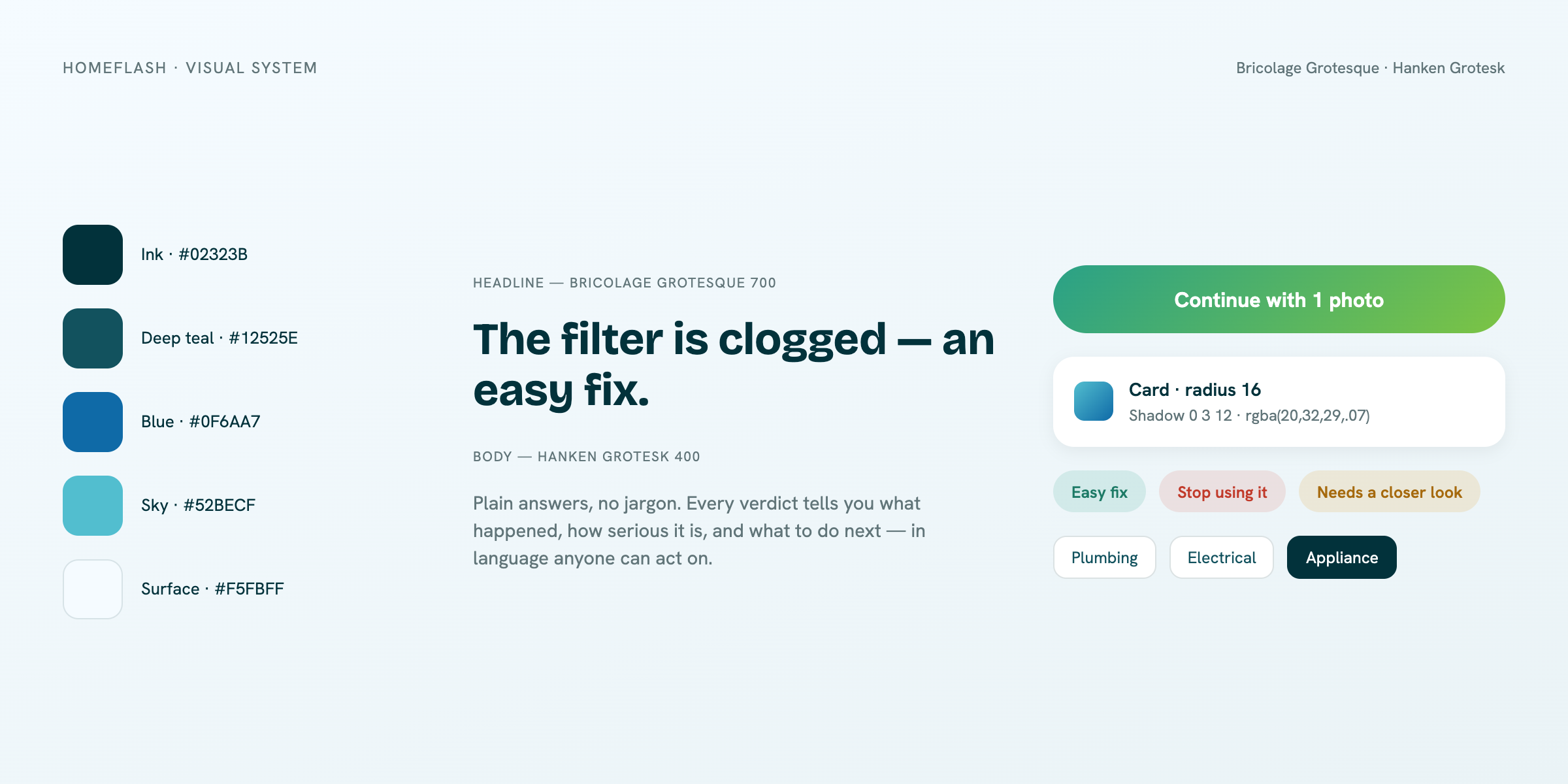
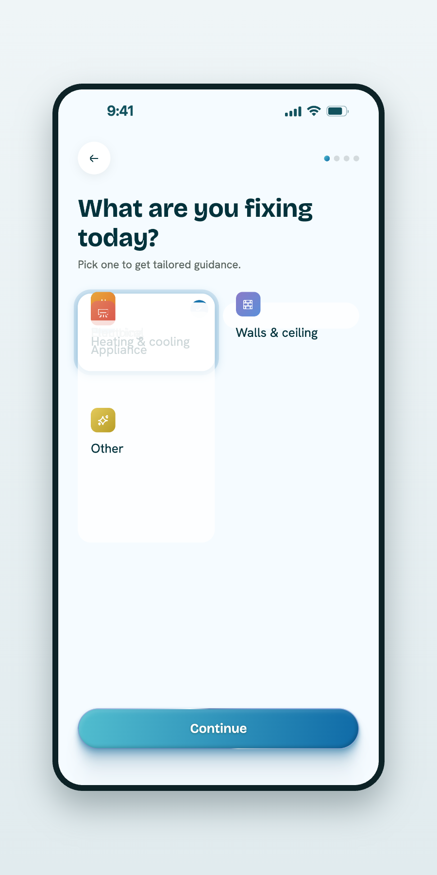
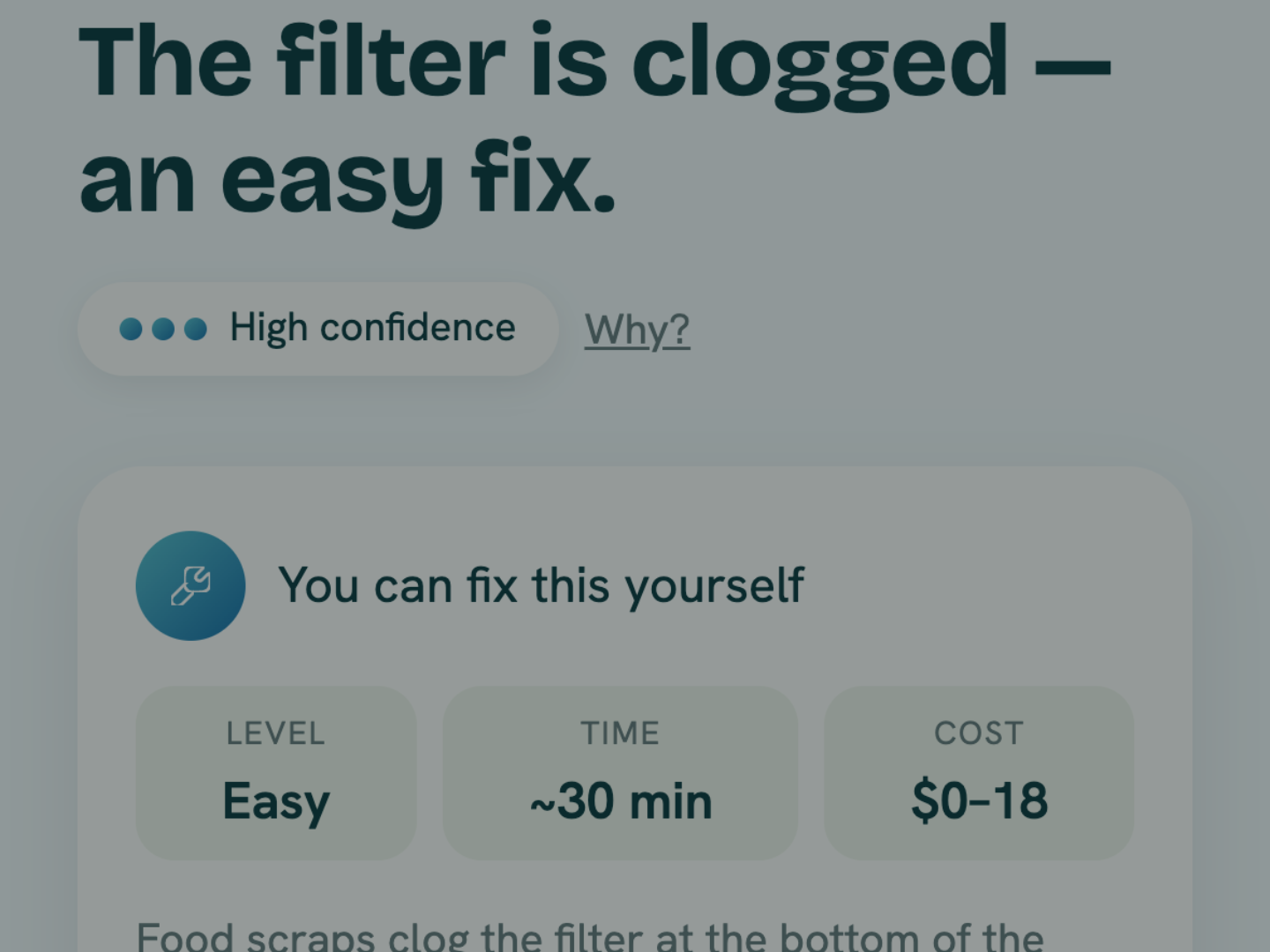
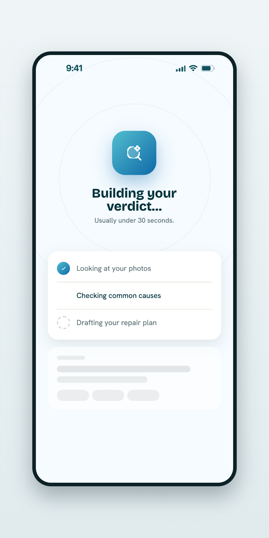
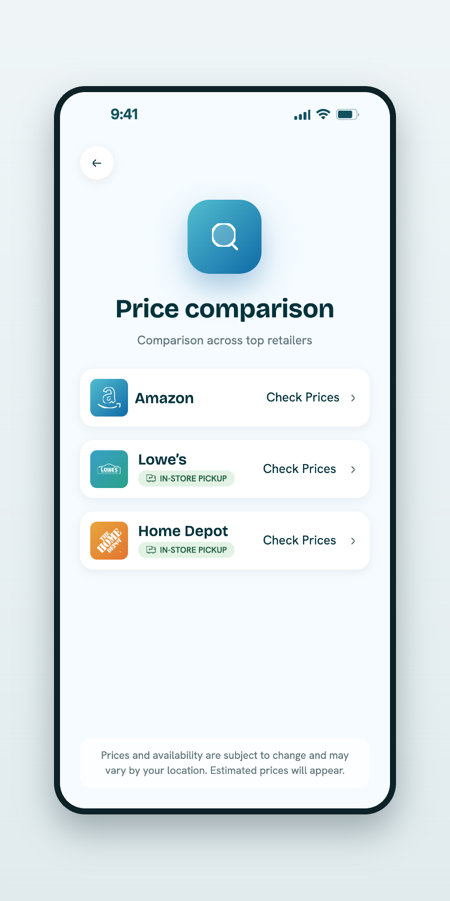
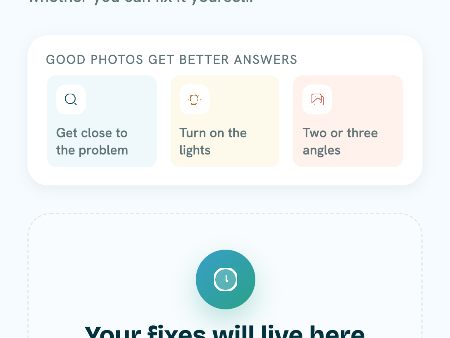
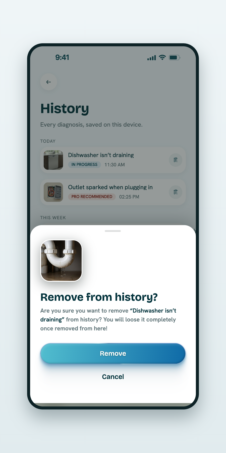
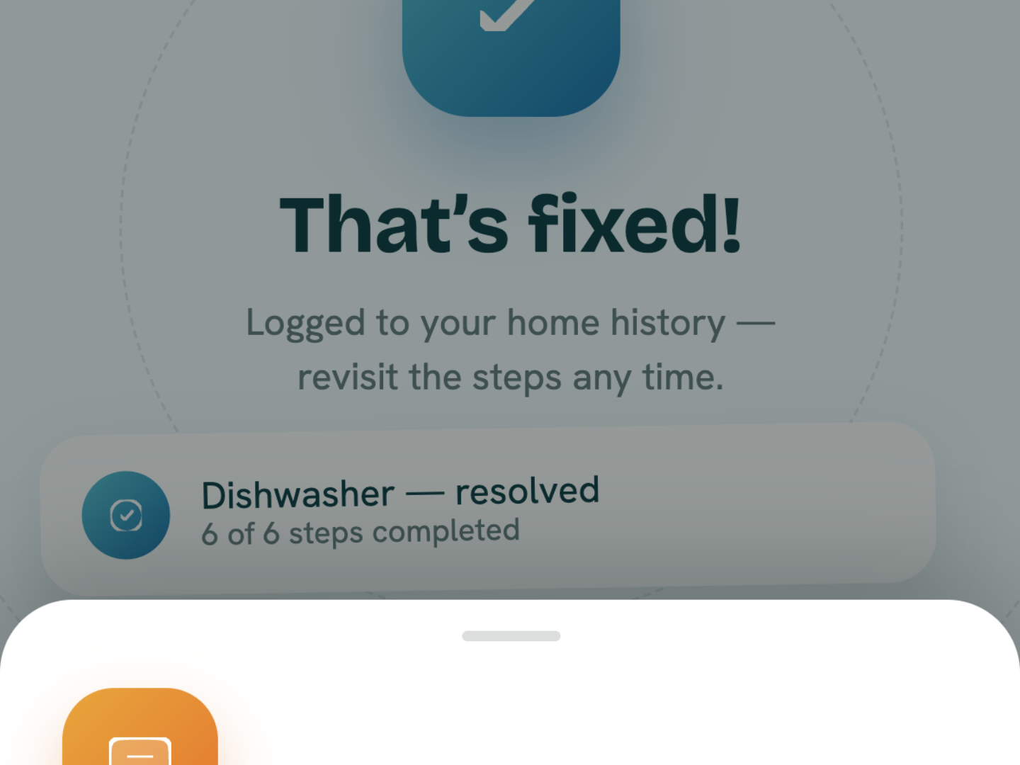
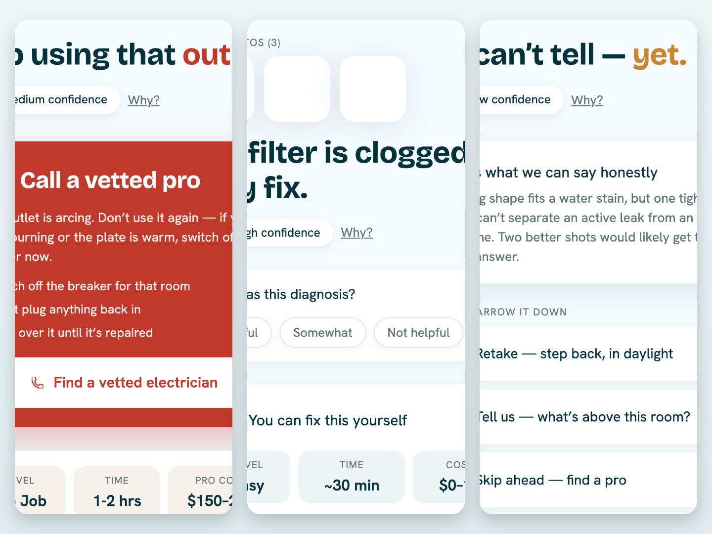
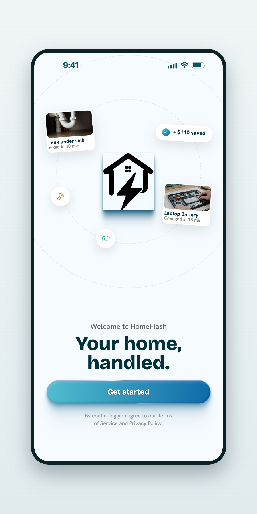
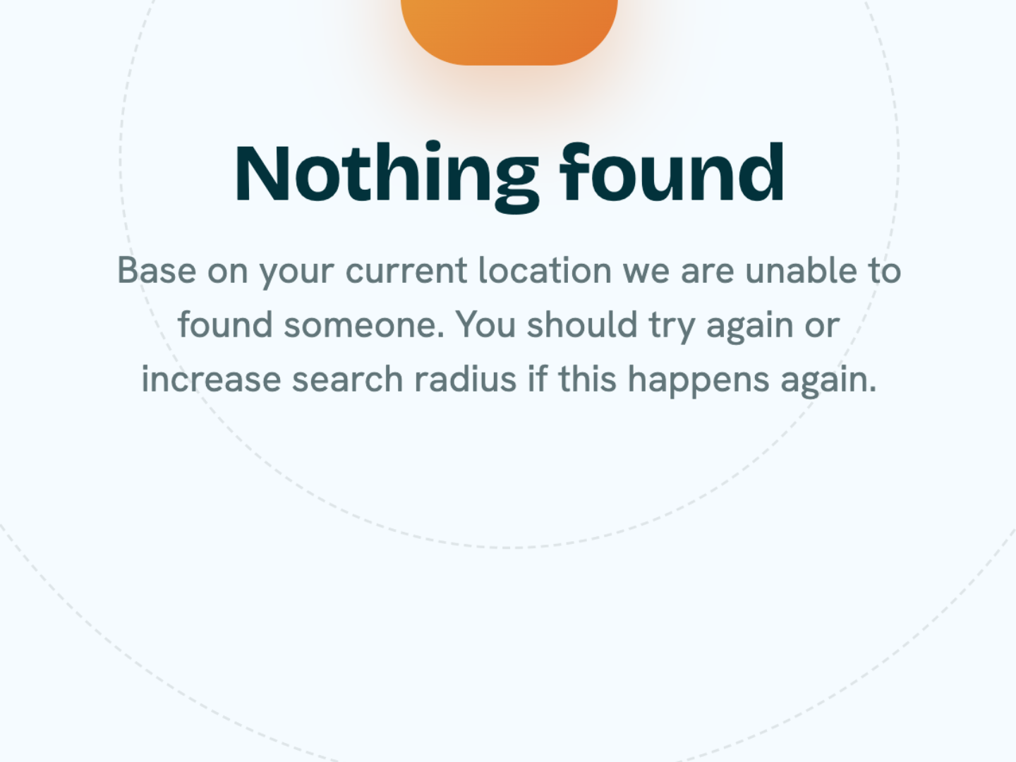
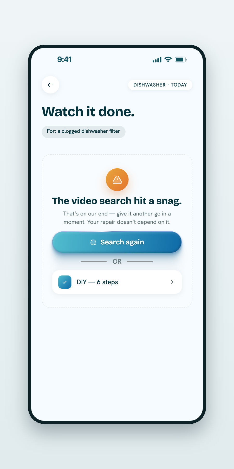
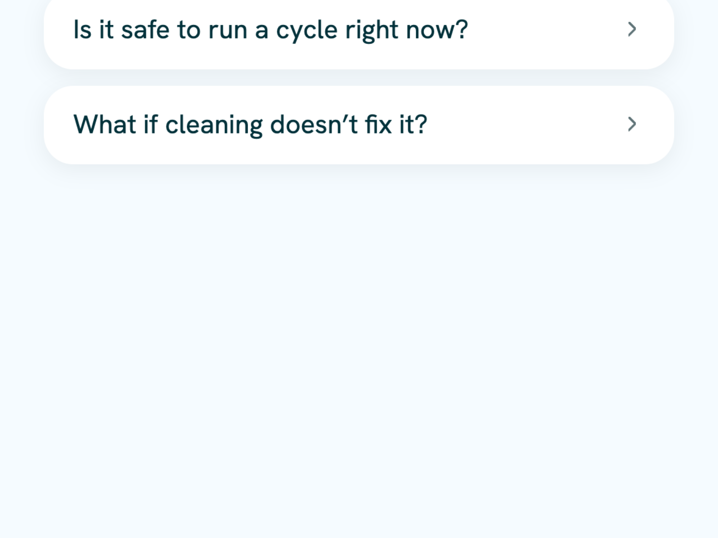
Designing AI responsibly meant making technical information understandable — and using every screen to reduce anxiety rather than add to it. HomeFlash succeeds when a worried homeowner feels confident, not confused.
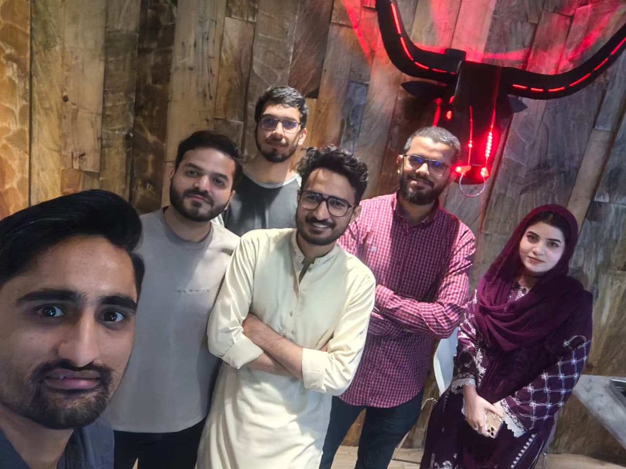
Hey, I’m Ashraf Sabri, a Product Designer who loves turning complex ideas into simple, thoughtful digital experiences.
Outside design, I enjoy traveling, photography, gaming, and discovering new perspectives through books. This page is a collection of the places, experiences, and milestones that have shaped who I am today.
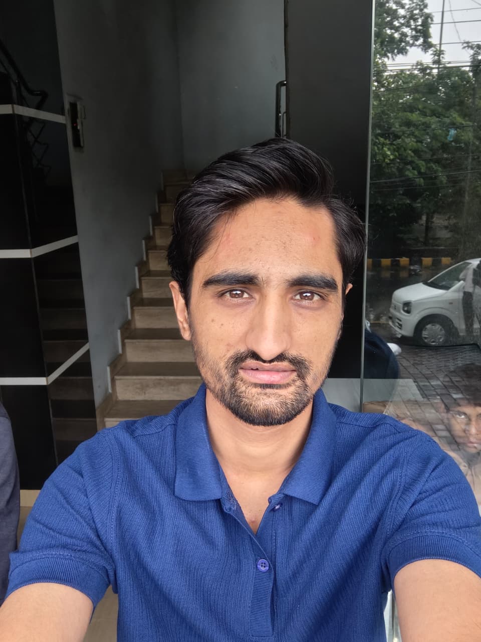
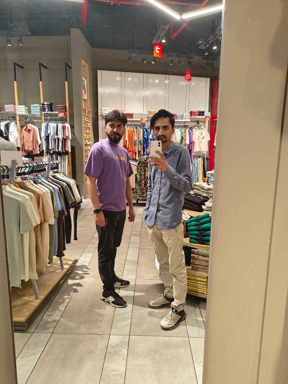

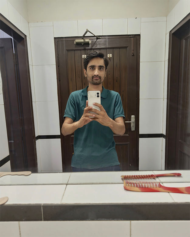
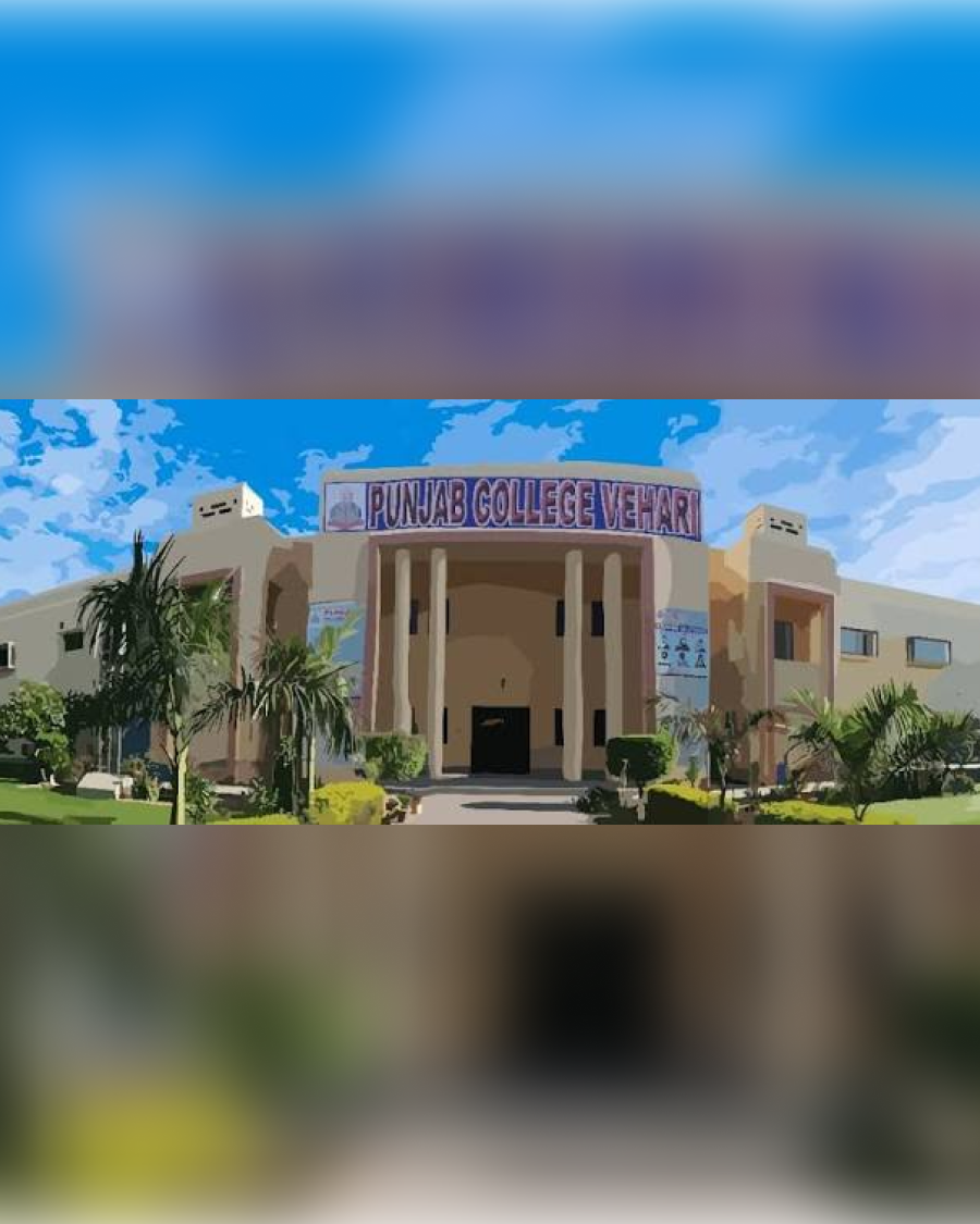
My journey into technology began at Punjab College Vehari, where I completed my Intermediate in Computer Science (ICS). Those two years gave me my first real introduction to computers and helped shape the direction I would take next.
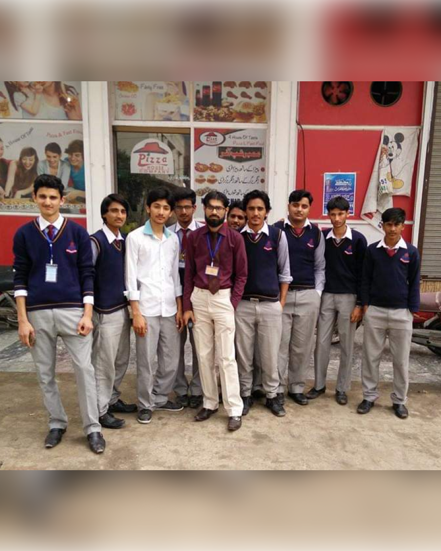
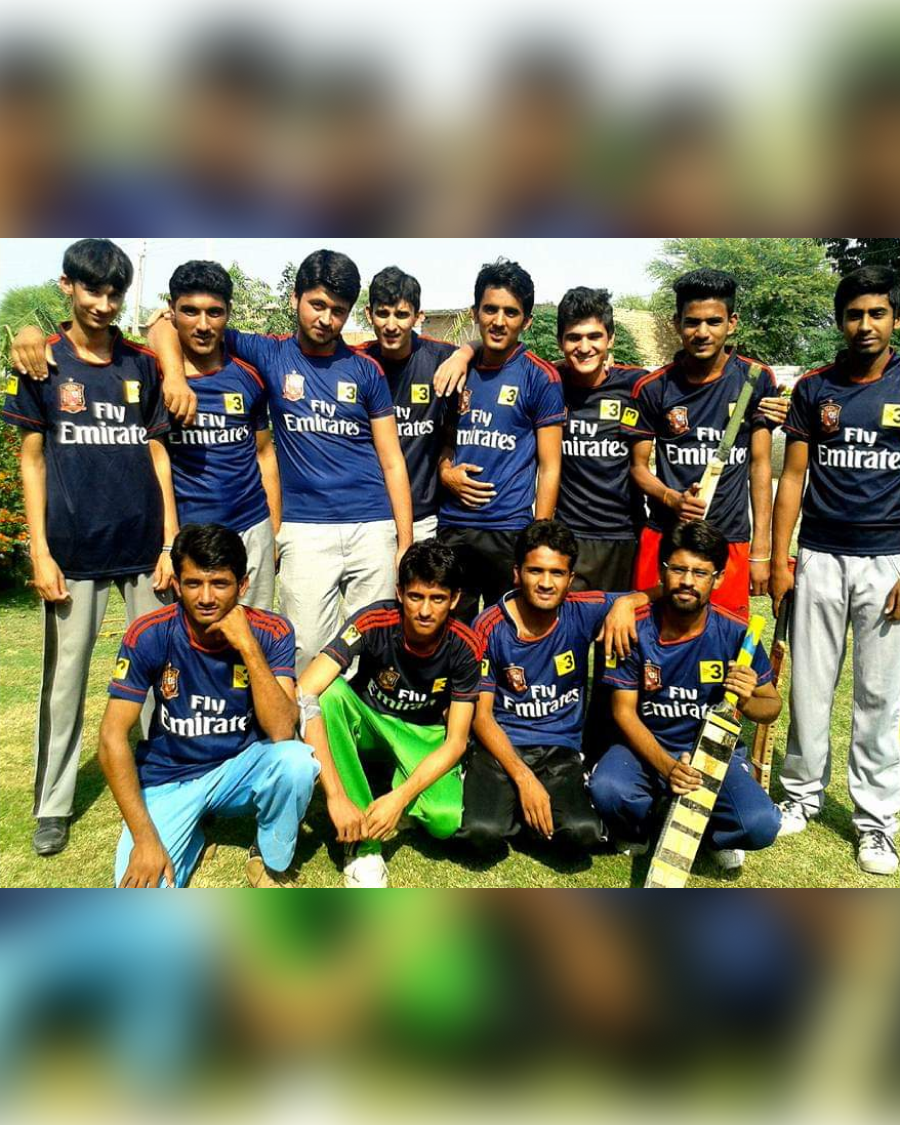
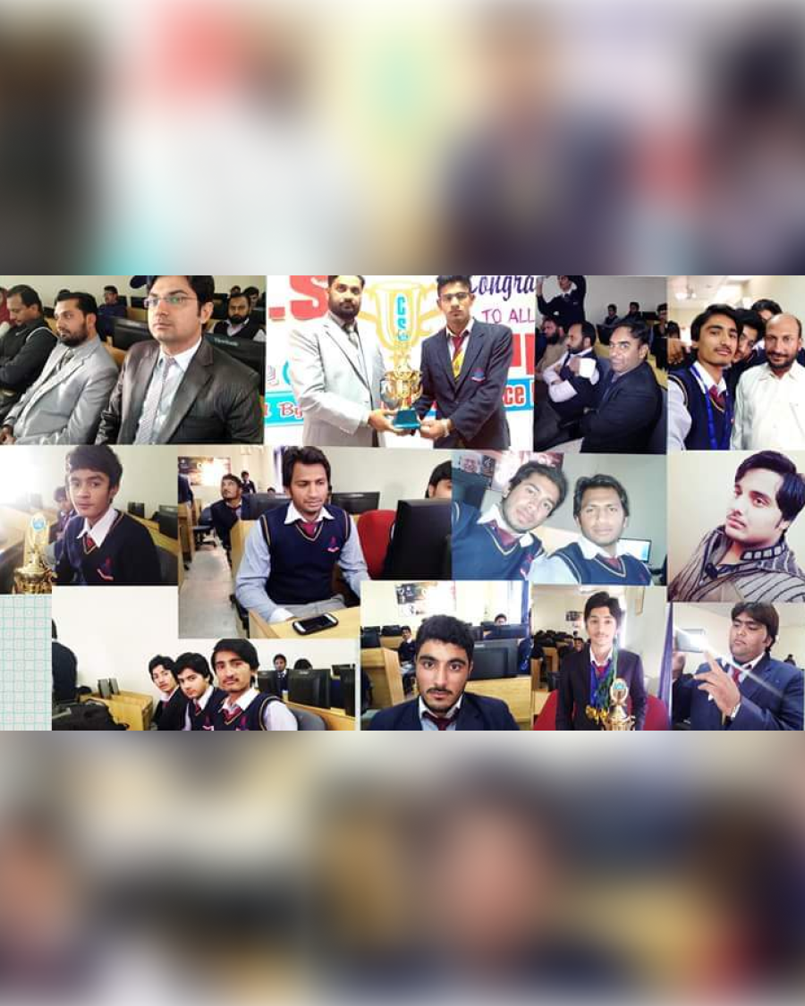
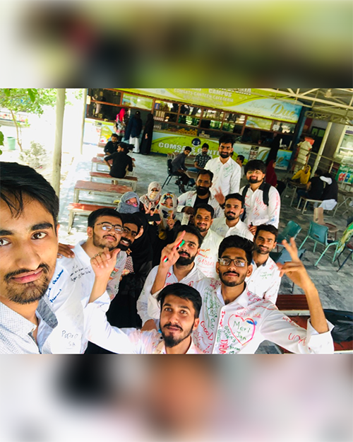
I studied Software Engineering at COMSATS University Islamabad, Vehari Campus. University gave me much more than a degree—it brought friendships, adventures, challenges, and memories that still mean a lot to me.
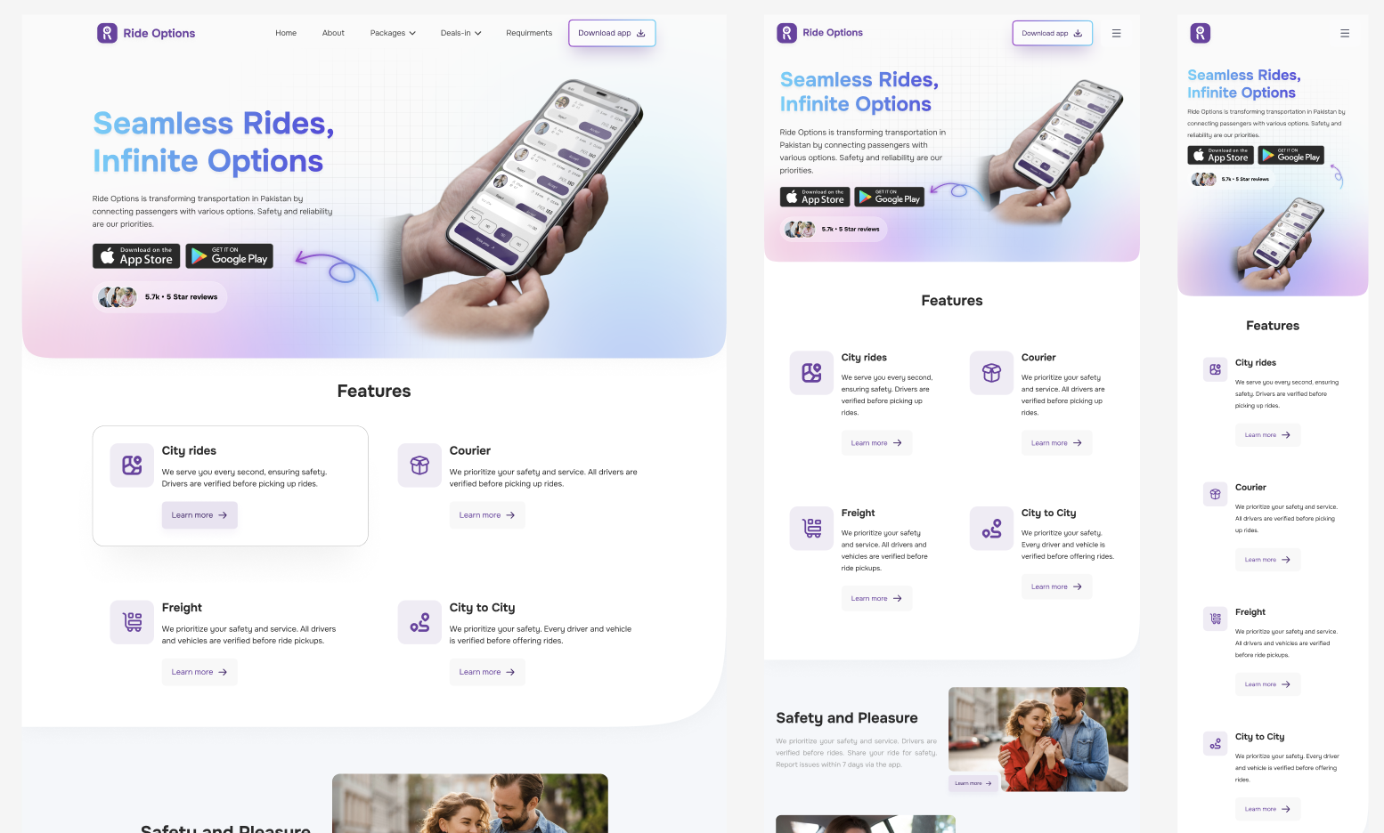
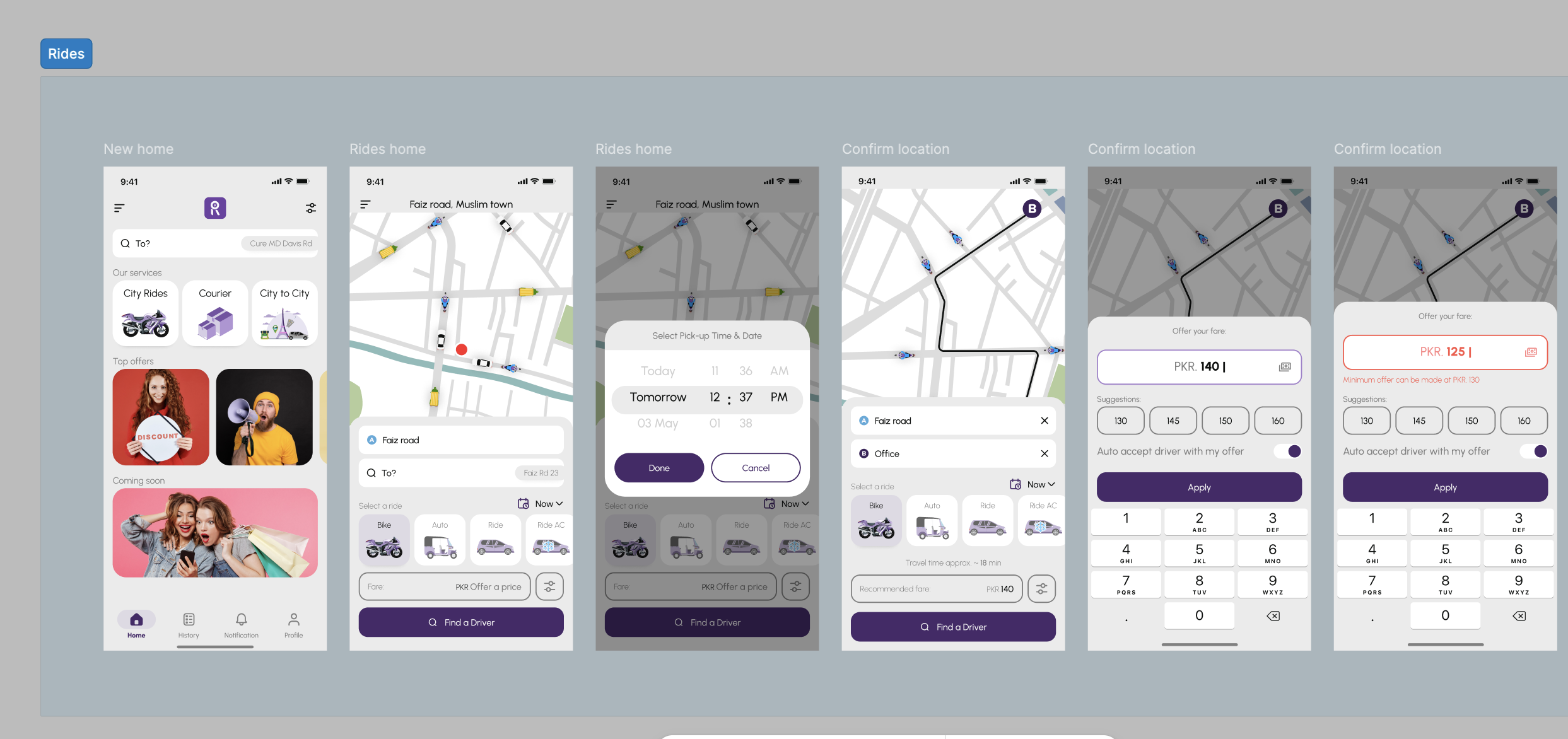
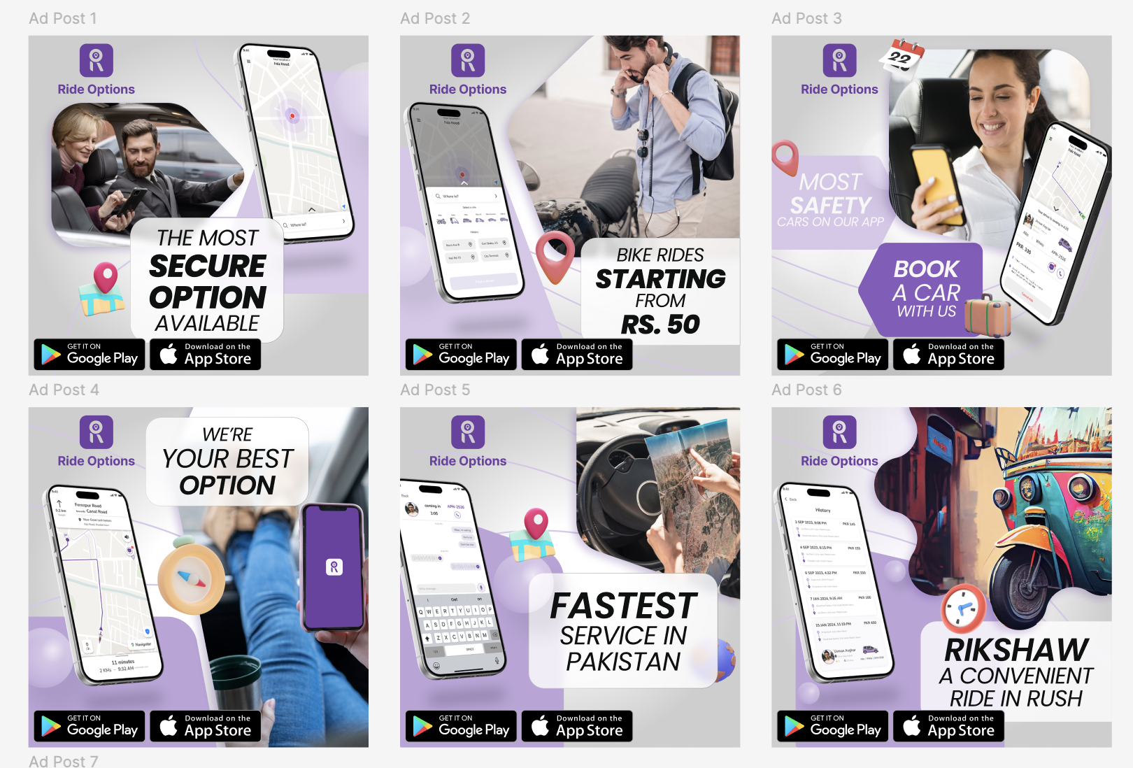
In 2023, I began turning my interest in design into a career. I joined Ride Options as an intern and progressed into a Junior UX/UI Designer role.
This chapter taught me how to move beyond attractive screens and think about the people using them. I learned to understand problems, ask better questions, work with a team, and design experiences that serve a real purpose.
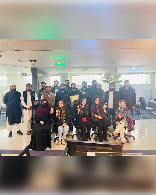
In 2024, I joined Amaze Health as a UX/UI Designer. Working in healthcare challenged me to approach design with greater clarity, empathy, and responsibility.
It was an opportunity to tackle more complex problems, strengthen my process, and create experiences for moments when ease of use truly matters.
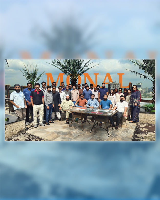
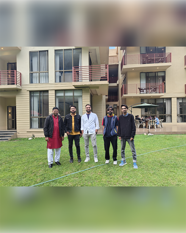
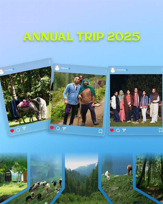
In 2025, I joined Barq Dev as a Senior UX/UI Designer. This role marked a new stage in my career—one centered not only on producing thoughtful work, but also on making stronger design decisions, collaborating closely with teams, and helping ideas develop from early concepts into polished products.
I’m still learning, still refining my process, and still excited by the challenge of making digital experiences feel simpler and more human.
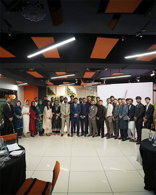
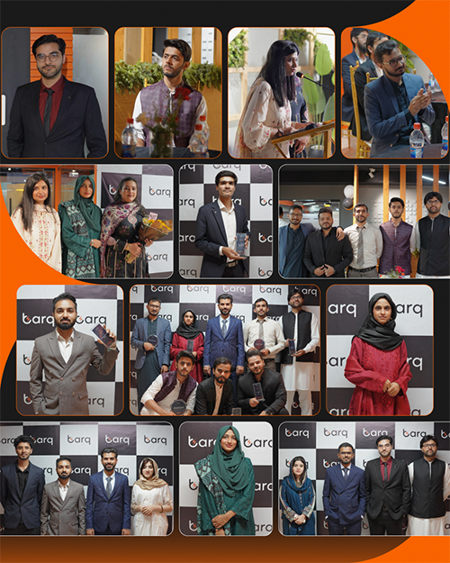
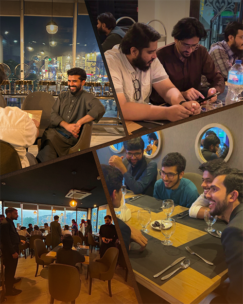
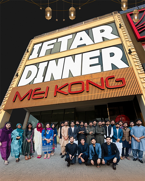
In August, I closed one chapter at Barq Dev and began a new one at Glowfish Product Studio. The journey continues—with new people, new challenges, and more room to grow.





From family pilgrimages and desert forts to mountain lakes and city streets—travel keeps refilling the well I design from.
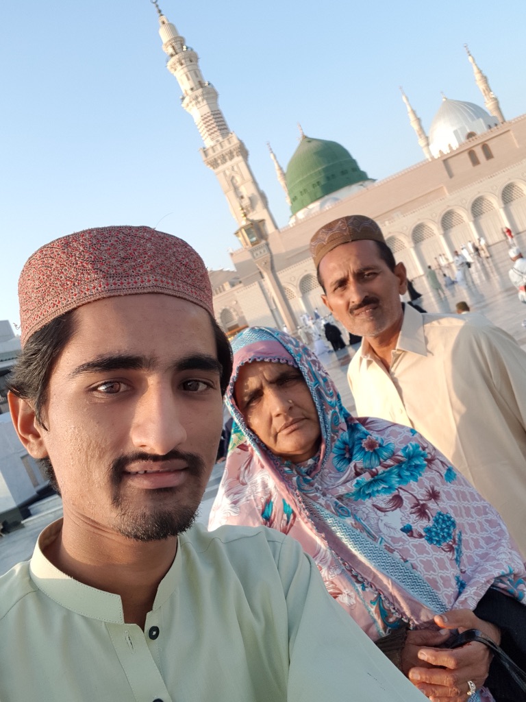



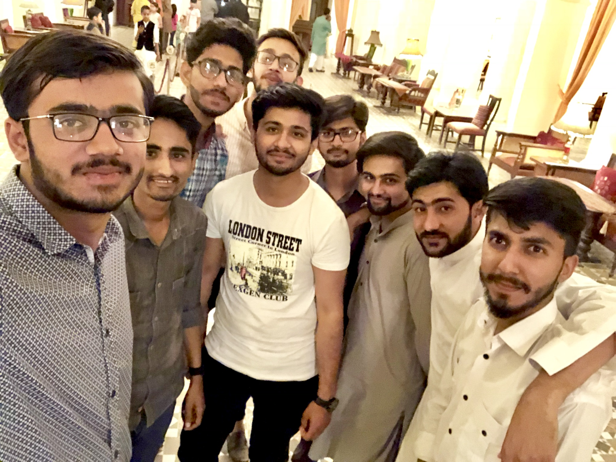

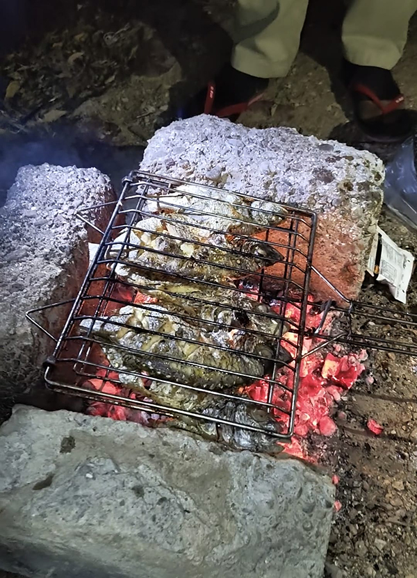

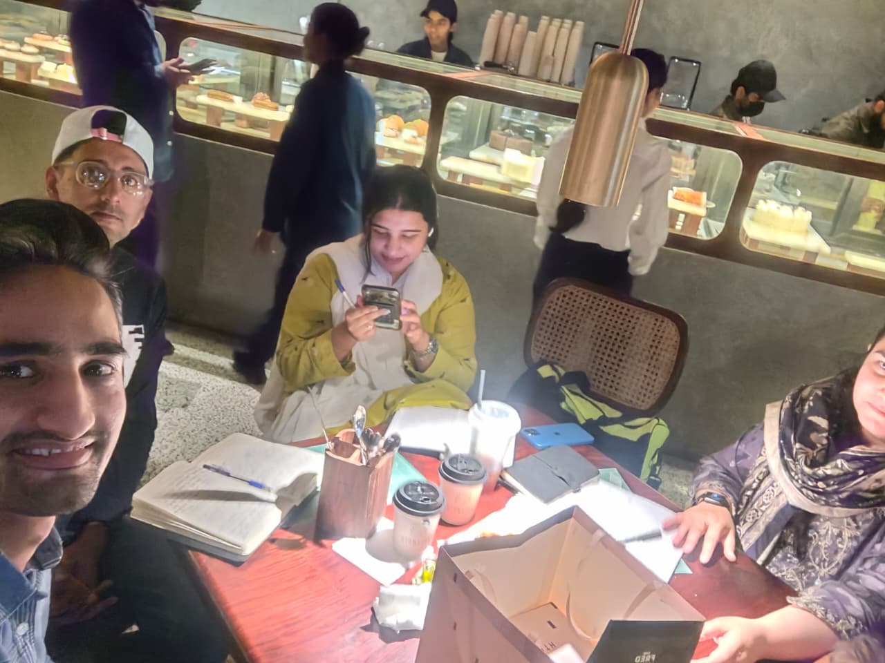
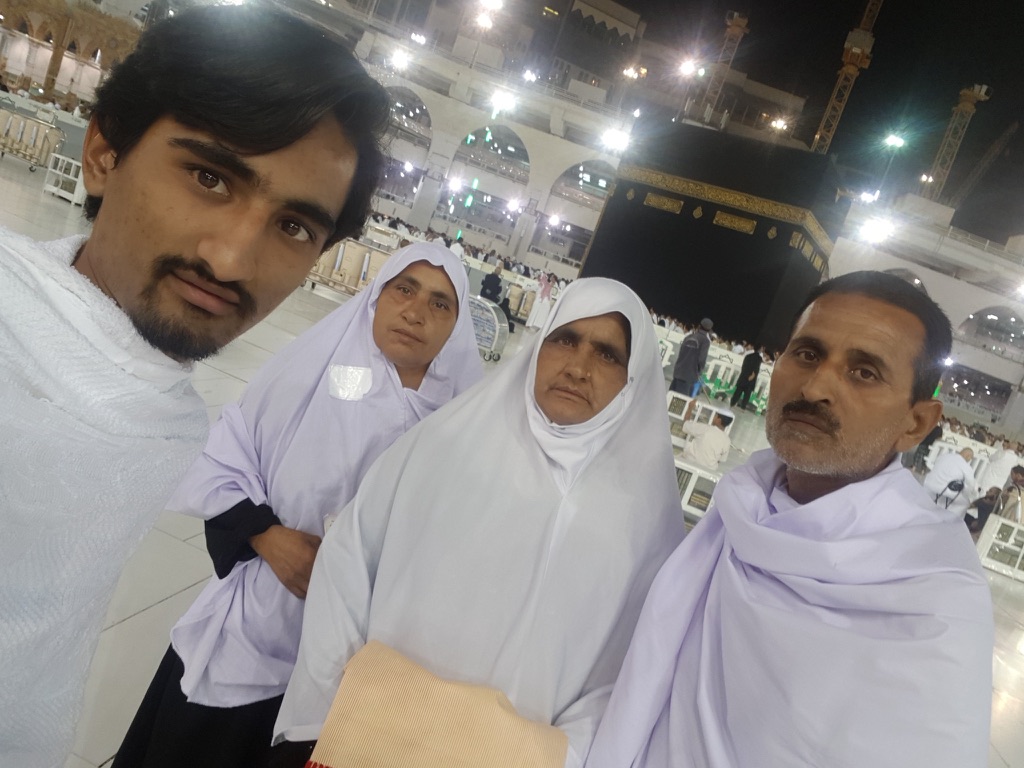
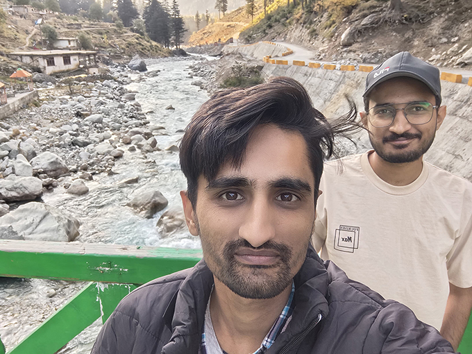
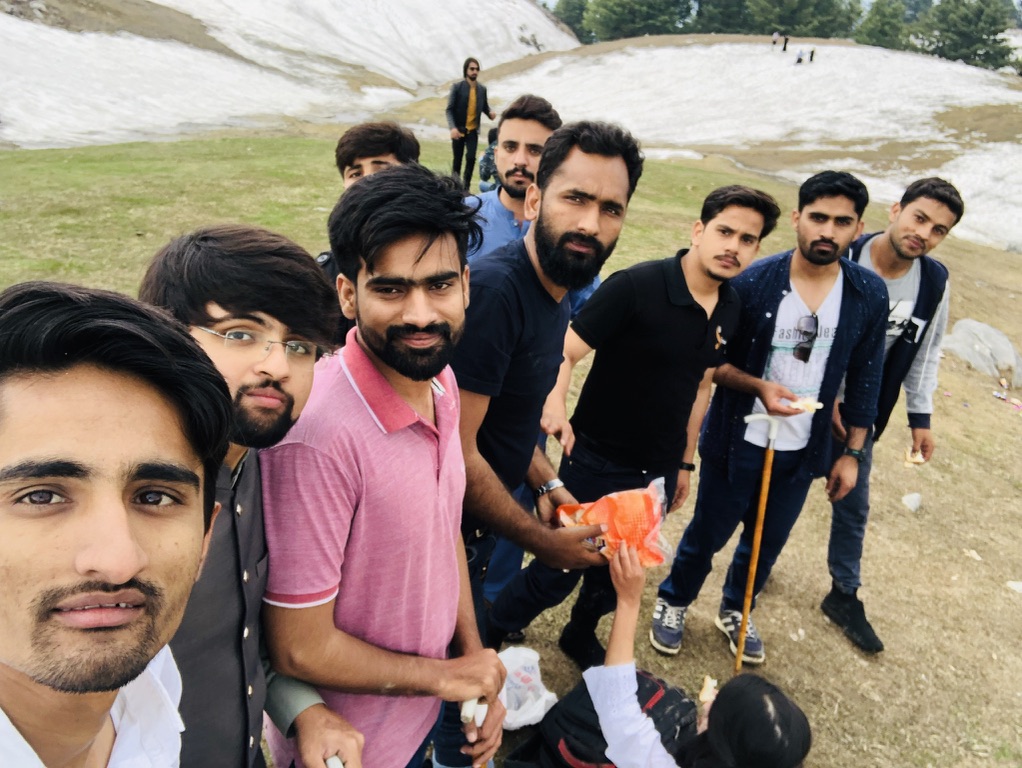
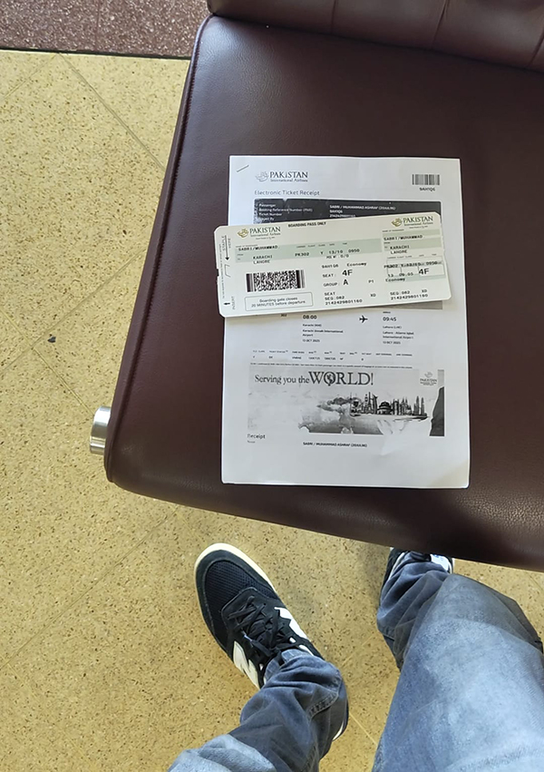

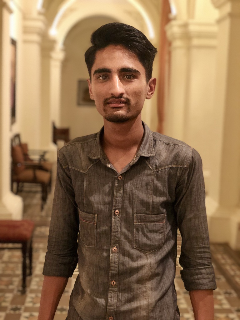


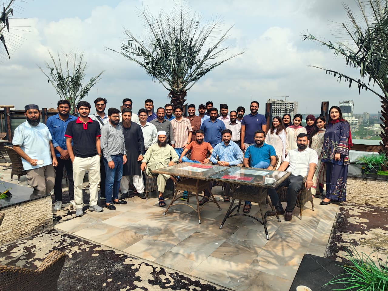
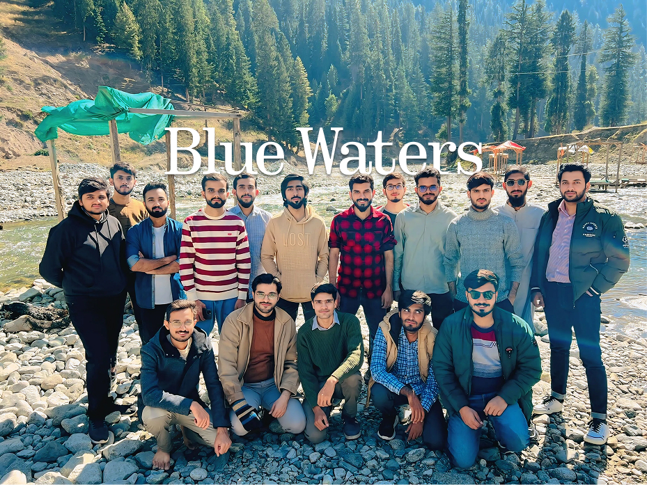


I believe good designers should remain curious. Reading has helped me question assumptions, understand human behavior, and approach problems from different perspectives.
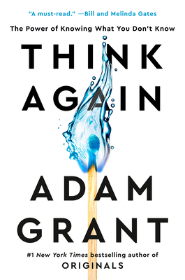
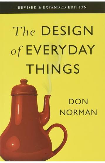
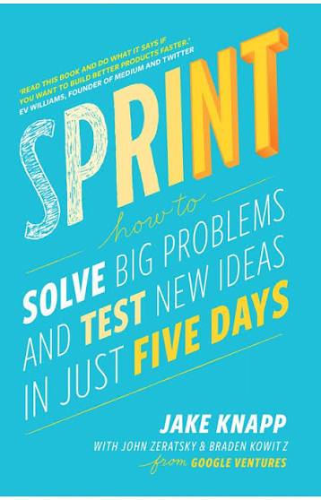
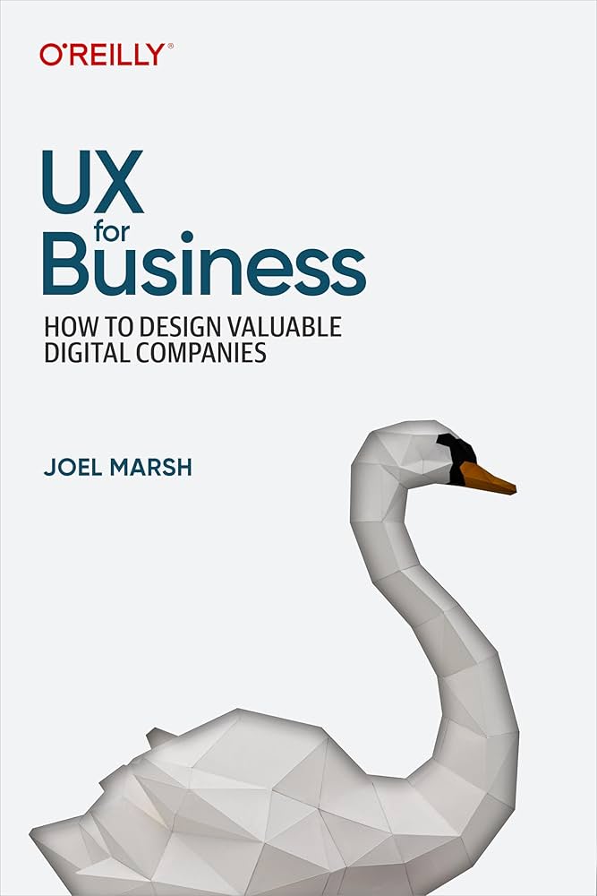
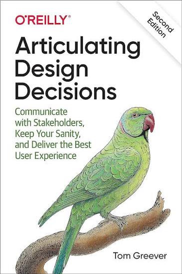



Each one has contributed something different—from rethinking old beliefs to understanding usability, teamwork, experimentation, and the business value of design.
A few things that make life feel like mine.
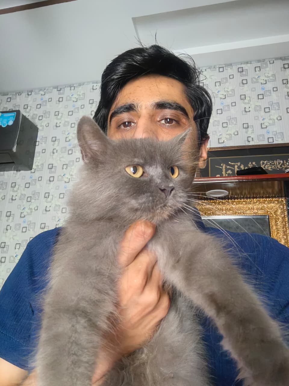
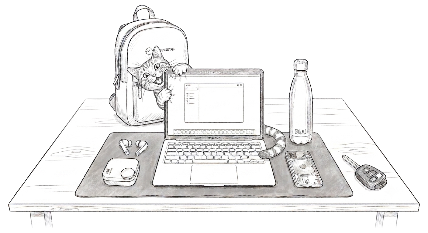
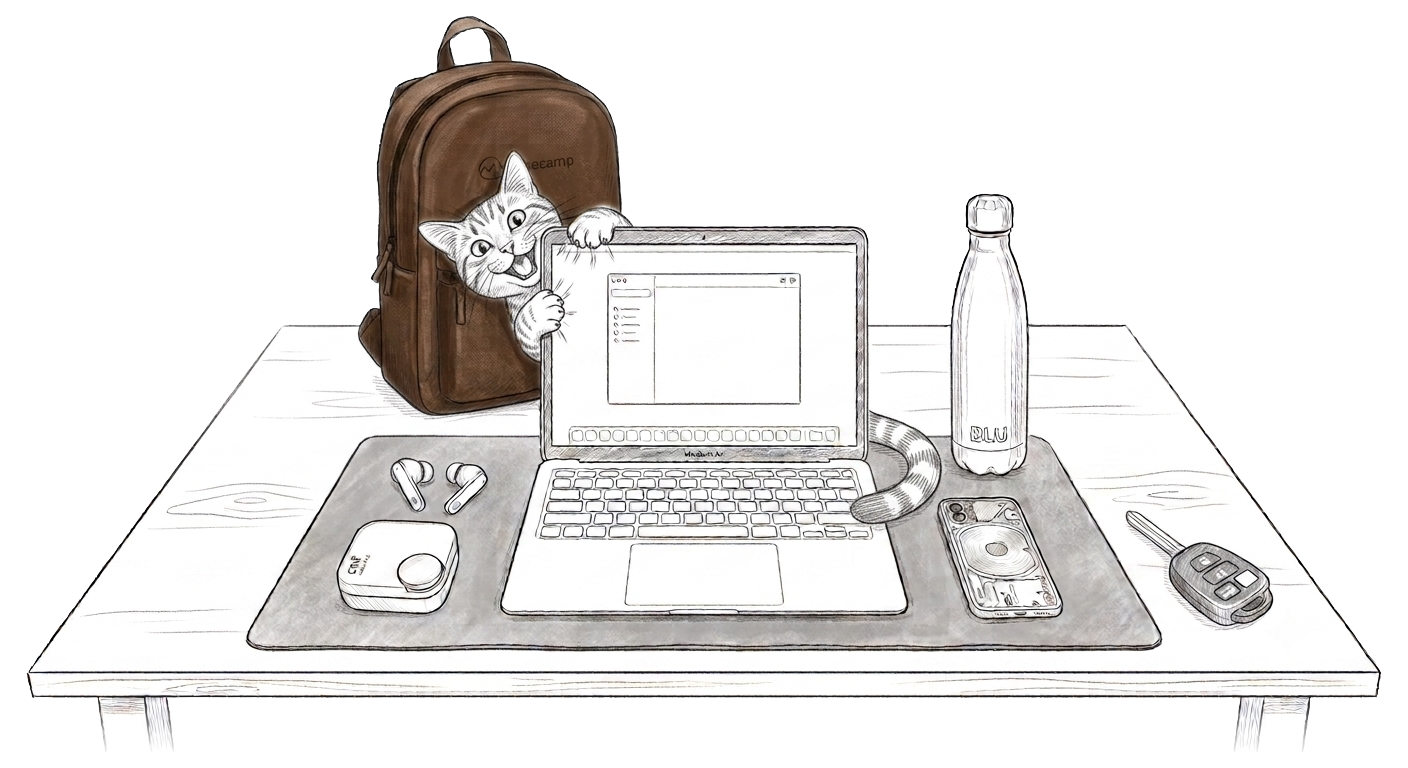
Cats, always.

Snooker, occasionally. Confidence, more consistently.

Nusrat, on repeat.

Stand-up comedy is my kind of therapy.
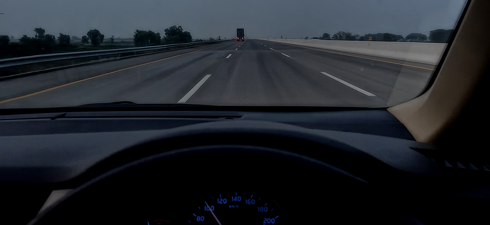
Late-night roads and a clear head.
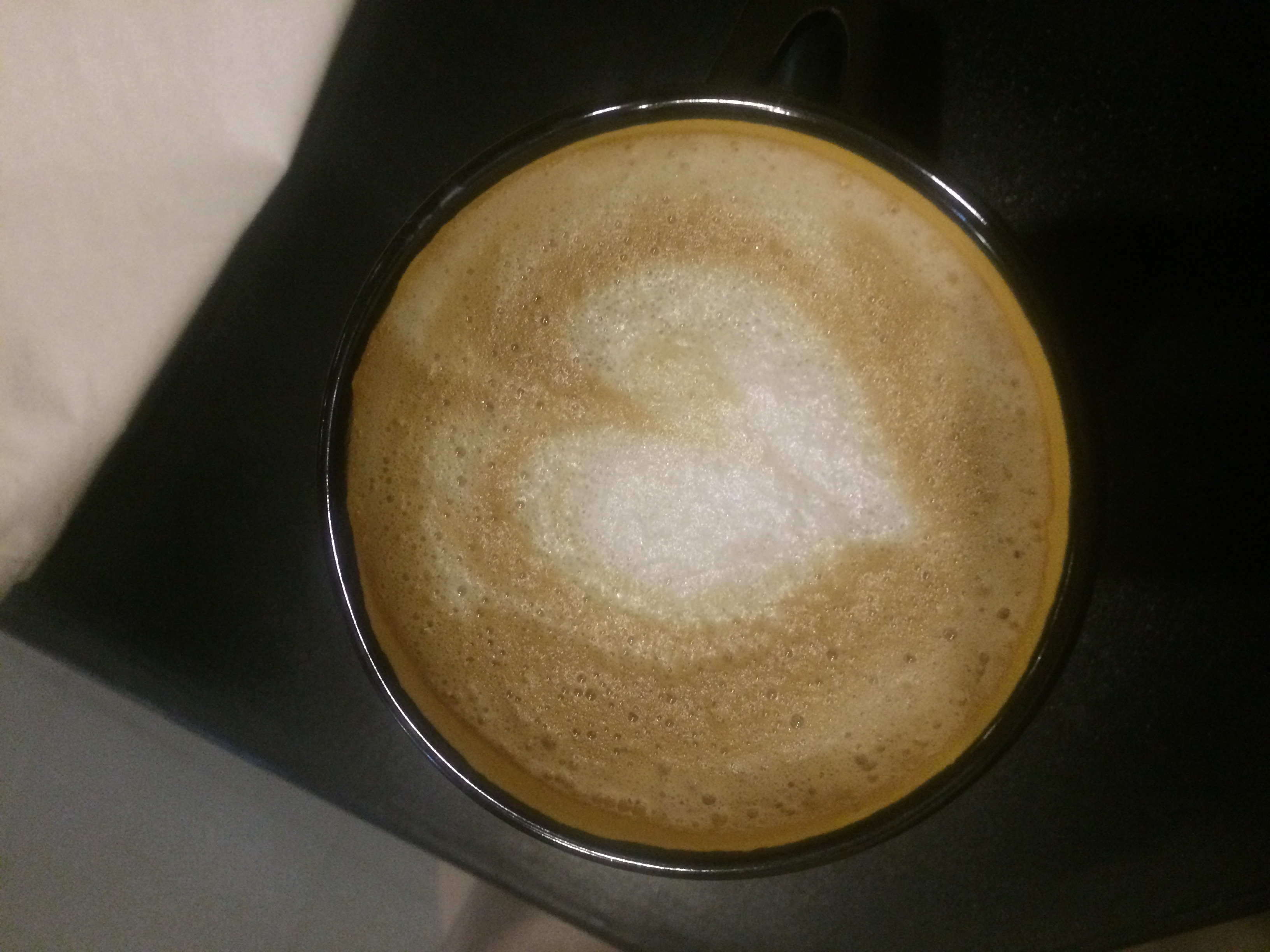
Coffee lover. Most ideas start with a refill.
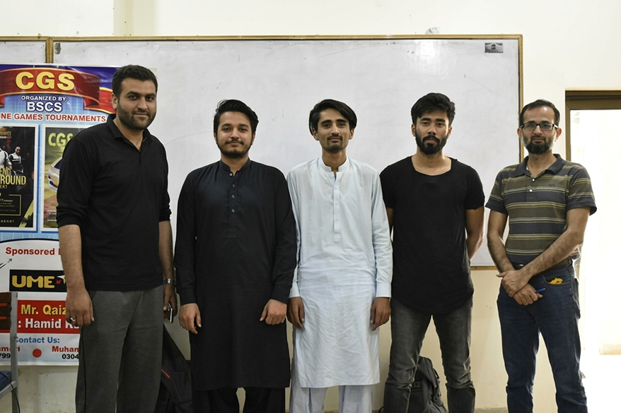 Winner Winner
University champions, 2019. More practice than I should admit.
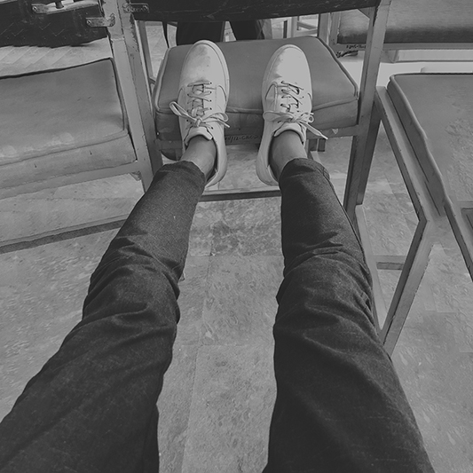
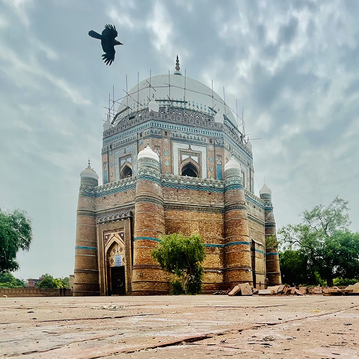


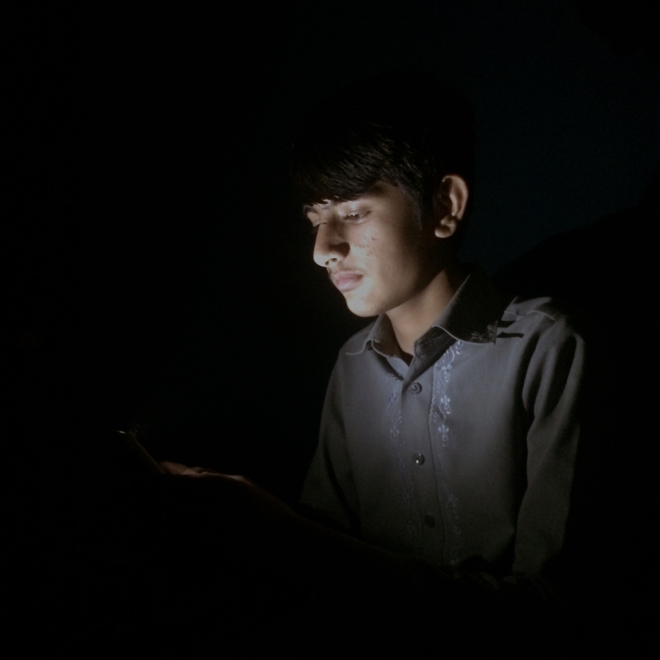
Photography taught me to notice the details.
I’ve never been too interested in one final destination. That sounds boring. For me, the good part is everything along the way—the work, the roads, the stories, the laughter, and the people who make ordinary moments memorable.
Amaze Health is a US-based telehealth platform that helps patients access healthcare through virtual consultations, secure messaging, appointments, health resources, insurance management, and ongoing care.
A centralized operations platform for a luxury vehicle storage business — replacing spreadsheets and WhatsApp with one connected system for staff, customers, and daily operations.
An all-in-one nutrition platform — and the marketing website that introduces it. Meal planning, pantry, shopping, cooking, and tracking, told as one connected product story.
An AI-powered iOS app that turns a single photo of a home problem into a clear explanation, severity, and next step — helping homeowners act with confidence.